Support This Site

If you like what I do please support me on Ko-fi

Watercolor Paper Testing – Part 2

Hello and welcome back for Watercolor Paper Testing – Part 2! My last post I had done some small tests to get started, and explained about the fall I had. Well I’m pretty much healed from that and getting back on track.

Hello there!

Hello there!

First I want to say, if you just go by what I say worked for me, it might help you decide on a paper you’d like to use, BUT WAIT! I highly recommend doing some testing of your own, you can follow my example or try new things on your own. I made a list of the techniques I was most likely to use and then did a simple, similar picture on all of them. I used 11 different papers, all ordered from Jackson’s Art Supply, my test sizes varied from about 5″x6″ to 3″x 6″, so they were small. It took me several days, of sitting down when I could, to work on each test criteria.

1.First label all your test peices of paper with what the paper is, the weight, type etc. One nice thing I ordered was the St. Cuthbert’s Mill sample pack of seven different papers; it only cost .50p and the peices were large enough to really play around with. Each of them was fully labeled too.

2.Make a list of the techniques you want to test on notebook paper; I will include my criteria list below. I decided to do one character (snail) on each and a simple dirt path, green bushy background and a sky with clouds. The sky allowed me to do a big simple graded wash, drop water in for clouds, and test by lifting with clean wet brush.

Clouds

Clouds

3.Do one technique at a time on each one in succession. This way you’ve got the same colors mixed, and can use the same brushes to compare how they go on each paper. Write down what you thought after each thing you test or you’ll forget. I did this on note paper then after I was all done I wrote them down on the back of each paper test. So years from now you can dig around and find them you’ll know what’s what.

OK, here’s my list of criteria I tested:  (all done on dry, unstretched paper)

  1. Can you trace through the paper using a black ink line drawing underneath? I traced different snails on each one.
  2. Does pencil erase easily?
  3. Wash layers- do they stay or lift too easy when new layers go on? Tested in bush areas, ground and sky (I wet paper with a brush first for this one).
  4. Lifting- do dry watercolors lift off when you rub/lift using damp brush and paper towel? On each I lifted a tree shape, like “stems” in the green bushes. Then on most I also lifted some of the dry blue sky.
  5. Dry brush technique. Mostly the bushes and some ground areas on each.
  6. Draw with dip nib and ink. I drew each snail with dip ink and nib, going over the pencil lines I traced.
  7. Scratch wet paint areas to see if dark lines appear. You’ll see some thin lines of color in the bushes, these were made by scratching into the wet paper where paint was laid down.
  8. Color pencil on dry watercolor areas, how do they go on? I mostly did this in the bushes around the snail, some on the ground using dark browns.
  9. Permanent ink pen, ease of drawing on paper? Used to outline each snail and some details on the ground.
  10. Clouds on damp blue sky, drop clear water on and some lifting with paper towel.
  11. In general how does paper take the paint?
  12. (other things you may want to test that I did not: using masking fluid, scraping off dry layers of paper with sharp knife, dropping salt on wet paint, whatever you may usually do when painting)

Please click each picture to see it enlarged.

Testing ability to trace through the paper from my drawing.

Testing ability to trace through the paper from my drawing.

This is my simple set up for tracing I used on this project, (sorry for the dark picture) it’s a clear plastic flat “scrapbooking” type container. I like using these containers to hold my illustrations and lately have been using one as an easel/drawing table. I put a peice of rubber shelf liner underneath it, and can tuck reference photos and drawing stuff inside. I hold the top up with different sizes of masonite or plexiglas depending on the angle I want; here I used plexiglas so it lets more light through. I put a strong little lamp behind it on the table and set my drawing that I’ve inked in black on top. Next you lay your watercolor paper on top and trace! *Note- I taped a carpenters pencil along the bottom to keep papers and boards from sliding off, it works pretty good for now. *Note 2- you can also trace using a bright window; tape your inked drawing up and then your watercolor paper on top. Use light pencil lines, don’t score into the paper, you’ll want to erase most of your lines anyways so draw light!

Now I’ll post pictures of each sample and tell what paper it was along with what I thought about it. Prices listed were at the time I bought them. Click on pictures to see larger.

Beginning sample for watercolor paper test.

Beginning sample for watercolor paper test.

This sample has no number because it’s a scrap peice of watercolor paper I grabbed and for each technique I gave it a go on here 1st as a warm up! If you’re worried about messing up your paper don’t be afraid to loosen up on some scraps first! this helped me to think of what techniques I wanted to try.

#1 St. Cuthbert's Mill, Millford, 140lb, CP (NOT) White

#1 St. Cuthbert’s Mill, Millford, 140lb, CP (NOT) White

#1 St. Cuthbert’s Mill, Millford, 140lb, CP (NOT) White. 22″x30″ sheet = £ 4.10, 9″x12″ cut peice = .82p. (all papers with blue type on them are from the St. Cuthbert’s Mill sample pack) 1. Traced through well enough, a bit rough. 2. Erases well. 3. Washes went on great, no hard edges. 4. Lifting dry color- this paper worked well. You can see the little ‘tree’ stem area in the green bushes, that was done by lifting, and at the top in the sky.  5. Dry brush was good, rough areas in bushes. 6. Ink and Nib- went on well, a bit rough but good. 7. Scratch test-worked but wasn’t very strong, may need to try more. 8. Color pencil- great, bit of texture. 9. Permanent ink pen- ok, a bit rough for long drawn curved lines (snail shell). 10. Clouds- worked well, soft edges. 11. Paper took the paint really well, nice texture on ground edges, blue sky washes even.

#2 St. Cuthbert's Mill, Bockingford, 140lb, HP White

#2 St. Cuthbert’s Mill, Bockingford, 140lb, HP White

#2 St. Cuthbert’s Mill, Bockingford, 140lb, HP White. 22″x30″ sheet = £ 2.10, 9″x12″ cut peice = .42p. 1. Traced through very well, smooth. 2. Erases well. 3. Washes- went on blotchy or patchy, layers hard edged. 4. Lifting dry color- worked well, see ‘tree’ shape and tiny cloud at top. 5. Dry brush-ok, not bad but a bit blah because of paper smoothness. 6. Ink and Nib- went on well, smooth. 7. Scratch test- worked. 8. Color pencil-good. 9. Permanent ink pen- very easy to draw with, smooth. 10. Clouds-Interesting, with water dropped in it formed harder dark edges, which I could have softened with lifting, but it was neat.  11. Was harder to float washes, paint colors got patchy.

#3 St. Cuthbert's Mill, Bockingford, 140lb, CP (NOT) White

#3 St. Cuthbert’s Mill, Bockingford, 140lb, CP (NOT) White

#3 St. Cuthbert’s Mill, Bockingford, 140lb, CP (NOT) White. 22″x30″ sheet = £ 2.10, 9″x12″ cut peice = .42p. 1. Traces well, tiny bit rough. 2. Erases easy. 3. Washes- great, easy to add water to. 4. Lifting dry color- did well. 5. Dry brush- worked really well. 6. Ink and Nib- worked ok, tiny bit rough. 7. Scratch test- worked ok. 8. Color pencil-good. 9. Permanent ink pen- good, a bit bumpy for drawing. 10. Clouds-excellent! Soft edges were perfect and harder edges on bottom edges looked good. 11. Paper took paint nicely.

#4 St. Cuthbert's Mill, Bockingford, 140lb, Rough White

#4 St. Cuthbert’s Mill, Bockingford, 140lb, Rough White

#4 St. Cuthbert’s Mill, Bockingford, 140lb, Rough White 22″x30″ sheet = £ 2.10, 9″x12″ cut peice = .42p. 1. Traced through well enough, a bit rough. 2. Erases well. 3. Washes- layered well. 4. Lifting dry color- worked rather well.  5. Dry brush- pretty good, rough areas in bushes and ground. 6. Ink and Nib- worked ok, a bit rough. 7. Scratch test-worked, a bit pale. 8. Color pencil- not as good, a bit too rough for me. 9. Permanent ink pen- well, a bit rough. 10. Clouds- worked well, wash went on nice, made clouds really well. 11. Paper took the paint really well, nice textures too.

#5 St. Cuthbert's Mill, Saunders Waterford, 140lb, HP High White

#5 St. Cuthbert’s Mill, Saunders Waterford, 140lb, HP High White

#5 St. Cuthbert’s Mill, Saunders Waterford, 140lb, HP High White 22″x30″ sheet = £ 3.60, 9″x12″ cut peice = .72p. 1. Traced through well. 2. Erases well. 3. Washes- went on nicely. 4. Lifting dry color- ok, not as easy as others, lifting small patch on blue sky was bad.  5. Dry brush- worked great, rough areas above bushes. 6. Ink and Nib- worked ok, a bit bleedy. 7. Scratch test-worked really well. 8. Color pencil- worked well easy to draw on to paper. 9. Permanent ink pen- great. 10. Clouds- worked well, I put clouds on with a bit too much water. 11. Paper took the paint well.

#6 St. Cuthbert's Mill, Saunders Waterford, 140lb, CP (NOT) White

#6 St. Cuthbert’s Mill, Saunders Waterford, 140lb, CP (NOT) White

#6 St. Cuthbert’s Mill, Saunders Waterford, 140lb, CP (NOT) White 22″x30″ sheet = £ 3.60, 9″x12″ cut peice = .72p. 1. Trace through-a bit rough, not as thin, can trace but not as easy. 2. Erases well. 3. Washes- went on really well. 4. Lifting dry color- not so good, soft edges.  5. Dry brush- worked great, rough areas in bushes and ground. 6. Ink and Nib- worked ok, not too bad. 7. Scratch test-worked ok. 8. Color pencil- worked well, especially for rough textures. 9. Permanent ink pen- very well. 10. Clouds- worked well, nice and soft, blue wash went on really well. 11. Paper took the paint really well.

#7 St. Cuthbert's Mill, Saunders Waterford, 140lb, Rough White

#7 St. Cuthbert’s Mill, Saunders Waterford, 140lb, Rough White

#7 St. Cuthbert’s Mill, Saunders Waterford, 140lb, Rough White 22″x30″ sheet = £ 3.60, 9″x12″ cut peice = .72p.  1. Traces through well-a bit rough. 2. Erases well. 3. Washes- very good. 4. Lifting dry color- worked well but not with sky color.  5. Dry brush- worked great, rough areas in bushes and ground. 6. Ink and Nib- worked ok, a bit rough. 7. Scratch test-worked ok. 8. Color pencil- worked well, especially for rough textures. 9. Permanent ink pen- well but can be bumpy. 10. Clouds- blue wash went on well, clouds did really well. 11. Paper took the paint really well.

#8 Canson, Moulin du Roy, HP

#8 Canson, Moulin du Roy, HP

#8 Canson, Moulin du Roy, HP 22″x30″ sheet = £ 3.10, 9″x12″ cut peice = .62p. 1. Traces through really well, feels thinner. 2. Erases well. 3. Washes- beaded up a lot, wouldn’t go on in some areas! 4. Lifting dry color- worked very well, even on the sky patch.  5. Dry brush- worked ok to good. 6. Ink and Nib- draws well. 7. Scratch test-not great. 8. Color pencil- worked well. 9. Permanent ink pen- nice, easy to draw. 10. Clouds- worked well, don’t get too wet, it gets blotchy. Paper towel lifts easily because color doesn’t soak in too fast. 11. Paint beaded up at first then was ok.

#9 St. Cuthbert's Botanical Ultra Smooth, 140lb

#9 St. Cuthbert’s Botanical Ultra Smooth, 140lb

#9 St. Cuthbert’s Botanical Ultra Smooth, 140lb full sheet = £ 2.20 (slightly smaller than the others), 9″x12″ cut peice = .55p. 1. Traces through really well, smooth. 2. Erases well. 3. Washes- a bit patchy in areas. 4. Lifting dry color- worked well.  5. Dry brush- worked well. 6. Ink and Nib- ok, a bit bleedy. 7. Scratch test-ok to pretty good. 8. Color pencil- worked very well. 9. Permanent ink pen- nice, easy to draw. 10. Clouds- worked well, color lifted well, clouds a bit hard edged. 11. Paper takes paint ok to well.

#10 Royal Botanical Society 140lb, HP

#10 Royal Botanical Society 140lb, HP

#10 Royal Botanical Society 140lb, HP 22″x30″ sheet = £ 4.70, 9″x12″ cut peice = .94p.  1. Traces through well, smooth. 2. Erases well. 3. Washes- went on nice. 4. Lifting dry color- worked well, a bit pale on sky patch.  5. Dry brush- worked well. 6. Ink and Nib- works fine. 7. Scratch test-worked well. 8. Color pencil- worked well. 9. Permanent ink pen- great, easy to draw. 10. Clouds- blue color went on nice, clouds went on very well. 11. Paper takes paint very well.

#11 Arches Aquarelle, 140lb, HP

#11 Arches Aquarelle, 140lb, HP

#11 Arches Aquarelle, 140lb, HP 22″x30″ sheet = £ 5.40, 9″x12″ cut peice = £ 1.08. 1. Traces through very well, smooth. 2. Erases well. 3. Washes- went on well. 4. Lifting dry color- worked really well.  5. Dry brush- worked well. 6. Ink and Nib- worked ok to good. 7. Scratch test-worked well. 8. Color pencil- worked very well. 9. Permanent ink pen- very good, easy to draw. 10. Clouds- blue wash went on well, clouds lifted with brush and paper towel. 11. Paper takes paint nicely.

That was the last one! Whew! You can see this kept me busy for awhile. A few of the papers didn’t take the paint nicely at first, they beaded up or skipped areas. For those papers I think I would try wetting the paper first and stretch it, then see how they act. Or just take a larger peice and really wet it then play around on it. After I did the tests I wrote the price per full sheet on the backside, then figured out how much one cut 9″ x 12″ peice would be, depending on how many you could get out of a full sheet.

So what’s my verdict you’re wondering? I have to admit it’s still hard to say! For the price and how they performed for me, I have four I want to explore further.

  • Saunder’s Waterford HP High White- seems to work well, price moderate but a bit more than the others I liked.
  • Bockingford CP (NOT) white- worked well, rougher than what I’m used to, very affordable
  • St. Cuthbert’s Botanical Ultra Smooth- love the smoothness, low price, worked well but sometimes patchy, need further testing.
  • Moulin du Roy- I want to test some more, because it beaded up, but I like the feel of it and the price.

On the ones I liked I draw a little star and fill it in with really bright golden yellow, so it’s easy to spot when I’m digging in my folders.

PLEASE DO leave some comments about the paper you use and why you like it!! It would be great for everyone to share some ideas and papers that work for them here.

Happy Spring everyone, springtime posts coming soon!

Happy Spring from our village in Northumberland, England!

Happy Spring from our village in Northumberland, England!

Watercolor Paper Testing

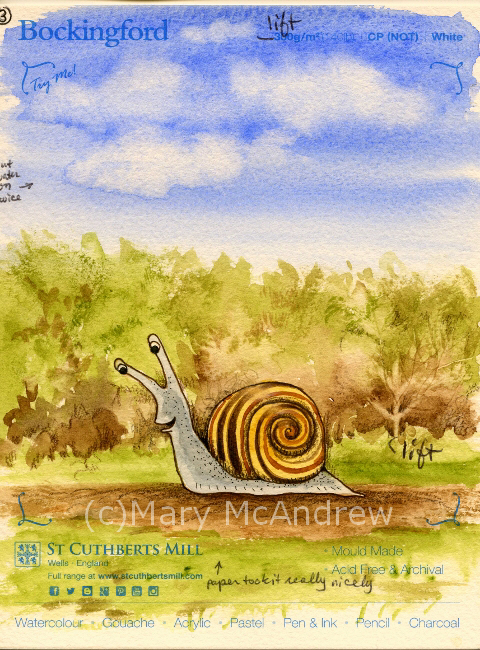
Since moving to England I’ve had to look elsewhere when it comes to buying my art supplies. Back in Clarence Center N.Y., I had lots of local choices for supplies, and I really miss being able to go look at and ‘feel’ things in person. Nothing beats feeling the spring of a brush on your hand or the roughness of a sheet of paper. Of course I ordered supplies online too, if you ordered enough it was cheaper, but it always helps to see it in person first and maybe test it out.

Where we live now there’s nothing close by, you have to drive to Newcastle for choice; so shopping online is more convenient. Last year I ordered some watercolor paper from Jackson’s (jacksonsart.com) online and was happy with the price and it came pretty quickly. I meant to write a post about my tests but alas never got the time, maybe I’ll post those simple tests later. This time around I ordered seven different papers but two I didn’t bother to test yet, they aren’t anything I would use for my illustration but I couldn’t know that until I saw them in person! I also ordered a sample pack of papers that are big enough to do tests on, I’ll include them in my next round of testing.

Here are the five I started testing:

1. Canson Moulin de Roy HP

2. St. Cuthbert’s Botanical Ultra Smooth 140

3. Royal Watercolour Society HP 140

4. Saunders Waterford HP 140 High White

5. Arches Aquarelle HP 140

The Arches is the most expensive, but it’s the one I picked from my last testing, as working best for my illustrations. I’m hoping some of these cheaper options will be just as good so I can make it my ‘go to’ paper and get really familiar with it!

When my new full size sheets of paper come they mostly measure 22″ x 30″ or 56cm x 76cm each. I then lay them out stacked up on my cutting board and figure out the best way to cut them up to get the most sheets. I’ll draw a little thumbnail on scrap paper to figure it out, then mark the watercolor paper for cutting. So I cut the sheets, leaving a big chunk uncut, and some small strips.

 (click on pictures to see larger)

Test strips and my tiny field palette.

Test strips being worked on and my tiny field palette (lid is partly closed, those aren’t my paints!).

For this post I’m just showing you the little bit of testing I’ve done so far. I have long strips from each paper on which I did small quick sketches/tests. Next I will use bigger peices and do a small study to get a feel for the paper with my inks and color pencils added.

All 5 test strips together.

All 5 test strips together.

Above shows all 5 strips laid out on my scanner, they were only 1″ to 1 1/2″ wide so you can imagine how small the bunnies and owls were! The strips are numbered L to R 5,4,3,2,1.

5 Little Owls

5 Little Owls

For the owls I did light pencil sketch then drew with Sepia Pitt “S” permanent ink pen, then watercolor on dry paper, then some color pencil last. The color pencil was brown or black and used for shading areas. They all were just great for using the ink pen and color pencil showed up on the tooth of the paper. Good so far!

5 Little Bunnies in a row.

5 Little Bunnies in a row.

It’s always good to practice bunnies! Isn’t it funny how each one looks like a different personality? For these I did a light pencil sketch then watercolor for all the color. Then I used various brown colored pencils for shading and some outlineing and at the end, a touch of black Pitt permanent ink “XS” pen. Doing the tiny washes showed me I will definitely need to do washes on larger paper to really see how it behaves. I want to see if layers lift too easily or does it get blotchy?

On the owls and bunnies I was also trying out different color pencils, my familiar Prismacolors, Derwent Coloursoft and some new Derwent “Studio” pencils. The “Studio” pencils are harder than the pencils I’m used to, so they will hold their point longer but not sure if I’ll like them yet!

Back side of test strips, dip nib testing.

Back side of test strips, dip nib testing.

On the backside of the strips I did a quick wash, let it dry then painted some Bracken leaves. When they were dry I used my dip ink nibs to try out some new inks I ordered, I’m very excited about them so far! I tested “Magic Colour – Grecian Olive” and “Vallejo – Umber”, both are acrylic permanent ink and the Magic Colour is made in England (yay! or should I say hoorah!) I did get some special empty markers that you can fill with this type of ink, but need to play around with that more. What I need to test here is, how well do my nibs work on the papers? They were all smooth enough that I cuoldn’t see much difference, next time I’ll try them on semi damp paper for bleeding.

Test of lifting and color pencils.

Test of lifting and color pencils.

For the test above I did a simple wash of green and brown then while it was damp lifted color using a clean damp brush. Repeatedly wiping and cleaning the brush and dabbing the paper with paper towel, to help lift moisture and color. Then when it was dry I used color pencil to pick out the marks. The green area was just a quick area to try lifing color after it had dried. All did ok, the St. Cuthbert’s Botanical and Canson Moulin du Roy lifted the cleanest and brightest; though this might not be a good thing when adding washes, we’ll see when I do larger studies.

(c)wc paper test strips- bunny 1 re2One Happy Bunny!

(c)wc paper test strips- owl 3 re

PS. Just wanted to mention on a more personal note, one of the reasons I did tiny strips was because I injured myself and sitting in the chair to work just kills me right now. I fell and cracked a rib or two and definitely injured the muscles in my back! But what’s so unbelieveable is that I could do that in a muddy sheep field! I was walking alone along a very old line of trees in a muddy field. I thought, I need a stick so I won’t slip so much….I broke a long stick off a big dead branch on the ground then tried to break it again with my foot on the bottom. Well it still had quite a bit of spring in it and as it resisted I slipped and the branch kind of sprung and I got thrown back against the base of this huge old tree! AY CARUMBA IT HURT! The tree had huge rounded burly roots and that’s exactly what I slammed my side into. Wish I had fallen in the mud! So once I sat up, avoided crying and took inventory of what was working, I had to get up and walk 1.25 miles home. This included climbing over two or three slippery farm gates, muddy fields and a steep road home. I guess there’s not much you can do for cracked ribs but take pain killers and I hate doing that. So I have but avoid overdoing it and now am not taking much. It’s gettiing better and you’d think, “ah, I can’t walk much but at least I can sit and work in the studio”, well no, I can’t concentrate on anything other than small stuff! So, now you’re caught up on me, don’t worry I’m pretty healthy so I should heal quickly (she says!)

I’ll try to work on more testing of these papers and update you on that as I go.

(c)wc paper test strips- bunny 3 reThis little bunny says good-bye!


Coffee Stain Moth and Arthur Rackham

Watercolor moth painted on coffee stained paper

This moth is a little watercolor painting I did on coffee stained paper (click it to see it larger and clearer). Using instant coffee to stain your paper is something I taught in my Creative Journaling class. It’s great to use lightly on your paper to make it look antique or like parchment. Here I just played with it like watercolor and brushed it around, then splattered water drops into it. Let it dry totally then you can draw or paint on top of it as I did. I have a few small sheets that I did at the same sitting, so I can grab one when I’m in the mood and use it. I lightly sketched with pencil first then just used burnt umber, burnt sienna, black and a touch of white for highlight. This was from a “Yellow Underwing” moth I photographed last year.

I have always loved the illustrations of Arthur Rackham and it’s the works he did using mostly brown colors that inspired me to work with brown tones alone. Click on any of the illustrations to see cards or gifts I created in my shop! There’s more items coming in the category Vintage Illustrations.

Flippant Fairies Floating Freely

Just look at how gorgeous this painting is!! Sigh…I love his work. (Sorry I don’t have a bigger copy to view) The background is just subtle tone, there’s a hint of tree tops below and then the sparrows come into view as they nonchalantly go about their business of preening. The branch is laid out as a perfect design element reaching across the paper and reaching up to lead your eye but not take you totally away from the subject of the fairies. Yes, those fairies, painted lighter than the rest to really make them stand out, aren’t they wonderful? Not having pointy ears, pointy eyes, pointy hair, sexy clothes and striped socks. Good God some of the awful modern day interpretations of what a fairy is is shocking! Just plain tacky and awful!

Oh but this is one of my favorites!

This is one of my favourites! SIGH….that’s how I feel when I look at work by another artist I revere. I love her dress, the attention to it’s detail but it doesn’t take over the attention of the piece, do you notice how the lower part blends into the tone of the ground and the skirt is the same as the background? It’s all married together, floating but on the same ground, do you know what I mean? Just like the tree roots coming from nowhere out of the paper and growing up into this tree that is alive. I love how he combined just enough elements that say man and tree at the same time, the fabric hanging adds a touch of color that picks up in her cheeks and it’s form adds a floating liveliness to the painting; movement. Not to mention the tenderness of the way they clasp hands….sigh.

Subtle tones means less distraction

In “The Man in the Wilderness” above, I love the way he draws his trees to be just like people, look at the ‘arms’ of the one in the background reaching up to the sky. For a child (or adult) reading the story this illustration would be something to pause over, study and discover. They’d see the obvious girl and elf and think about what they are doing but then they’d look at the trees and realize with delight they have faces and arms! Here again I like how he’s used such simple color to make this illustration, just a simple bit of red and gold on the elf to show the main subject. I can’t wait to use the card in my shop (click picture to see) as an invitation or birthday card, “Can we meet for tea?” “May your day be full of discovery”. Oh, how about a funny one for your friend…”I know you’re kind of different….but I like you all the same!” haha

The Queen floats in as if on air

This illustration shows use of line at it’s best, do you notice how in some places it’s thicker and heavy then it gets thin and light? This is very important in drawing, good drawing. This one is definitely more of a drawing than a painting, hardly any range of values used, quite flat. It’s all about the lines and what lines!, all swirling and curling, sweeping like there is a magical breeze blowing just her skirts and delicate lace veil. To give some depth and interest I like how he put the pale leaves and branches at the top then used a light similar design on her skirt in just the front.

I have wanted to do drawings and paintings starting with a freely painted base of brown or parchment colored paper for ages. The moth is my first one I guess, though I’ve done paintings before that are monochrome browns, (Autumn watercolor, Etain oil, Twilight oil) they were never started on a freely tinted paper. By that I mean a piece of paper where you just play with the color and use water drops and salt to add interest and you end up with something that in itself looks good. I’ve played with coffee staining before (as you can see on this post) but never got around to painting on them. So I’m hoping to do some more starting with small studies like this moth. Hope you enjoyed my discussion on using browns and the great Arthur Rackham! (more sighs) Oh, and I found an excellent, though old, article written about a show of his works in London in 2002 here on the “Telegraph”.

Below are a few items I designed with the Moth painting on it, please click the picture to see them in my shop. Enjoy and let me know if you’d like it on another item!

Yellow Underwing Moth card
Try these stickers out, they’re glossy and I love ’em!
Yellow Underwing Moth Sticker sticker

Below, Sterling Silver necklace!

Yellow Underwing Moth necklace

Crocus Geometer Moth

Crocus Geometer Moth full page from my sketchbook journal

In the morning when I let Ginger (my dog) out the back door for her morning wee, I always survey the screen porch to see if any visitors of the mothy type, have overstayed their visit. I used to leave the screen door open so I could be lazy and Ginger would just run right out, but stopped when too many flies were coming in! But I did get all kinds of moths in there! Well even with the door shut, some do sneak in and that’s how I found this little guy. Well sad to tell you it wasn’t alive, but laying on the floor in perfect condition. So I gently, gently picked it up and put it in my “Crisco” container for study.

Above is a full sketchpage from my journal, I did a life size study in the lower left corner and an enlarged size in the middle. I had fun with the border by just using my waterbrush with a matching color and added little ‘butterfly’ heads.

My set up when I sketched the moth

You can see in my picture that I lay the moth on the lid of the “Crisco” container and that way I was able to move it around as I worked. My watercolor pan is under it and the sketchbook is on my little table top easel box. (you can see my last page from the lady bug post!)

Drawing a study at the same size first

Now here I’m showing how nice it was to sketch the same size study by having the moth on the plastic lid. Using my pencil I did comparative measurements to compare the width to the height of the moth. Do you see those lines on the page? I put them just as a teaching tool, to show you that I found the measurement from inside wing to outside tip was the same measurement as the bottom of the wing to the top, his head I think it was. I always use comparative measurements when drawing!

Such a gorgeous colored subject!

Isn’t this a beautiful moth? His antennae were really elegant and graceful, very hard for me to paint with watercolor!  The more I studied him under a magnifying glass the more I saw and appreciated it’s beauty.

This is how my larger sketch looked at first.

(Above) Now I’ll show you the steps I took to do the large painting of this Crocus Geometer Moth, mostly how I drew it. Do you see how boring and technical it looks? I know, but if you don’t start with a clear drawing done in PROPER PROPORTION it will never look right! Sorry, I”m not shouting, but it is REALLY important! If you do anything, learn how to draw well!

So I used my pencil to compare the width of the wings tip to tip to the measurement of the moth top to bottom. I put light lines on the paper then drew an arc as close to the shape of the ‘real’ moth subject as I could. Then I decided where the wings ended in the centre, keeping in mind that they overlap.

The second stage is lightly sketching the placement of shapes, wings, body, head.

Above you see a lot more drawn here; I drew an arc lightly for the bottom wings too, then decided where the two wings met and overlapped then drew them. I found the wing tips were half way between the head (top) and bottom wing edge, can you see how there’s a little ‘t’ at the tips?; that’s centre from top to bottom.

It’s really fun when you get into a drawing and start to find things that are the same measurement so you can check other parts of your drawing by comparing them! That’s why it’s called Comparative Measurements! (This is something I teach my students first!)

Then I clean up the lines and decide how the outline will look.

Look back and forth at the subject and drawing, look for areas that might be out of line and fix it now. After you feel your measurements are right, you clean up the light lines and decide on the lines you leave. Keep your final line clean and neat. Use your kneaded rubber eraser now to dab repeatedly at the line to lighten it as much as you can, just enough so you can still see it but you can do watercolor over it and not have it show.

Laying in some washes with watercolor and adding some details.

Here I put the first washes of color on and then started to add where the dark markings are and light wing ‘ruffles’.

Larger study of the moth finished.

And here it is finished! I just kept adding the tiny spots and built up the larger dark markings. Sometimes it dries and just doesn’t look as colorful because watercolor can look lighter and duller after it dries. So I go back and add some light washes when needed to perk it up, I added bright yellow and more browns on this one. (ps. I did have trouble with the antennae! I need to practice how to do such tiny detail with watercolor!)

I’ve created some really pretty note cards and other things in my shop using this page from my journal, please have a look! Please forward my shop (or this post) to your friends to help me spread the word.

I love this tee shirt!

Two July Beetles

Two new beetle studies to share, the Milkweed Borer Beetle and the Rhubarb Curculio. Sometimes I print out 4×6″ photos of my bugs and then as I have time I can sit and do studies in my sketch journals. I’ve been working on lots of bug studies as you’ve noticed lately, but plan to work on a series of small insect paintings soon.

Milkweed Borer Beetle

I love the Milkweed Beetle because of it’s black and red coloring and nice black curved antennae. With the black legs it looks rather coordinated in a fashion sense of the word! I’ve always been partial to red and black clothes or designs!

Milkweed Borer Beetle and Rhubarb Curculio

Then just below I decided to add a little study of the Rhubarb Curculio Beetle.  I photographed it in my garden in early spring, it wasn’t ‘on’ my Rhubarb but I bet it was soon to be! I liked the rusty, powdery appearance of it and it’s unusual ‘snout’, typical of a weevil type insect.

My set up while painting

I tried to take some pictures, with my tiny camera, of some of the stages while I painted the Milkweed Beetle. I like to try and show the steps a bit because there are so many ways to approach how to do a painting.

(side note- you see on the page a bunch of dots of color, I was playing around with color mixing with my watercolor crayons and it had nothing to do with these bug paintings)

Laying green 'spots' on top of first light green layer

I missed taking a picture of the first stage but here (above) you can see that I put a very light green wash all over the leaf around the beetle first. I did this before I painted any of the bug, I used a bigger brush and just washed it on quickly but still tried to stay neat around the bug outline.

Then I started to paint the beetle; I used a water brush to wet the paper only where I was going to paint. The water brush was very handy to use instead of dipping my brush in water and wiping. I tested the red out on a piece of scrap paper then added a little at a time. The dampened paper was a nice way to keep the shading soft. Start with the overall color or the ‘background’ color first, then the darker values of red will be layered over it after it dries. I was careful not to paint red to the edges because it would ruin the 3d effect and also he had a powdery look that I wanted to imitate.

To make the leaf veined pattern, I thought I’d try just adding these little green ‘spots’ in a sort of organized pattern. By organized I mean that I would put them next to my pencil lines that indicated where a light vein would be, just arranging them along it was enough to indicate a vein.

Green 'spots' layer is finished

I’ve finished the green spots layer and you can see now how the bugs legs don’t look as dark? That’s relative to the new value of color around it and now will need to be darkened some more. That’s usually the way as you work on a detailed watercolor, it’s many layers to push things darker and bring out detail.

My set up today on an easel to give my neck relief!

Here’s a picture just showing you my set up as I worked at this stage. Before I had it flat on the table but that starts to hurt your neck after awhile, so best to prop it up somehow, this is a basic wooden paint box that you use on the table and the lid serves as an easel.  I just stick the photo to it with “Blue Tack” or “Sticky Tack” and then I put my field palette of watercolors on a small box in front of it (so it’s raised up closer).  This table easel a great little box because I keep ALL of my color pencils in it, separated by colors with rubberbands. I used to always use color pencil on my watercolors to add details at the end, but find I haven’t done that in ages!

Milkweed Borer Beetle finished and edited

I took a wet brush and gently wet the spots and rubbed very lightly to blend them a bit, then I washed some blue faintly over areas of the leaf to tone down the yellow green a bit. The picture above is of the Milkweed Borer Beetle all finished and cleaned up (the edges) on the computer so I could use it in my shop on note cards.  (if you click on it, it will take you to see Note Cards in my shop).  Now I wanted to comment here that if I was making this as a finished painting to frame and sell I would have worked on it more. I would have washed over more of the pattern here to ‘push it back’ and not make it so spotty looking, though I don’t mind it much. And the area right in front of his face I would have tidied up a bit more but that’s it for now, I consider him a good study for a better painting someday!

Here’s some more items with this painting on it:

Thanks for stopping by, leave me a comment if you like, I LOVE reading them and replying! And I hope I encouraged you to stop and look a little closer at the bugs in your garden, you may be surprised at how interesting they are! If I could encourage one more thing, it would be to get you to leave some areas of your yard go wild with local weeds and wildflowers. I have some huge Bull Thistles growing now and have discovered many interesting bugs living on them all summer. It’s like a highrise building in a city, some live at the bottom, some at the top and they climb up and down the main stem all day long! The other day I saw a Ruby Throated Hummingbird stop at the huge pink bloom of the thistle and soon the Goldfinches will be using the down from it for nesting and in fall they will eat the seeds.

There are many other ‘weeds’ growing around my yard besides the thistle, more because I have trouble keeping it neat with my neck and back giving me trouble. BUT I have also noticed new bugs almost every single time I walk around the perimeter of my yard and STOP to look. If you stop, stand still and just watch awhile, you’ll see so much. Here’s a little rhyming quote from me:

“When you stop, study and sketch, a fine image you will catch.  Study even longer, your drawing will be stronger!” Mary McAndrew

OK, go have some fun now looking for bugs! (and please get your children to look with you!)

Watercolor Lesson – Color Practice

Sometimes when you don’t feel like painting or don’t have the time to work on a painting, it can be helpful to just play with color mixing; this is also great for a beginner in watercolor (or any medium!) or if you haven’t touched them in awhile and feel rusty.

Watercolor practice mixing - pages 1+2 of sketchbook

Watercolor practice mixing - pages 1+2 of sketchbook

Here is my small field sketchbook opened up to show you my color studies. I wanted to experiment with greens and then various blues for landscape painting. It can be great fun to do this, it’s relaxing and loosens you up with the paints. I find it good practice to try to copy from life, that is the landscape right in front of you, but also from pictures of paintings you like in books.

Watercolor - practice mixing - pg 1

Watercolor - practice mixing - pg 1

I made this nice and big so you could read my notes, I abbreviate the names of my colors and put (+) plus signs where I mixed a new color in.

Watercolor practice mixing - pg 2

Watercolor practice mixing - pg 2

The blues at the bottom of this page are from looking at watercolor paintings and trying to copy the color and study how the artist (A. Heaton Cooper) made it look like water.

Having these pages in my field sketchbook is great reference when I’m in the field painting or at home in the studio, you can refer to your color notes when searching for the right color. This was a great exercise and glad to share it with you, give it a try no matter what your level of experience, remember even virtuoso violinists warm up and practice their scales everyday!

Large Snail Studies (step by step)

I’ve been studying my snail Cuthbert, and really learning a lot of interesting facts. I know they’re slimy, strange little creatures that eat your garden plants, but they still merit study in my opinion. So I went outside the strange thing was I just walked over to a huge Sycamore tree and felt directed to look right at it’s base in the long grasses, tucked between some big roots. I pulled the grass aside and there, lo and behold two snails! I must have felt the “Snail Vibes” hahah.

big snail photo

big snail photo

One of the snails was this big guy (or girl!) that has now been named “Jabba the Hut”! He’s munching on some sweet corn here. Enjoy the simple stages of painting in watercolor shown below, to give you an idea of how I paint them.

big snail stage 1- ink

big snail stage 1- ink

First I did drawings using light pencil, then go over it my micro permanent pen, keeping it simple and cartoon-like so I could add the detail with watercolor.

big snail stage 2

big snail stage 2

Then I look at the snails to see what pale color I see ‘underneath’ the other darker colors. I make a wash of this color and put it on, and while it’s wet, sometimes I drag a bit more of the wash or color into areas I want darker, with the tip of my brush.

big snail stage 3

big snail stage 3

Here you can see I’m just adding a bit more details and colors, keeping it simple. Look for dark patterns and be careful to leave light or white areas alone.

big snail stage 4

big snail stage 4

Sorry my stages kind of jumped here, I think I got busy and didn’t photograph any more stages! But all I did was kept looking for pattern, colors and shapes, let areas dry before adding new patterns so it doesn’t all blur together. If it does, take your paper towel tip and push it on the area to blot it, rub with brush tip and repeat until you get it lightened. You can add dappley marks with your brush tip for texture.

big snail stage 4 + paint

big snail stage 4 + paint

This is my sketch book along side my pan of watercolors, this is what I used to paint them.

Hope you enjoyed more snail studies!

“Blackbird Study” on May 28, 2010

Today, though it is sad, I did a watercolor study of a blackbird female that died after flying into our patio window. Just as other naturalists before me have done, I took advantage of having a real bird in front of me and did a study as quickly as I could. I find that if you love nature you can do this as a way of showing respect for the creature and not think of it as ‘gross’. Of course always be careful handling things like this by washing your hands after, putting it on plastic, not having food or drink nearby while working…just to be safe. I did notice a little tiny bug or two on it as I worked, which made me work even quicker, to get it out of the house sooner!

Watercolor study of Female Blackbird-stage 1

Watercolor study of Female Blackbird-stage 1

The picture above shows my pencil sketch and beginning stages of watercolor. I am laying in the golden color that I see ‘under’ the darker colors of the feathers.

Watercolor study of Female Blackbird-stage 2

Watercolor study of Female Blackbird-stage 2

Here I put dark tone on the tail and more darks on the head and some cool tones along the side of the breast to start to round the form.

Watercolor study of Female Blackbird-stage 3

Watercolor study of Female Blackbird-stage 3

Some more dark tones and details are laid in, feathers on ‘bottom’ wing.

Watercolor study of Female Blackbird-stage 4

Watercolor study of Female Blackbird-stage 4

At this stage I stopped painting feeling it was done, at least working from the ‘real’ model. I put a light wash of cool blue on the belly and added more color to the breast along with more details there.

Watercolor study with Blackbird

Watercolor study with Blackbird

When I stood up and looked from further back, I felt it needed a more broad wash of dark on the birds right side so I just grabbed my brush and quickly washed some tone on, while standing up. Many times I like to work on my watercolors from a standing position to keep them loose and free; if it’s a detailed painting I like to either start it while standing to have a loose feel, or at least finish it this way. I could add some loose color around the bird, but I just didn’t feel like adding to it.

My set up to add final details from computer

My set up to add final details from computer

So on another day I set up to touch up details using my photographs of the dead bird from my laptop. I used my field pan of watercolors and brushes and a magnifying glass to help me see details.

Dead Blackbird - stage 6

Watercolor study of female Blackbird - stage 6

At this point I decided it was finished. To be honest, I wanted to go back and ‘scratch’ out highlights along the legs to show their shine and make them stand out from the dark background, I also wanted to add grasses around the bird, but I’ve had too many other things to work on and just didn’t get time. So it’s DONE.

Blackbird male

Blackbird male

I don’t want to leave you with a dead Blackbird, here’s two photos of a healthy male so you can see how nice they look, their song is even nicer!

Blackbird male

Blackbird male

As a side note, the Blackbird (UK) is in the Thrush family just as my American Robin is. For my American readers you’ll notice a very close silhouette to our Robin, and the song, though different is beautiful as thrush songs are.  The male Blackbird is ‘black’ with a yellow beak, the female looks, well like my painting, brown with speckles on breast.

Groundhog (Woodchuck) Painting Commission 1-12-10

Groundhog

"Groundhog" finished

This watercolor was commissioned by a lady for her husband’s 80th birthday! He loves groundhogs (just like me) and she really liked the groundhogs I had sketched on my blog this past summer, so she asked me to do a painting.  Here’s the finished painting and below it I’ll share the stages of painting as I worked on it, along with how I changed or corrected areas as I went.

my set up 1

Above is my set up, an artists’ table easel box type thing that you can put oils  paints in underneath, I have it filled with color pencils at the moment. I like it because you can change the angle to work on, I altered it though by drilling holes right up the front panel so I can change the height of the little shelf that you put your painting on while you work. (Yes, I love using my power drill!)

my watercolor pan palette

my watercolor pan palette

When I work on little watercolors, I like to keep my palette of colors close to the work. The paint dries out quickly in the tiny brushes so it helps to have it all close by. I set my pan of colors on a little wooden box and I can keep other supplies in here instead of all over my table. This pan is also what I use in the field, I have so many colors in it, I really don’t need to set up my big huge palette that I use in my studio for big paintings. When I worked on the painting, I had several pictures of groundhogs to the left of it for my reference, I used sticky tack (blue tack) to hold things in place on the Plexiglas surface.

my set up 2

I really created this set up because I wanted to work where the wood stove was, right in the middle of my living room.  You can see the cold snow outside my window! So it’s like my little studio island, a plastic table 4′ x 2′, complete with laptop, small lamp, bundles of color pencils and some other piles of ‘stuff’. (ahmm…there’s a dark chocolate bar hidden in the box too, well you know, gotta keep the ‘ol strength up!)

groundhog 1

groundhog 1

This is the first stage of the painting, a light pencil sketch that I lighten first by tapping over it with a kneaded rubber eraser. Before I started I decided to make this a 5 x 7″ painting to fit a standard mat, so I lightly trace the inside of an 8 x 10 mat (5 x 7″ opening).  Then I wash in a simple background of trees and start to place the long grasses and dandelions I want around this plump little groundhog.

groundhog 2 blocking shape

groundhog 2 blocking shape

I like to try to keep some spontaneity in my paintings especially in the backgrounds. Here’s a little trick you can try to keep it loose while protecting areas; I grab a piece of paper or plastic to block or protect an area. This piece was just the right curve for his back, when it’s covered I can very freely stroke my brush right over the area with out it looking contrived and stiff.

groundhog 3 blocking shape

groundhog 3 blocking shape

You can see above the protected area of his back.

groundhog 4

groundhog 4

In “groundhog 4” I have laid in some light body washes and beginning some fur areas, starting on the darker areas first. Notice I have left a light ‘cut out’ looking edge to him, this is so I can go back later and stroke color into it to make it look like fur, but also he’ll stand out a bit from the background.  I also started to push the darks around the grass blades in the front left.

groundhog 5

groundhog 5

In “groundhog 5” you can see I darkened around the dandelions, added some grasses in front and also added some more tone and fur strokes on his body. Keep looking for the dark and light areas of his body; sometimes you show this by adding strokes or by adding whole washes to an area. If you look at his tail here I want to point out that I didn’t just paint in a tail shape, I put dark bits around where the grass went over it and it looks much more natural.

groundhog 6

groundhog 6

In “groundhog 6” you can see I have put a light wash of green in the background, then washes of brown in the foreground.  I then added more grasses and darks around the dandelions, foreground and his body. I developed the arm and shoulder area more now, also added more to the head.

groundhog 7

groundhog 7

I developed the grasses around him in “groundhog 7”, pushing the darks in places.

Now I’ll show you some close up pictures of parts of the painting as I did corrections. I find it interesting to look back on how I changed things and I know my readers really like to see this, you can learn a lot by looking at how another painter reworks things to correct them.

correcting the back 1

When I painted more of the grasses in I was able to see his back silhouette better; I then realized that it looked too straight. So I gently re-wet the area along the edge (above) and rubbed a bit with my brush to lift the color then I blotted it with a clean paper towel. I repeat this as many times as nessesary to lift what I need to, you can’t always lift everything though!! Take care also not to lift other areas.

correcting the back 2

correcting the back 2

To reshape the back I carefully put down the dark green grass colors further out from the original back line. (above) Then you have to soften where needed so it all looks ‘right’ together.

Below I show a close up of an area that when I thought I had finished the painting, I looked back and decided to fix. That blade of grass pointing at his head looked ok in the beginning when it was lighter, but now was too strong.

blades of grass 1

blades of grass 1

Below is the area that I changed.

blades of grass final

Here’s some close ups of the head as I changed it. The mouth I found difficult to do, it was a give and take between showing details and sort of softening them, but then that’s the essence of painting! Notice the careful biulding of darks on the head to shape it’s 3 Dimensional feel, the changing of the black area of the mouth and the developing of the dark area under the jaw.

Head close up #1

Head close up #2

Head close up #3

#4 Final head close up

I ended up going over the entire head at the end and added darks here and there…sculpting until it looked just right.

Once again here is the painting finished and ready for it’s new owner!

Groundhog

"Groundhog" finished

The original is sold but  SHOP for gifts, note cards, prints, t-shirts etc with this image on it in my Zazzle shop! Go to www.zazzle.com/marymcandrew* This will take you to my shop where my artwork and designs are listed, go to the Small Mammals folder to find the groundhog designs or just type Groundhog into the search box. You can add your own text to customize gifts! If you want it on something you don’t see, just email me to ask!

Miniature Great Grey Owl Painting 6-5-09

"Great Grey Owl"

"Great Grey Owl"

My finished miniature watercolor painting of a Great Grey Owl, measuring a mere 2″x2″!  Be sure to check it out in my Owl Gallery too. It’s an owl named “Aspen” that I photographed at the Keilder Water Bird of Prey Centre in Northumberland England. I’ll show you the stages of painting and talk about how I did it below.

"Great Grey Owl" -first washes

"Great Grey Owl" -first washes

This shows the first stages of painting, the beginning washes to lay down the values, color hue and expression of the painting. I first started with a light sketch in pencil, lifting it as much as I could with a kneaded rubber eraser before painting.  Then I painted the washes and sprinkled salt on wet areas to see how it would ‘pull’ the color and create interesting patterns. It is at this stage of the painting that you can get a feel for how the painting will go, will you be loose and expressive? Will you go for more details? Sometimes I think we have to let our intuition guide us, or perhaps our mood.

First wash set up

First wash set up

This picture shows you my set up for the first washes, I always start flat on the table so the color doesn’t run. Many times on larger paintings I stand up and work loosely with my brush. (check out this short Utube video of me working on the “Screech Owl” painting, it shows how I paint loosely when standing). This set up shows my photo reference to the left, the salt above that, then my field palette to the right because I’m right handed, the water bowl above that. I keep a white paper towel folded nearby for wiping off excess water and it allows me to see if there’s paint left on my brush. You see my magnifying lamp which I find good because the light is cool and matches daylight; but I don’t use the magnifier on it as I find it clumsy to use my brushes under it and I bump into all the time when I lean in super close! Sometimes I use a hand held magnifying glass or you’ll see pictures later of my glasses.

Great Grey Owl -stage 3

Great Grey Owl -stage 3

Now here in stage 3 you see I’ve jumped ahead with lots of details and color. As you work, squint your eyes at the photo and your painting to catch large areas of value that need to be developed and notice color hues. At one point I felt my owl was too brown so I washed a very watered down blue grey over areas, but only on very dry areas. In areas you need to lighten you can either lift color with a damp brush and blot with a paper towel, or you can add it using white watercolor or gauche mixed with your paint colors.

Now on purpose I’m going to point out some things that I found to be unsatisfactory in my painting and I changed. At stage 3 here, I felt like I did a pretty nice painting! I was feeling like it was done, ah….no such luck. If you let it sit a day or two and return to it, or if you show it with the photo reference to a friend with a sharp eye, they’ll be sure to catch something ‘off’ with it.  If you’re a conscientious artist, you’ll be bothered by it until you fix it and you probably already knew it was wrong to begin with but wanted to ignore it!   Well lets just say my boyfriend has a good eye, sigh, well now he ‘did’ pick me didn’t he?  We both agreed the beak wasn’t right, I pointed it out to him then when he agreed it was back to the easel with it. I can’t believe how much I was able to amend the beak being that this is watercolor after all. People are afraid of watercolor because they think it’s unforgiving, wait until you see the changes I made.

Great Grey Owl -stage 4

Great Grey Owl -stage 4

Stage 4 shows the beak changed, I totally moved the angle of it and lengthened it! (see the enlargements below of these final stages too) If you take a damp brush and gently re-wet an area, and only the area you want to fix, you can then repeatedly rub it gently with a damp brush tip, blot it with a clean paper towel (I prefer Viva!) then clean your brush, wipe it off and repeat. Do this over and over, you’ll be amazed at how much you can lift. When I repainted the beak I thought like an oil painter, I laid down a more opaque yellow layer to clean and brighten the beak, then I kept putting washes over this dry layer to affect the color. It ended up with an unusual translucent look like a real beak would have.

As I did this, of course I started to notice other areas I wanted to improve upon. Sigh…such is the plight of an artist with a picky eye! Notice the area of light tan below his beak, I needed to bring out the lightness of it so I added white watercolor to some cad.yellow, and browns to create a tint for an underlayer. Another note about this painting, next time I will pick a much smoother paper, working with this much detail you need to keep your paper super smooth with no distracting texture.

Great Grey Owl -stage 5

Great Grey Owl -stage 5

Stage 5 shows how I painted detail on top of the tan area under the beak and the beak has more details added. The owl has an overall lighter look, this is because I kept stroking on little feathers with a tint of whitish blue grey to add detail. Now I thought I was done here, but remember that boyfriend of mine with the good eye? Well he helped me notice I had painted out the nostril! SIGH….yes, when I was adding the little hairs by the beak I must have done that so back to the easel. The picture at the beginning of the post is the final stage, fixed and finished!

Working with my magnifying glasses

Working with my magnifying glasses

This is me working with my reading glasses on and a little set of clip on magnifier lenses. In the photo I have the magnifying lenses lifted up so I can look at the paints in front of me, if they were down I’d need to get much closer to see what I was doing. So I would lift the lenses up when I would sit back a bit and take a look at the ‘whole’ painting and the photo, looking for areas that need attention. Then I’d flip them back down and get close for the detail painting. I wouldn’t use them for the initial stages of painting, you don’t want to focus on details at that point.

Also you notice here my setup is different than before, I have another pan of watercolors and have them set up on some jars so they are closer to my painting. Working with a tiny brush ( 10/0 liner) it dries out super fast and keeping my pallet nearer seemed to help. The nice thing about working on a miniature painting was being able to mix small amounts of color right in the pan lid. (the brush in the picture is not my liner brush)

The pictures below are so you can look at one section close up to see the changes I made to the beak and area around it.

Great Grey Owl close up detail stage 3

Great Grey Owl close up detail stage 3

Great Grey Owl close up detail stage 4

Great Grey Owl close up detail stage 4

Great Grey Owl close up detail stage 5

Great Grey Owl close up detail stage 5

Great Grey Owl -close up detail finished

Great Grey Owl -close up detail finished

I hope you’ve enjoyed my post about my painting. I looked forward to showing you my mistakes and how I fixed things as I painted because this is how it goes, it’s a process and doesn’t always go as easy as it looks. I like to encourage my students and others to keep looking at their paintings for more detail but most of all a good beginning drawing is crucial. As you can see here, I missed the beak angle and had to fix it later, but the more you paint and draw the better you’ll be at catching these things in your work. That’s my two cents!  Please leave me some comments and if you are interested in note card or prints please let me know.

For the fun of it, here’s some Utube links with owls!

http://www.youtube.com/watch?v=HErZ6Xp8CcQ&NR=1

http://www.youtube.com/watch?v=gKH_IQr1hAI&NR=1

http://www.youtube.com/watch?v=x_-dkr2AOhY&feature=related

This next one is Excellent! Great footage of a Great Grey Owl!

http://www.youtube.com/watch?v=ekrfclBAjEY