Support This Site

If you like what I do please support me on Ko-fi

Sketching Grass on a Snowy Day

We had about two inches of snow last night, everything is covered in a soft white blanket. All our flowers that were finally coming up are now covered but at least the daffodils haven’t bloomed yet.

Above is the Hawthorn I painted not long ago, and I’ll be putting a post up about that soon. I’m following fox tracks in the snow and they led here, then it jumped up on the wall and walked behind the tree! I love following tracks in snow to see what story it tells, guessing at what happened in the night.

The tracks led here also, where a fox jumped and hopefully got a vole! I did a Youtube video talking about it and will link it at the end. The grass clump above is what I decided to draw.

Here’s my little field watercolor palette, holding it in one hand with my fat mittens on!

It’s hard to take pictures while holding things!

I was trying to show how I hold the sketchbook against me and the palette, both in the same hand. I used to have a small hard panel that I would clip them to, I’ll have to revisit that idea! Kind of like a clipboard but skinnier.

Here’s my field kit I used today, it’s a small one. I stepped into the wood shed a minute so I could put things down to take a picture and video tape.

“Grasses in the Snow”, watercolor and ink

My finished little study, I like how it came out. I put together a short Youtube video about doing this sketch and I show my field kit. Find it RIGHT HERE, give me a like and leave a comment if you can!

I’ll be sharing another post soon, about the Hawthorn tree and Mossy Wall, with lots of stages of painting to see. I’m also saving my pennies (pence?) to buy a new printer so I can get back to offering prints and note cards, stay tuned!!

Stone Wall Studies in Gouache

(Please click on photos to see enlarged, click again for larger view.)

Blocking in base colors.

For these two new little studies I’m working from photos I took this Autumn of a wall in our back garden. Instead of braving the elements right now, I’m painting in the sitting room with a wood fire going! I’m still a bit new to gouache but the more I use it the more I like it. Above you see I start by blocking in colors and shapes of areas with not much added detail.

Getting those darks laid in there.

If there is a dark area like under plants or in crevices, put them in early. This way you can paint lighter details on top and they will really show up. The rocks in the foreground had a violet coloring, that was fun to put in and see if it worked.

Adding the moss on top of the rocks.

After getting the rock colors right I dabbed on greens for moss, leaving the lightest values to use last. I used a very rough dry brush to dab paint on that wasn’t very wet. After it’s all dry I added the tiny wisps of dry grass over areas. I was also trying to use different brush strokes and dabs to create the fern fronds.

Working on my studies in my little cigar box pochade, with gouache paints and palette.

The picture above shows I’m using my very small cigar box plein air kit that I’ve created to use as a pochade box. I’ve tried to make it small and very lightweight so I can carry it in a backpack. It has a mount attached to the bottom that clips onto a tripod. But indoors I just set it on the table and use it to see how everything fits and if there was anything I could leave out.

What I want to point out is the bright blueish purple blotch and the blue one next to that at the right side of the paper. They were blotches from when I was just messing around with the gouache. I took a very wet brush and repeatedly wet, scumbled and lifted color with paper towel to remove the color as much as I could. It was stained into the paper so I decided to just work on top of it.

Painting on top of purple and blue stained paper.

When I looked at my reference photo, the stones had a cool cast to them so I thought I’d give it a go. I first lightly sketched the rocks in using a small brush to make the crevices between the rocks. You can clearly see the purple and blue colors in the paper! I started to dabble on the moss and the yellow color in some rocks.

Adding darks at base of wall, then leaves.

Then, at the base of the wall, I put dark burnt umber and sepia brown as a background. Then when you paint leaves and stems on top, they show up nicely. But this is the tricky part for me still, trying to have opacity and rich color but light enough to show up on the dark colors.

Here’s a better view of my little cigar box set up. The study is quite small but I’m very happy with how it came out. You can also see the two little studies I did last summer by our stone barn. (When you click the picture below you’ll see them much better.) I experimented by approaching them in different ways. The left one I put down black brown background and then painted the stones on top. The right one I first painted a dirty yellow ochre color (more of the stone color) then painted the crevices of the rocks. Then I added different colors of rocks on top. I definitely think some more studies of the barn walls would be a great idea!

I’m finding the gouache colors, chroma and values really lend themselves to woodland, mossy rocks, trees and muted color scenes. So many times I’ve seen gouache paintings that are all bright colors and scenes, but right now I’m attracted to their softer look. I have started using them with some of the children’s book style paintings I’m doing and that’s really different for me. This is still a new medium for me so there’s lots to try out and discover!

I’ve already completed two gouache paintings since doing these studies, and I’m very happy with how they came out! One is from a photo I took of an old Beech tree along a favorite walk we had in Northumberland. The other is a photo right from my back garden here in the Scottish Borders, an old Hawthorn tree and mossy wall in winter. Those will be shared in posts coming up.

Thank you for stopping by to read about my painting adventures and to those who have been following me, thanks for being patient as I know my posts are very sporadic! I AM working very hard and always have some projects on the go. I’m looking into buying a good printer so I can produce prints as I used to before I moved to the UK. Then I can offer my new works and old, and get my website organized for that. Always something to work on isn’t there?!

You can see current photos I share while I’m working on paintings, on my Facebook page “Mary McAndrew Painting and Illustration” and on Instagram as “mary_mcandrew_artist”. Follow me there to see the up to date goings on and some photos of the views I see around me here in the Borders.

Watercolor Paper Testing – Part 2

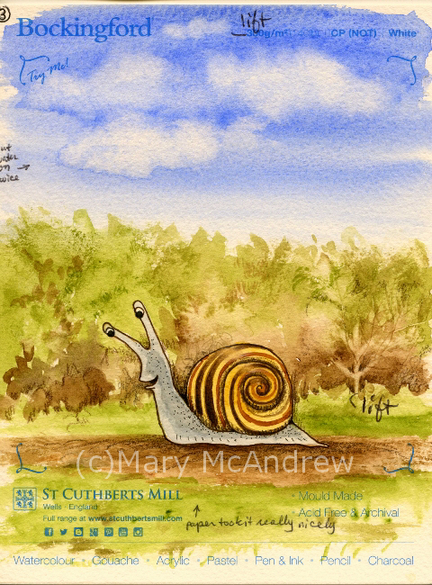
Hello and welcome back for Watercolor Paper Testing – Part 2! My last post I had done some small tests to get started, and explained about the fall I had. Well I’m pretty much healed from that and getting back on track.

Hello there!

Hello there!

First I want to say, if you just go by what I say worked for me, it might help you decide on a paper you’d like to use, BUT WAIT! I highly recommend doing some testing of your own, you can follow my example or try new things on your own. I made a list of the techniques I was most likely to use and then did a simple, similar picture on all of them. I used 11 different papers, all ordered from Jackson’s Art Supply, my test sizes varied from about 5″x6″ to 3″x 6″, so they were small. It took me several days, of sitting down when I could, to work on each test criteria.

1.First label all your test peices of paper with what the paper is, the weight, type etc. One nice thing I ordered was the St. Cuthbert’s Mill sample pack of seven different papers; it only cost .50p and the peices were large enough to really play around with. Each of them was fully labeled too.

2.Make a list of the techniques you want to test on notebook paper; I will include my criteria list below. I decided to do one character (snail) on each and a simple dirt path, green bushy background and a sky with clouds. The sky allowed me to do a big simple graded wash, drop water in for clouds, and test by lifting with clean wet brush.

Clouds

Clouds

3.Do one technique at a time on each one in succession. This way you’ve got the same colors mixed, and can use the same brushes to compare how they go on each paper. Write down what you thought after each thing you test or you’ll forget. I did this on note paper then after I was all done I wrote them down on the back of each paper test. So years from now you can dig around and find them you’ll know what’s what.

OK, here’s my list of criteria I tested:  (all done on dry, unstretched paper)

  1. Can you trace through the paper using a black ink line drawing underneath? I traced different snails on each one.
  2. Does pencil erase easily?
  3. Wash layers- do they stay or lift too easy when new layers go on? Tested in bush areas, ground and sky (I wet paper with a brush first for this one).
  4. Lifting- do dry watercolors lift off when you rub/lift using damp brush and paper towel? On each I lifted a tree shape, like “stems” in the green bushes. Then on most I also lifted some of the dry blue sky.
  5. Dry brush technique. Mostly the bushes and some ground areas on each.
  6. Draw with dip nib and ink. I drew each snail with dip ink and nib, going over the pencil lines I traced.
  7. Scratch wet paint areas to see if dark lines appear. You’ll see some thin lines of color in the bushes, these were made by scratching into the wet paper where paint was laid down.
  8. Color pencil on dry watercolor areas, how do they go on? I mostly did this in the bushes around the snail, some on the ground using dark browns.
  9. Permanent ink pen, ease of drawing on paper? Used to outline each snail and some details on the ground.
  10. Clouds on damp blue sky, drop clear water on and some lifting with paper towel.
  11. In general how does paper take the paint?
  12. (other things you may want to test that I did not: using masking fluid, scraping off dry layers of paper with sharp knife, dropping salt on wet paint, whatever you may usually do when painting)

Please click each picture to see it enlarged.

Testing ability to trace through the paper from my drawing.

Testing ability to trace through the paper from my drawing.

This is my simple set up for tracing I used on this project, (sorry for the dark picture) it’s a clear plastic flat “scrapbooking” type container. I like using these containers to hold my illustrations and lately have been using one as an easel/drawing table. I put a peice of rubber shelf liner underneath it, and can tuck reference photos and drawing stuff inside. I hold the top up with different sizes of masonite or plexiglas depending on the angle I want; here I used plexiglas so it lets more light through. I put a strong little lamp behind it on the table and set my drawing that I’ve inked in black on top. Next you lay your watercolor paper on top and trace! *Note- I taped a carpenters pencil along the bottom to keep papers and boards from sliding off, it works pretty good for now. *Note 2- you can also trace using a bright window; tape your inked drawing up and then your watercolor paper on top. Use light pencil lines, don’t score into the paper, you’ll want to erase most of your lines anyways so draw light!

Now I’ll post pictures of each sample and tell what paper it was along with what I thought about it. Prices listed were at the time I bought them. Click on pictures to see larger.

Beginning sample for watercolor paper test.

Beginning sample for watercolor paper test.

This sample has no number because it’s a scrap peice of watercolor paper I grabbed and for each technique I gave it a go on here 1st as a warm up! If you’re worried about messing up your paper don’t be afraid to loosen up on some scraps first! this helped me to think of what techniques I wanted to try.

#1 St. Cuthbert's Mill, Millford, 140lb, CP (NOT) White

#1 St. Cuthbert’s Mill, Millford, 140lb, CP (NOT) White

#1 St. Cuthbert’s Mill, Millford, 140lb, CP (NOT) White. 22″x30″ sheet = £ 4.10, 9″x12″ cut peice = .82p. (all papers with blue type on them are from the St. Cuthbert’s Mill sample pack) 1. Traced through well enough, a bit rough. 2. Erases well. 3. Washes went on great, no hard edges. 4. Lifting dry color- this paper worked well. You can see the little ‘tree’ stem area in the green bushes, that was done by lifting, and at the top in the sky.  5. Dry brush was good, rough areas in bushes. 6. Ink and Nib- went on well, a bit rough but good. 7. Scratch test-worked but wasn’t very strong, may need to try more. 8. Color pencil- great, bit of texture. 9. Permanent ink pen- ok, a bit rough for long drawn curved lines (snail shell). 10. Clouds- worked well, soft edges. 11. Paper took the paint really well, nice texture on ground edges, blue sky washes even.

#2 St. Cuthbert's Mill, Bockingford, 140lb, HP White

#2 St. Cuthbert’s Mill, Bockingford, 140lb, HP White

#2 St. Cuthbert’s Mill, Bockingford, 140lb, HP White. 22″x30″ sheet = £ 2.10, 9″x12″ cut peice = .42p. 1. Traced through very well, smooth. 2. Erases well. 3. Washes- went on blotchy or patchy, layers hard edged. 4. Lifting dry color- worked well, see ‘tree’ shape and tiny cloud at top. 5. Dry brush-ok, not bad but a bit blah because of paper smoothness. 6. Ink and Nib- went on well, smooth. 7. Scratch test- worked. 8. Color pencil-good. 9. Permanent ink pen- very easy to draw with, smooth. 10. Clouds-Interesting, with water dropped in it formed harder dark edges, which I could have softened with lifting, but it was neat.  11. Was harder to float washes, paint colors got patchy.

#3 St. Cuthbert's Mill, Bockingford, 140lb, CP (NOT) White

#3 St. Cuthbert’s Mill, Bockingford, 140lb, CP (NOT) White

#3 St. Cuthbert’s Mill, Bockingford, 140lb, CP (NOT) White. 22″x30″ sheet = £ 2.10, 9″x12″ cut peice = .42p. 1. Traces well, tiny bit rough. 2. Erases easy. 3. Washes- great, easy to add water to. 4. Lifting dry color- did well. 5. Dry brush- worked really well. 6. Ink and Nib- worked ok, tiny bit rough. 7. Scratch test- worked ok. 8. Color pencil-good. 9. Permanent ink pen- good, a bit bumpy for drawing. 10. Clouds-excellent! Soft edges were perfect and harder edges on bottom edges looked good. 11. Paper took paint nicely.

#4 St. Cuthbert's Mill, Bockingford, 140lb, Rough White

#4 St. Cuthbert’s Mill, Bockingford, 140lb, Rough White

#4 St. Cuthbert’s Mill, Bockingford, 140lb, Rough White 22″x30″ sheet = £ 2.10, 9″x12″ cut peice = .42p. 1. Traced through well enough, a bit rough. 2. Erases well. 3. Washes- layered well. 4. Lifting dry color- worked rather well.  5. Dry brush- pretty good, rough areas in bushes and ground. 6. Ink and Nib- worked ok, a bit rough. 7. Scratch test-worked, a bit pale. 8. Color pencil- not as good, a bit too rough for me. 9. Permanent ink pen- well, a bit rough. 10. Clouds- worked well, wash went on nice, made clouds really well. 11. Paper took the paint really well, nice textures too.

#5 St. Cuthbert's Mill, Saunders Waterford, 140lb, HP High White

#5 St. Cuthbert’s Mill, Saunders Waterford, 140lb, HP High White

#5 St. Cuthbert’s Mill, Saunders Waterford, 140lb, HP High White 22″x30″ sheet = £ 3.60, 9″x12″ cut peice = .72p. 1. Traced through well. 2. Erases well. 3. Washes- went on nicely. 4. Lifting dry color- ok, not as easy as others, lifting small patch on blue sky was bad.  5. Dry brush- worked great, rough areas above bushes. 6. Ink and Nib- worked ok, a bit bleedy. 7. Scratch test-worked really well. 8. Color pencil- worked well easy to draw on to paper. 9. Permanent ink pen- great. 10. Clouds- worked well, I put clouds on with a bit too much water. 11. Paper took the paint well.

#6 St. Cuthbert's Mill, Saunders Waterford, 140lb, CP (NOT) White

#6 St. Cuthbert’s Mill, Saunders Waterford, 140lb, CP (NOT) White

#6 St. Cuthbert’s Mill, Saunders Waterford, 140lb, CP (NOT) White 22″x30″ sheet = £ 3.60, 9″x12″ cut peice = .72p. 1. Trace through-a bit rough, not as thin, can trace but not as easy. 2. Erases well. 3. Washes- went on really well. 4. Lifting dry color- not so good, soft edges.  5. Dry brush- worked great, rough areas in bushes and ground. 6. Ink and Nib- worked ok, not too bad. 7. Scratch test-worked ok. 8. Color pencil- worked well, especially for rough textures. 9. Permanent ink pen- very well. 10. Clouds- worked well, nice and soft, blue wash went on really well. 11. Paper took the paint really well.

#7 St. Cuthbert's Mill, Saunders Waterford, 140lb, Rough White

#7 St. Cuthbert’s Mill, Saunders Waterford, 140lb, Rough White

#7 St. Cuthbert’s Mill, Saunders Waterford, 140lb, Rough White 22″x30″ sheet = £ 3.60, 9″x12″ cut peice = .72p.  1. Traces through well-a bit rough. 2. Erases well. 3. Washes- very good. 4. Lifting dry color- worked well but not with sky color.  5. Dry brush- worked great, rough areas in bushes and ground. 6. Ink and Nib- worked ok, a bit rough. 7. Scratch test-worked ok. 8. Color pencil- worked well, especially for rough textures. 9. Permanent ink pen- well but can be bumpy. 10. Clouds- blue wash went on well, clouds did really well. 11. Paper took the paint really well.

#8 Canson, Moulin du Roy, HP

#8 Canson, Moulin du Roy, HP

#8 Canson, Moulin du Roy, HP 22″x30″ sheet = £ 3.10, 9″x12″ cut peice = .62p. 1. Traces through really well, feels thinner. 2. Erases well. 3. Washes- beaded up a lot, wouldn’t go on in some areas! 4. Lifting dry color- worked very well, even on the sky patch.  5. Dry brush- worked ok to good. 6. Ink and Nib- draws well. 7. Scratch test-not great. 8. Color pencil- worked well. 9. Permanent ink pen- nice, easy to draw. 10. Clouds- worked well, don’t get too wet, it gets blotchy. Paper towel lifts easily because color doesn’t soak in too fast. 11. Paint beaded up at first then was ok.

#9 St. Cuthbert's Botanical Ultra Smooth, 140lb

#9 St. Cuthbert’s Botanical Ultra Smooth, 140lb

#9 St. Cuthbert’s Botanical Ultra Smooth, 140lb full sheet = £ 2.20 (slightly smaller than the others), 9″x12″ cut peice = .55p. 1. Traces through really well, smooth. 2. Erases well. 3. Washes- a bit patchy in areas. 4. Lifting dry color- worked well.  5. Dry brush- worked well. 6. Ink and Nib- ok, a bit bleedy. 7. Scratch test-ok to pretty good. 8. Color pencil- worked very well. 9. Permanent ink pen- nice, easy to draw. 10. Clouds- worked well, color lifted well, clouds a bit hard edged. 11. Paper takes paint ok to well.

#10 Royal Botanical Society 140lb, HP

#10 Royal Botanical Society 140lb, HP

#10 Royal Botanical Society 140lb, HP 22″x30″ sheet = £ 4.70, 9″x12″ cut peice = .94p.  1. Traces through well, smooth. 2. Erases well. 3. Washes- went on nice. 4. Lifting dry color- worked well, a bit pale on sky patch.  5. Dry brush- worked well. 6. Ink and Nib- works fine. 7. Scratch test-worked well. 8. Color pencil- worked well. 9. Permanent ink pen- great, easy to draw. 10. Clouds- blue color went on nice, clouds went on very well. 11. Paper takes paint very well.

#11 Arches Aquarelle, 140lb, HP

#11 Arches Aquarelle, 140lb, HP

#11 Arches Aquarelle, 140lb, HP 22″x30″ sheet = £ 5.40, 9″x12″ cut peice = £ 1.08. 1. Traces through very well, smooth. 2. Erases well. 3. Washes- went on well. 4. Lifting dry color- worked really well.  5. Dry brush- worked well. 6. Ink and Nib- worked ok to good. 7. Scratch test-worked well. 8. Color pencil- worked very well. 9. Permanent ink pen- very good, easy to draw. 10. Clouds- blue wash went on well, clouds lifted with brush and paper towel. 11. Paper takes paint nicely.

That was the last one! Whew! You can see this kept me busy for awhile. A few of the papers didn’t take the paint nicely at first, they beaded up or skipped areas. For those papers I think I would try wetting the paper first and stretch it, then see how they act. Or just take a larger peice and really wet it then play around on it. After I did the tests I wrote the price per full sheet on the backside, then figured out how much one cut 9″ x 12″ peice would be, depending on how many you could get out of a full sheet.

So what’s my verdict you’re wondering? I have to admit it’s still hard to say! For the price and how they performed for me, I have four I want to explore further.

  • Saunder’s Waterford HP High White- seems to work well, price moderate but a bit more than the others I liked.
  • Bockingford CP (NOT) white- worked well, rougher than what I’m used to, very affordable
  • St. Cuthbert’s Botanical Ultra Smooth- love the smoothness, low price, worked well but sometimes patchy, need further testing.
  • Moulin du Roy- I want to test some more, because it beaded up, but I like the feel of it and the price.

On the ones I liked I draw a little star and fill it in with really bright golden yellow, so it’s easy to spot when I’m digging in my folders.

PLEASE DO leave some comments about the paper you use and why you like it!! It would be great for everyone to share some ideas and papers that work for them here.

Happy Spring everyone, springtime posts coming soon!

Happy Spring from our village in Northumberland, England!

Happy Spring from our village in Northumberland, England!

Watercolor Paper Testing

Since moving to England I’ve had to look elsewhere when it comes to buying my art supplies. Back in Clarence Center N.Y., I had lots of local choices for supplies, and I really miss being able to go look at and ‘feel’ things in person. Nothing beats feeling the spring of a brush on your hand or the roughness of a sheet of paper. Of course I ordered supplies online too, if you ordered enough it was cheaper, but it always helps to see it in person first and maybe test it out.

Where we live now there’s nothing close by, you have to drive to Newcastle for choice; so shopping online is more convenient. Last year I ordered some watercolor paper from Jackson’s (jacksonsart.com) online and was happy with the price and it came pretty quickly. I meant to write a post about my tests but alas never got the time, maybe I’ll post those simple tests later. This time around I ordered seven different papers but two I didn’t bother to test yet, they aren’t anything I would use for my illustration but I couldn’t know that until I saw them in person! I also ordered a sample pack of papers that are big enough to do tests on, I’ll include them in my next round of testing.

Here are the five I started testing:

1. Canson Moulin de Roy HP

2. St. Cuthbert’s Botanical Ultra Smooth 140

3. Royal Watercolour Society HP 140

4. Saunders Waterford HP 140 High White

5. Arches Aquarelle HP 140

The Arches is the most expensive, but it’s the one I picked from my last testing, as working best for my illustrations. I’m hoping some of these cheaper options will be just as good so I can make it my ‘go to’ paper and get really familiar with it!

When my new full size sheets of paper come they mostly measure 22″ x 30″ or 56cm x 76cm each. I then lay them out stacked up on my cutting board and figure out the best way to cut them up to get the most sheets. I’ll draw a little thumbnail on scrap paper to figure it out, then mark the watercolor paper for cutting. So I cut the sheets, leaving a big chunk uncut, and some small strips.

 (click on pictures to see larger)

Test strips and my tiny field palette.

Test strips being worked on and my tiny field palette (lid is partly closed, those aren’t my paints!).

For this post I’m just showing you the little bit of testing I’ve done so far. I have long strips from each paper on which I did small quick sketches/tests. Next I will use bigger peices and do a small study to get a feel for the paper with my inks and color pencils added.

All 5 test strips together.

All 5 test strips together.

Above shows all 5 strips laid out on my scanner, they were only 1″ to 1 1/2″ wide so you can imagine how small the bunnies and owls were! The strips are numbered L to R 5,4,3,2,1.

5 Little Owls

5 Little Owls

For the owls I did light pencil sketch then drew with Sepia Pitt “S” permanent ink pen, then watercolor on dry paper, then some color pencil last. The color pencil was brown or black and used for shading areas. They all were just great for using the ink pen and color pencil showed up on the tooth of the paper. Good so far!

5 Little Bunnies in a row.

5 Little Bunnies in a row.

It’s always good to practice bunnies! Isn’t it funny how each one looks like a different personality? For these I did a light pencil sketch then watercolor for all the color. Then I used various brown colored pencils for shading and some outlineing and at the end, a touch of black Pitt permanent ink “XS” pen. Doing the tiny washes showed me I will definitely need to do washes on larger paper to really see how it behaves. I want to see if layers lift too easily or does it get blotchy?

On the owls and bunnies I was also trying out different color pencils, my familiar Prismacolors, Derwent Coloursoft and some new Derwent “Studio” pencils. The “Studio” pencils are harder than the pencils I’m used to, so they will hold their point longer but not sure if I’ll like them yet!

Back side of test strips, dip nib testing.

Back side of test strips, dip nib testing.

On the backside of the strips I did a quick wash, let it dry then painted some Bracken leaves. When they were dry I used my dip ink nibs to try out some new inks I ordered, I’m very excited about them so far! I tested “Magic Colour – Grecian Olive” and “Vallejo – Umber”, both are acrylic permanent ink and the Magic Colour is made in England (yay! or should I say hoorah!) I did get some special empty markers that you can fill with this type of ink, but need to play around with that more. What I need to test here is, how well do my nibs work on the papers? They were all smooth enough that I cuoldn’t see much difference, next time I’ll try them on semi damp paper for bleeding.

Test of lifting and color pencils.

Test of lifting and color pencils.

For the test above I did a simple wash of green and brown then while it was damp lifted color using a clean damp brush. Repeatedly wiping and cleaning the brush and dabbing the paper with paper towel, to help lift moisture and color. Then when it was dry I used color pencil to pick out the marks. The green area was just a quick area to try lifing color after it had dried. All did ok, the St. Cuthbert’s Botanical and Canson Moulin du Roy lifted the cleanest and brightest; though this might not be a good thing when adding washes, we’ll see when I do larger studies.

(c)wc paper test strips- bunny 1 re2One Happy Bunny!

(c)wc paper test strips- owl 3 re

PS. Just wanted to mention on a more personal note, one of the reasons I did tiny strips was because I injured myself and sitting in the chair to work just kills me right now. I fell and cracked a rib or two and definitely injured the muscles in my back! But what’s so unbelieveable is that I could do that in a muddy sheep field! I was walking alone along a very old line of trees in a muddy field. I thought, I need a stick so I won’t slip so much….I broke a long stick off a big dead branch on the ground then tried to break it again with my foot on the bottom. Well it still had quite a bit of spring in it and as it resisted I slipped and the branch kind of sprung and I got thrown back against the base of this huge old tree! AY CARUMBA IT HURT! The tree had huge rounded burly roots and that’s exactly what I slammed my side into. Wish I had fallen in the mud! So once I sat up, avoided crying and took inventory of what was working, I had to get up and walk 1.25 miles home. This included climbing over two or three slippery farm gates, muddy fields and a steep road home. I guess there’s not much you can do for cracked ribs but take pain killers and I hate doing that. So I have but avoid overdoing it and now am not taking much. It’s gettiing better and you’d think, “ah, I can’t walk much but at least I can sit and work in the studio”, well no, I can’t concentrate on anything other than small stuff! So, now you’re caught up on me, don’t worry I’m pretty healthy so I should heal quickly (she says!)

I’ll try to work on more testing of these papers and update you on that as I go.

(c)wc paper test strips- bunny 3 reThis little bunny says good-bye!


Garden Plant Studies

It’s gardening time again! I started a variety of seeds on the window sill and we’re really looking forward to the sunflowers! The spring has been so cold that I waited a bit to plant, but we can hope for warmer weather. Now the sprouts have been moved outside and a few are planted. Fingers crossed, we’ll see what happens!

Sunflower seeds sprouting.

Sunflower seeds sprouting.

Above are two very small studies of the sunflowers sprouting; I LOVE when seeds sprout! After messing around with my sunflower sprouts, I decided to get outside, now that the sun is actually shining!

Photo of the plant I did the watercolor study of.

Photo of the plant I did the watercolor study of.

I wanted to do a small study of some plants and decided on this one. I liked how the tips of the leaves at the bottom of the plant are reddish, a good alizarin crimson red. I’m almost positive it’s a weed, but who cares? It looks good for a study.

My sketchbook and paint kit, where I sat in front of the garden.

My sketchbook and paint kit, where I sat in front of the garden.

I sat on the grass and the plant was about eye level in a low bed. I clipped my sketchbook and the tiny paint kit onto a stiff peice of cardboard, then I could hold it in one hand. I used a waterbrush to paint and the tiny white bottle is water that I can squirt onto the pan for extra wetness, I also use it to wet my colors.

Close up of my kit and sketchbook.

Close up of my kit and sketchbook.

Here it is a bit closer. The sketch of the bird was done from a dead wren that my husband’s cat killed. 🙁 I would usually like to do a study from it but just didn’t have time, so I traced it’s outline. Poor sweet little thing. Happily though, the wrens are nesting behind our house, under the seat of an old bicycle! We keep the cat well away from there!

Coming up soon, a post about an adventurous hike and some watercolors that were inspired by it. (it involves little mice!)

To get automatic updates when I post, sign up your email in the subscribe box in upper right column.

Views of Edlingham Castle, Northumberland

I wrote this post way back in July, when it was sunny and warm, now here we are at the end of October! I still have new drawings and paintings to share, it’s just been more hectic than I expected! I’m still settling into this new life, trying to learn how to drive standard (badly!), finding a new accountant, and not being able to find some of my supplies because many things are still packed and stacked in plastic bins! But what has been most excellent is our walks near our home and a few trips to the Lake District. The greatest joy Gary and I share is our love of walking in the countryside. I’m overwhelmed with subject matter, it’s just finding time to sit and work.

So, on to my July post! Please click on the pictures to see them enlarged and clearer, enjoy!

(July 2015) I’m very lucky to have an ancient castle near where I live.  I can go visit the site and walk around it, or view it from the fields.

(c)April 2015 Edlingham Castle from the field

Brown ink drawing of Edlingham Castle done in the field in April 2015.

I did this drawing in brown ink (Faber Castell Pitt pen) while standing in the field where only local villagers usually go, way back in April. It’s great to switch your mediums once in awhile when out painting. I think it’s great ‘brain training’ as you have to approach it in different ways, seeing shapes, values, lines, textures and measurements; and thinking what you will use to capture that.

As I am settling into my new studio space here in England, I am still re-organizing my ‘stuff’ and wanting to play with materials I’ve had packed for ages. One of those is charcoal, I haven’t really used it in a long time so lately I’ve been rediscovering it. Below I’ll show you how I did another small drawing of the castle en Plein Air or sitting in a field with my art kit.

Sometimes I set my stuff out on the ground, this is charcoal drawing supplies.

Sometimes I set my stuff out on the ground, this is charcoal drawing supplies.

This shows my small backpack, a big lawn + leaf type garbage bag, Altoids tin with loose charcoal sticks and one plastic box with charcoal pencils, tortillions, brushes, sandpaper and eraser. I almost always stand when I work but today I had a small folding camp stool to sit on. The garbage bag is great for when you want to throw your backpack or kit on the ground and it’s all damp OR use it for sitting on.

Here's part of my field kit for charcoals, good 'ol Altoids tin.

Here’s part of my field kit for charcoals, good ‘ol Altoids tin.

And the ever popular ‘Altoids tin’, once used by me for watercolors but now I put my charcoal sticks in here. The rubber bands on the lid are holding a piece of paper towel and some cotton balls in place.

Here it is open and ready to use.

Here it is open and ready to use; I put the messy hard and soft sticks in here.

The base holds an assortment of soft vine and compressed charcoal sticks also a piece of chamois for blending and shading.

You can use the 'messy' charcoal powder in the tin to draw with a stiff brush.

You can use the ‘messy’ charcoal powder in the tin to draw with a brush.

When I sharpen points on sandpaper I let the powder fall into this tin and then it’s great to pick up with brushes for shading. A great way to start your sketch with soft blocked in areas of value, using soft or stiff brushes.

Work in progress, my support is just the cardboard back of a sketchpad.

Work in progress, my support is just the cardboard back of a sketchpad.

Above here it is almost finished, just a few touch ups and strengthening of darks and details to do.

Charcoal drawing of Edlingham Castle,  July 2, 2015.

Charcoal drawing of Edlingham Castle, July 2, 2015.

And it’s finished! I hope you enjoyed seeing some of my kit and how I worked. I’ll try to post more of those sketches I’ve done! Leave me comments below, I love to hear from you all.

And my other facebook page: Mary McAndrew Painting and Illustration

A Last Look at Winter

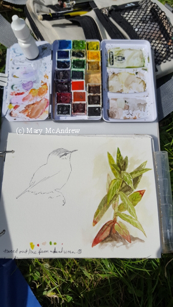
I’ve been meaning to post these pictures as I did them at the end of this winter. All of them were done outside while wearing mittens, so I was going to title the post something like that, but now that winter is gone I can’t bring myself to think about mittens! So, here’s a bunch of tiny sketches done at the end of winter, using my tiny square sketchpad.

Tiny sketch kit I keep in my winter 'backyard coat' pocket. I also keep a mechanical pencil and kneaded rubber eraser in it.

Tiny sketch kit I keep in my winter ‘backyard coat’ pocket; I also keep a mechanical pencil and kneaded rubber eraser in it.

The baggie is sandwich sized and in it I keep a permanent ink pen, one mechanical pencil, a kneaded rubber eraser along and the homemade 4″ x 4″ sketchbook. This small size is great for winter because just capturing a small sketch on a freezing cold day is better than trying to do something bigger and your fingers fall off from the cold before you’re done! 😉 I also keep a few pages of printer paper at the back for notes or creative ideas for poems.

(c)3-16-14 tiny sketchbook (400x391)

Aspen leaf deep in the snow…very cold outside!

I’ll add my small sketches in order that I did them.

(c)3-16-14 tiny sketchbook -2 (400x392)

“Waiting for Spring”

The tree sketch above was done the same day, after strolling around the frozen yard. The two trees at the back corner of my yard had dark, dead leaves and swirled dried grasses all about them, like an oasis in the white snow.

(c)photo 2 (500x373)

“Waiting for Spring” photo of sketchbook.

This photo above just shows how small the sketch is. Like I said the idea is to keep the sketchbook handy in my pocket and keep the drawing time to a minimum.

(c)3-20-14 tiny sketchbook (400x392)

“Cocoon Leaf” that I’ve been watching all winter.

This is a sketch of the leaf I’ve kept an eye on all winter. I wondered why one dead leaf never fell from this little tree in my yard, I suspected what I found, a cocoon. Very interesting to look at up close and see the silk spun around the stem.

(c)3-21-14 tiny sketchbook (400x399)

“Cocoon Leaf” sketched from the other side.

And this is sketched the next day after my walking. It was difficult to draw with bulky mittens on, sometimes I pull back the top and use my fingers. I like this sketch because it shows how beautiful the form of the leaves wrap together.

(c)3-22-14 tiny sketchbook (400x391)

A tree by the lane (Long Lane).

Today I went further than the yard, up Pasture Lane into the big field. It was just great to be out in the open and not cooped up inside, though it was still very cold. All the ground that had flooded in the winter was covered by ice + water, so I had to watch my steps. As I sketched the tree I imagined a squirrel could be looking down from that one ‘V’ branch, in a story, then I thought of England as usual. “My mind if full of leaving, my mind is full of returning…to England”. Then it started to snow again.

(c)3-23-14 tiny sketchbook (400x399)

“Cocoon Leaf”, another sketch…I like this one.

The next day I walked in the yard again and drew the leaf. It’s great to repeatedly study one object, every sketch a different angle or different lighting.

(c)3-24-14 (398x400)

“Cocoon Leaf” gets covered with a plastic mesh bag.

I decided to play more the ‘scientist’ and hopefully get to study what kind of critter comes out of the cocoon, if any!  I took a plastic mesh bag from some onions and gently tied it over the twig with the cocoon. I made sure the bag won’t move and disturb the cocoon leaf. The only thing about doing this is now I’ve signed on to be “Cocoon Keeper”, it’s my responsibility to watch it everyday in case something does come out.

The other neat thing about drawing outside that day is the sounds I heard from the treeline. There’s a ditch that drains the fields there and all winter it’s full of water and ice. Today the ice made such interesting cracking sounds, I assume it’s to do with temperature changes between air and earth.

(c)3-25-14 1 (400x398)

Sketches of what I think are Woodcock footprints in the snow.

I had a nice walk on this day, March 25. The sun was out, it was cold but calm and I got to see a Woodcock walking on the ground! First I saw these tracks which I noted, then just further on I saw a Woodcock in the treeline walking! I’ve never seen one on the ground, they always flush as I come upon them. I tried to grab photos but, NO WAY, it was too quick for me.

(c)3-25-14 2 (400x398)

Tree in Aspen Hall with interesting marks on it.

Last sketch of ‘Winter’; though it’s officially spring, with snow on the ground and mittens I still call it winter! This was sketched the same day, after seeing the Woodcock. I walked up Long Lane to Aspen Hall and sat for a bit on a pile of dead branches I use for a seat. Aspen Hall is a special place for me because it’s a place on my land where my sons and I would first hike to. Just far enough for a 2 + 4 year old to make it to, one in a wagon when tired, but far enough to be an adventure and secret place; I always loved secret, special places. We planted daffodils and crocuses 20 years ago, and some still come up now! I can’t believe it’s been so long ago.

Well that’s it for ‘wintery sketches’! I do have more in my tiny sketchbook but they are officially done ‘without mittens’! so I’ll save them for another ‘tiny sketchbook post’.

If anything, I hope this encourages some of you to stick a small sketchbook in your pocket and just do little studies when you’re out. Some of us spend far too much time focused on work, the house, the kids, the computer….when it’s so important to get out and walk and see. The best way to see is to stop, study and draw!

(Just a note on my actual drawing techniques, sometimes I use a pencil to sketch and correct with a kneaded rubber eraser. Afterwards I’ll go over it with the permanent pen, let it dry, then erase the pencil. I do this because I don’t like pencil in my field sketchbooks as it smudges. Many, many times I don’t use the pencil first at all, I just take my time and sketch directly with the permanent pen. It can be a freeing feeling to do this, but also can make you think a little more before you make your mark!)

Hope you enjoyed my tiny sketches and notes, please leave me comments and ask questions if you like, I love reading them and replying!

A New Sketchbook!

My New Sketchbook! (please click pictures for clearer view)

I had fun decorating the cover of my new sketchbook!

I had fun decorating the cover of my new sketchbook!

Sometimes you just need a new sketchbook. A fresh start along a new path. Something that allows you to jot down all your creative ideas, no matter how small. I’ve put so much of my art career on hold this past year because of preparing to move to England. Lately (as you may know) I’ve been exploring the art of felt making and silk painting and that ties in here too! I wanted a sketchbook that I could draw ideas in and tape things in like a scrap book. So I created this big sketchbook that is meant to stay in the studio, not venture outside for hikes.

I surrounded myself with color pencils and just had fun!

I surrounded myself with color pencils and just had fun!

A sketchbook to an artist is like a living thing; we tell it our inner thoughts and ideas, inspirations, by drawing, writing and painting in it. It becomes the very closest, best friend you’ve ever had! Sometimes we share what’s on the pages freely, enjoying the reaction and feedback from those we share it with. But it’s also nice to have a sketchbook that is just for you, that you decide how much of it you’ll share. Most of my sketchbooks the past few years, have been very public; nature sketches done while walking here in New York or in England. I LOVE sharing them! When I was in England it was enjoyable to let interested strangers look through my pages, finding out what they liked best, hearing their comments about places I painted that they recognized. But my new sketchbook I’m ‘allowing’ myself to share only what I want, PHEW! It’s funny the feeling of freedom you get just making that decision as a teacher and one who loves sharing their work.

The first page in my sketchbook, totally geared towards felting and silk painting.

The first page in my sketchbook, totally geared towards felting and silk painting.

This is the first page in my sketchbook; you can see it’s all geared towards felting and silk painting. Instead of worrying about this new love distracting me from my illustration and painting, I embraced it because I saw it as good practice while my mind is occupied with other things. I taped some watercolor studies in later used the space around for more notes and ideas.

Working on the letter "S".

Working on the letter “S”.

I drew the letters free-form on the cover (which by the way is a piece of colored mat board), later realizing that I should have made them fatter. So I added onto them and it still worked alright. I had fun making the letters look like shiny ribbons.

Ok, what I love about my new sketchbook is the size! I used full sheets of 9 x 12″ papers from various sketchpads. I put bristol board, watercolor papers, card stock and plain drawing paper for an assortment and labeled each in tiny letters along the edge. This way I can continue to test and evaluate what paper I like best. I’m used to working in sketchbooks half this size for drawing and painting in the field.

My sketch in progress, for a new poem, "Red Dragonflies".

My sketch in progress, for a new poem, “Red Dragonflies”.

The very best thing I’ve found use for on these big pages, is that I can jot down a new poem and then right next to it do sketches of my ideas for illustrating it! I was in the garden in September and enjoyed watching two red dragonflies, landing on the leaves, sunning, glittering. When I went in the house I started writing a poem about them and did four stanzas. The next day I added two more and then at the end of the month I tied it up with two more! But the best thing is I sketched an idea of an illustration right next to it, while looking at photos I took of the dragonflies. As I have time I’m adding a bit of watercolor and working on the little sketch.

I also put notes around sketches for ideas of what to put in the painting, like colors and subjects, as below.

An idea I had for a funny illustration, while walking around my backyard.

An idea I had for a funny illustration, while walking around my backyard.

One day while walking around my yard I noticed the little paths that go into the tall grasses along the edges of my yard. I always look at these and imagine the critters who walk on them and think they’re great subjects for my stories. Well there’s a stray black cat that hangs around my yard sometimes and after seeing the paths and thinking of the cat, I drew this funny little sketch! The cat is waiting in the shadows…but he doesn’t look mean, is he going to eat them? Or is he a friend? The one mouse beckons to the other, “C’mon”….as you wonder what will happen. The little wren at the top looks on.

So there is the evolution of my new sketchbook! Lots going into it and I’ll try to post more soon! Please leave comments below, I love reading them and responding!

Sketch for a little girl mouse.

Sketch for a little girl mouse.

Mouse Family in Ink

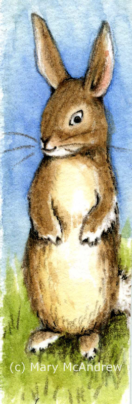
Though I’m working on illustrating a story with Teddy Bears at the moment, I just can’t leave behind my love of nature. I haven’t had much time for my usual nature studies but what I have been doing is testing out different papers to use for illustration. Arches, Fabriano, Canson…cold press, hot press, dual sided even!, they are all getting tried. I was surprised to find the ones I thought I’d love I hated and the cold press was feeling pretty nice. Cold press paper is rougher and can show nice textures when working with watercolors, but not as nice if you’re doing fine detail.

"The Mouse Family" in Windsor Newton Nut Brown Ink on Arches 140lb watercolor cold press paper.

(please click the pictures to see larger)

So I combined my experimenting with papers with wanting to draw some mice, my subject in many, many little children’s poems I’ve written. I want to keep a realism but cross the line into children’s illustration…make them a bit cute and giving them humanesque qualities.

Just showing the start of my drawing; I did it without a pencil sketch first!

I started by drawing freehand in permanent ink (no pencil sketch) this mouse on Arches 140 lb cold press paper. I used Windsor Newton Nut Brown, a really nice brown ink. (Forgive the yellow picture quality, I snapped this with my camera at night-time so I could record the stages of drawing.)

Windsor Newton Nut Brown Pernanent Ink

Then I went outside and grabbed up a bunch of leaves to add around it, and drew some of them.

my pile of leaves I first brought in to sketch from

What started all this was a cute sketch in ink of the mouse (mother) but she had to have some leaves to be tucked into. I brought in a good variety from the yard, they looked more colorful than this in the beginning. They all curled and dried but that’s ok, I like keeping some dried leaves around in a small box, for sketching.

Here it is on the easel, you can see my dip nib pen and brown ink there.

This is my set up, a small table easel that has a little drawer you can slide out. I like to put my watercolors there and anything else I might be using to draw. You can see my bottle of ink and my small ‘dip nib pen’ laying there. I have my paper on a piece of plexiglas. This is great to use when you are tracing a sketch onto ‘good’ paper, just go over your sketch with dark ink, put good paper on top, stick a lamp behind and sketch lightly with pencil. I didn’t do that with this drawing, as I said, I just started in and the drawing grew.

Here’s a picture of my “dip nib pen”.

Small "dip nib pen" with a little study after Beatrix Potter's Dormouse in the background.

You can see my two favorite pens here, when I want to use loose dip ink that is. I just love the detail I can get with this little nib! There’s something nice about using loose ink. I decided I liked when it ran out of ink regularly, it gave me a pause to check my drawing and think before making marks!

Just a little more drawn in...

As I drew the mouse I started to think maybe it could become a story, so I felt I needed to leave the area in front of it open to possibilities. *Very important when working with permanent ink to take your time and plan a bit!

A little close up of the mother mouse and baby.

I was going to put a grasshopper in because they are everywhere in the grass right now, but I decided on a baby mouse. At this point I started sketching with pencil…the rest of the leaves, mushrooms and babies, because now it had become an actual illustration to NOT mess up! haha. You can see I changed the mouses face, added an open mouth, eyes a bit bigger with lashes, just a touch! I’m looking for my ‘mousy style’.

And a close up of the other little baby mouse!

And you know with mice…where there’s one there’s many!…so I added this baby on the right. It’s good for the composition because it leads your eye around the page. Keep this in mind too when arranging your leaves, all the curves, waves and curls can really be exciting to draw and look at as they lead your eye around the composition.

Below are a few photos of what inspired me to keep adding to my drawing.

baby nursery web spider

I’m fascinated by the Nursery Web Spiders in my yard. In spring I see them living half under water and half above, then all summer they have their webs in the tall grasses on the lanes. Now as I walk through my yard in fall I see tiny baby spiders darting across the leaves everywhere!  I couldn’t wait to sneak them into an illustration!

I liked the twist of this leaf so I used it in my drawing

Well these leaves aren’t colorful but I love the curve of the big one, and the other small one fit in nice. You can see them on the right side of my drawing. I used this photo on my computer screen when I drew these leaves.

dead fall leaves in the grass

This is another one I added on the right side by the baby mouse. I tried not to go too heavy adding the shadows, since the leaves were all photographed at different angles in the sun. I also looked at this on my tiny computer screen while drawing, late into the night!

little golden mushrooms in the grass

One day when I was walking through the yard I spotted an area of mushrooms, each were about 2″ across at least. They blended in so well I almost didn’t notice them at first, but looking for “things in the grass” for my drawing they were a nice find. It wasn’t until the next day I went out to photograph them and they were all gone! I searched and searched and finally started noticing these tiny mushrooms around under blades of grass. NO, my lawn is NOT neatly mowed, I’m lucky when my son comes and gives it a cut, so I get all kinds of things growing and hiding in the long grass!

more tiny little golden mushrooms

I love looking at mushrooms, though I admit I don’t know too many species names. If anyone can tell me what these are I’d be grateful (Western NY-wet area)

This is the small Ink Cap mushroom I used after the first one disappeared

This one was the best find! It’s a Shaggy Ink Cap mushroom and I’ve never seen one here before, I’ve only ever seen them when I was in Ireland and England. One day I spotted a big one growing in the yard, I wasn’t able to get out to photograph it until the next day. To my great disappointment it had all but disappeared! I never saw one ‘roll up’ as fast as that! For those who have never seen this, the mushroom will start to roll up from the bottom, disappearing until just the top is left, surrounded by a black inky goo. It’s really quiet interesting and yuchy at the same time!

But lucky me, walking my laps around the yard the next day I spotted this small one growing not far from the other spot. So I grabbed my camera right away and got some good shots. I couldn’t wait to use it in my drawing and already knew it would be perfect as a backdrop.

"The Mouse Family" Ink on Arches watercolor paper.

So there you have it, all the parts together! Now that I’ve scanned it, I can play around with watercolors on it and we’ll see how that goes! Please visit my shop to see the Note Cards and Gifts I made using this and other photos in this post. I’ll add a few picture links you can click to visit it, please please share my shop links with friends once you get there! 🙂

Glossy Note Card with plain white background
Glossy Note Card with changeable text and brown background
Customizable Mug
Shaggy Ink Cap Glossy Note Cards
Hope you enjoyed my post! Please leave me comments and share on your Facebook or Pinterest pages!

“Winter Field Sketch” oil

"Winter Field Sketch"

This is a little (5 x 7″) oil painting I did “en plein air”, or translation… “while standing in the snowy field freezing my fingers off”! What I wanted to do was study the colors in oil and not get too caught up in the finished look of a painting. It was a good exercise in study of color for me, it would not have been as successful if I did it from a photograph.

My oil field kit, closed.

I rigged up a little field kit for oil painting, just for taking out on hikes. Here’s a picture of the kit closed, it’s a plastic case you can buy at an office supply department. I’ve only used it this once but hope to work with it more and ‘tweek’ it. The main objective was to keep it as light as possible.

Here it is open to show you the metal pencil case and use of 'sticky tack'.

This shows the kit open with two areas of gessoed canvas ready to use. Notice the four dots of ‘sticky tack’ on the left, they’ll hold the lid of the metal pencil case when I want to paint, using the lid for mixing. I used tape to make loops to hold brushes; just put tape sticky sides together to make it ‘not’ sticky in the middle.

I created a loop of tape to slide my medium cup into.

I used the tape in the same way here, keeping it sticky on the ends but not in the middle, I created a loop that my medium cup would slot onto. At the angle I would hold the kit, the cup would not come off! It was then held from behind with a dab of ‘sticky tack’.

Here is my field kit in action!

I held the homemade kit in one hand, using my arm for support, and painted with my right hand. It’s all in my reach and I brought no tubes of paint. Notice my fingers are holding one brush at the ready and the other ‘dirty’ or ‘in use’ brushes are kept on the left of the hinge, clean ones to the right in the loop.

Of course Ginger was along for the adventure and waits patiently to continue with our walk!

I put a squeeze of my colors in a metal pencil case and put some in a pill box from the pharmacy before I left the house. The pill box was an experiment and I wasn’t really satisfied with it, it gets too messy on the lids and doesn’t keep the paint really airtight. Since then I’ve moved to using contact lens cases that screw shut…we’ll see how the paint lasts in them as they’re all back in England and I won’t see them until spring!

This shows you my view of the field as I worked.

The above picture shows you the view I had as I worked, it also illustrates how dull the colors look on a photograph and how I perceived the colors with my eyes to be a bit more vivid. This is why working in the field is so important whether you are oil painting, using watercolors, pastels…etc.

When I came back home, I stuck the little study up on a wood post in my living room using ‘Loctite” sticky tack. I hung there for ages and I enjoyed looking at it whenever I walked by. It wasn’t until I found a great frame and laid it on top that it popped out and said “HEY…I’m a good little painting!” hahah…yes sometimes my paintings talk to me…don’t yours? It also told me to stop ignoring it and get it framed so it could have a proper place on the wall! Yes…yes, the voice of guilt, this painting actually was done last year (12/31/10) and since I traveled to England it got sort of forgotten!

Click to see photos enlarged:

How it looks framed on the wall

"Winter Field Sketch" framed and in cool daylight

Original framed painting $165 contact me

Go here to see all my Landscape Paintings in the Gallery.

I also made some nice products in my Zazzle Gift Shop with this, please click on the pictures to have a look!

Glossy Note Cards- 2 sizes
Glossy Post Cards