This watercolor was commissioned by a lady for her husband’s 80th birthday! He loves groundhogs (just like me) and she really liked the groundhogs I had sketched on my blog this past summer, so she asked me to do a painting. Here’s the finished painting and below it I’ll share the stages of painting as I worked on it, along with how I changed or corrected areas as I went.
my set up 1
Above is my set up, an artists’ table easel box type thing that you can put oils paints in underneath, I have it filled with color pencils at the moment. I like it because you can change the angle to work on, I altered it though by drilling holes right up the front panel so I can change the height of the little shelf that you put your painting on while you work. (Yes, I love using my power drill!)
my watercolor pan palette
When I work on little watercolors, I like to keep my palette of colors close to the work. The paint dries out quickly in the tiny brushes so it helps to have it all close by. I set my pan of colors on a little wooden box and I can keep other supplies in here instead of all over my table. This pan is also what I use in the field, I have so many colors in it, I really don’t need to set up my big huge palette that I use in my studio for big paintings. When I worked on the painting, I had several pictures of groundhogs to the left of it for my reference, I used sticky tack (blue tack) to hold things in place on the Plexiglas surface.
my set up 2
I really created this set up because I wanted to work where the wood stove was, right in the middle of my living room. You can see the cold snow outside my window! So it’s like my little studio island, a plastic table 4′ x 2′, complete with laptop, small lamp, bundles of color pencils and some other piles of ‘stuff’. (ahmm…there’s a dark chocolate bar hidden in the box too, well you know, gotta keep the ‘ol strength up!)
groundhog 1
This is the first stage of the painting, a light pencil sketch that I lighten first by tapping over it with a kneaded rubber eraser. Before I started I decided to make this a 5 x 7″ painting to fit a standard mat, so I lightly trace the inside of an 8 x 10 mat (5 x 7″ opening). Then I wash in a simple background of trees and start to place the long grasses and dandelions I want around this plump little groundhog.
groundhog 2 blocking shape
I like to try to keep some spontaneity in my paintings especially in the backgrounds. Here’s a little trick you can try to keep it loose while protecting areas; I grab a piece of paper or plastic to block or protect an area. This piece was just the right curve for his back, when it’s covered I can very freely stroke my brush right over the area with out it looking contrived and stiff.
groundhog 3 blocking shape
You can see above the protected area of his back.
groundhog 4
In “groundhog 4” I have laid in some light body washes and beginning some fur areas, starting on the darker areas first. Notice I have left a light ‘cut out’ looking edge to him, this is so I can go back later and stroke color into it to make it look like fur, but also he’ll stand out a bit from the background. I also started to push the darks around the grass blades in the front left.
groundhog 5
In “groundhog 5” you can see I darkened around the dandelions, added some grasses in front and also added some more tone and fur strokes on his body. Keep looking for the dark and light areas of his body; sometimes you show this by adding strokes or by adding whole washes to an area. If you look at his tail here I want to point out that I didn’t just paint in a tail shape, I put dark bits around where the grass went over it and it looks much more natural.
groundhog 6
In “groundhog 6” you can see I have put a light wash of green in the background, then washes of brown in the foreground. I then added more grasses and darks around the dandelions, foreground and his body. I developed the arm and shoulder area more now, also added more to the head.
groundhog 7
I developed the grasses around him in “groundhog 7”, pushing the darks in places.
Now I’ll show you some close up pictures of parts of the painting as I did corrections. I find it interesting to look back on how I changed things and I know my readers really like to see this, you can learn a lot by looking at how another painter reworks things to correct them.
correcting the back 1
When I painted more of the grasses in I was able to see his back silhouette better; I then realized that it looked too straight. So I gently re-wet the area along the edge (above) and rubbed a bit with my brush to lift the color then I blotted it with a clean paper towel. I repeat this as many times as nessesary to lift what I need to, you can’t always lift everything though!! Take care also not to lift other areas.
correcting the back 2
To reshape the back I carefully put down the dark green grass colors further out from the original back line. (above) Then you have to soften where needed so it all looks ‘right’ together.
Below I show a close up of an area that when I thought I had finished the painting, I looked back and decided to fix. That blade of grass pointing at his head looked ok in the beginning when it was lighter, but now was too strong.
blades of grass 1
Below is the area that I changed.
blades of grass final
Here’s some close ups of the head as I changed it. The mouth I found difficult to do, it was a give and take between showing details and sort of softening them, but then that’s the essence of painting! Notice the careful biulding of darks on the head to shape it’s 3 Dimensional feel, the changing of the black area of the mouth and the developing of the dark area under the jaw.
Head close up #1
Head close up #2
Head close up #3
#4 Final head close up
I ended up going over the entire head at the end and added darks here and there…sculpting until it looked just right.
Once again here is the painting finished and ready for it’s new owner!
"Groundhog" finished
The original is sold but SHOP for gifts, note cards, prints, t-shirts etc with this image on it in my Zazzle shop! Go to www.zazzle.com/marymcandrew*This will take you to my shop where my artwork and designs are listed, go to the Small Mammals folder to find the groundhog designs or just type Groundhog into the search box. You can add your own text to customize gifts! If you want it on something you don’t see, just email me to ask!
My finished miniature watercolor painting of a Great Grey Owl, measuring a mere 2″x2″! Be sure to check it out in my Owl Gallery too. It’s an owl named “Aspen” that I photographed at the Keilder Water Bird of Prey Centre in Northumberland England. I’ll show you the stages of painting and talk about how I did it below.
"Great Grey Owl" -first washes
This shows the first stages of painting, the beginning washes to lay down the values, color hue and expression of the painting. I first started with a light sketch in pencil, lifting it as much as I could with a kneaded rubber eraser before painting. Then I painted the washes and sprinkled salt on wet areas to see how it would ‘pull’ the color and create interesting patterns. It is at this stage of the painting that you can get a feel for how the painting will go, will you be loose and expressive? Will you go for more details? Sometimes I think we have to let our intuition guide us, or perhaps our mood.
First wash set up
This picture shows you my set up for the first washes, I always start flat on the table so the color doesn’t run. Many times on larger paintings I stand up and work loosely with my brush. (check out this short Utube video of me working on the “Screech Owl” painting, it shows how I paint loosely when standing). This set up shows my photo reference to the left, the salt above that, then my field palette to the right because I’m right handed, the water bowl above that. I keep a white paper towel folded nearby for wiping off excess water and it allows me to see if there’s paint left on my brush. You see my magnifying lamp which I find good because the light is cool and matches daylight; but I don’t use the magnifier on it as I find it clumsy to use my brushes under it and I bump into all the time when I lean in super close! Sometimes I use a hand held magnifying glass or you’ll see pictures later of my glasses.
Great Grey Owl -stage 3
Now here in stage 3 you see I’ve jumped ahead with lots of details and color. As you work, squint your eyes at the photo and your painting to catch large areas of value that need to be developed and notice color hues. At one point I felt my owl was too brown so I washed a very watered down blue grey over areas, but only on very dry areas. In areas you need to lighten you can either lift color with a damp brush and blot with a paper towel, or you can add it using white watercolor or gauche mixed with your paint colors.
Now on purpose I’m going to point out some things that I found to be unsatisfactory in my painting and I changed. At stage 3 here, I felt like I did a pretty nice painting! I was feeling like it was done, ah….no such luck. If you let it sit a day or two and return to it, or if you show it with the photo reference to a friend with a sharp eye, they’ll be sure to catch something ‘off’ with it. If you’re a conscientious artist, you’ll be bothered by it until you fix it and you probably already knew it was wrong to begin with but wanted to ignore it! Well lets just say my boyfriend has a good eye, sigh, well now he ‘did’ pick me didn’t he? We both agreed the beak wasn’t right, I pointed it out to him then when he agreed it was back to the easel with it. I can’t believe how much I was able to amend the beak being that this is watercolor after all. People are afraid of watercolor because they think it’s unforgiving, wait until you see the changes I made.
Great Grey Owl -stage 4
Stage 4 shows the beak changed, I totally moved the angle of it and lengthened it! (see the enlargements below of these final stages too) If you take a damp brush and gently re-wet an area, and only the area you want to fix, you can then repeatedly rub it gently with a damp brush tip, blot it with a clean paper towel (I prefer Viva!) then clean your brush, wipe it off and repeat. Do this over and over, you’ll be amazed at how much you can lift. When I repainted the beak I thought like an oil painter, I laid down a more opaque yellow layer to clean and brighten the beak, then I kept putting washes over this dry layer to affect the color. It ended up with an unusual translucent look like a real beak would have.
As I did this, of course I started to notice other areas I wanted to improve upon. Sigh…such is the plight of an artist with a picky eye! Notice the area of light tan below his beak, I needed to bring out the lightness of it so I added white watercolor to some cad.yellow, and browns to create a tint for an underlayer. Another note about this painting, next time I will pick a much smoother paper, working with this much detail you need to keep your paper super smooth with no distracting texture.
Great Grey Owl -stage 5
Stage 5 shows how I painted detail on top of the tan area under the beak and the beak has more details added. The owl has an overall lighter look, this is because I kept stroking on little feathers with a tint of whitish blue grey to add detail. Now I thought I was done here, but remember that boyfriend of mine with the good eye? Well he helped me notice I had painted out the nostril! SIGH….yes, when I was adding the little hairs by the beak I must have done that so back to the easel. The picture at the beginning of the post is the final stage, fixed and finished!
Working with my magnifying glasses
This is me working with my reading glasses on and a little set of clip on magnifier lenses. In the photo I have the magnifying lenses lifted up so I can look at the paints in front of me, if they were down I’d need to get much closer to see what I was doing. So I would lift the lenses up when I would sit back a bit and take a look at the ‘whole’ painting and the photo, looking for areas that need attention. Then I’d flip them back down and get close for the detail painting. I wouldn’t use them for the initial stages of painting, you don’t want to focus on details at that point.
Also you notice here my setup is different than before, I have another pan of watercolors and have them set up on some jars so they are closer to my painting. Working with a tiny brush ( 10/0 liner) it dries out super fast and keeping my pallet nearer seemed to help. The nice thing about working on a miniature painting was being able to mix small amounts of color right in the pan lid. (the brush in the picture is not my liner brush)
The pictures below are so you can look at one section close up to see the changes I made to the beak and area around it.
Great Grey Owl close up detail stage 3
Great Grey Owl close up detail stage 4
Great Grey Owl close up detail stage 5
Great Grey Owl -close up detail finished
I hope you’ve enjoyed my post about my painting. I looked forward to showing you my mistakes and how I fixed things as I painted because this is how it goes, it’s a process and doesn’t always go as easy as it looks. I like to encourage my students and others to keep looking at their paintings for more detail but most of all a good beginning drawing is crucial. As you can see here, I missed the beak angle and had to fix it later, but the more you paint and draw the better you’ll be at catching these things in your work. That’s my two cents! Please leave me some comments and if you are interested in note card or prints please let me know.
For the fun of it, here’s some Utube links with owls!
This is a watercolor study I did to as a demonstration for my fall Nature Sketching and Painting Indoor class that just finished up. I used it to show the stages it took to make a simple study, step by step, layering washes, values etc. Posted below are the steps it took to make this 5″x5″ study head, be sure to click on pictures to see larger views! Enjoy!
Detailed sketch – Shown below, first I started with a light gesture sketch of the shape of the bird, then rechecked placements of things and refined details.
Darkest Darks-This is one approach to watercolors, start by laying in your darkest darks and blacks. If you start with a confident sketch it should work out fine, when you work this way you set out from the beginning with a defined dark end of the value range. You can then judge all other values against it as you paint. You won’t have to go back and keep “pushing” your darks to make them pop.
I also painted the eye, being carful not to touch the highlight area, black for the pupil, and brown put into the wet black for the iris. (I think I put my reading glasses on for this step! haha).
Below I started to lay in more darks of the cheek, as my brush was drying out I would ‘sketch’ areas I wasn’t sure about…just to start to lay in some value so I could see where I wanted to paint. Color Wash-Here I laid in a bluish grey, ultramarine and black thinned with water. After it dried I laid in some small lines for feathers.
Changeing the drawing– A pale yellow ochre wash on skin of eye area and nares. A wash over the eye highlight to tone it down and soften it. Here I also made a decision about the beak, now that I was putting values down, I thought the beak looked a bit too heavy. So before committing to paint, I erased! I reworked the curve then I painted keeping all areas soft and blended slightly. Feather details-I brushed on more feather details here, laid in more darks with repeated ‘feather’ strokes to top of head and all around eye. Nice spotty look at right edge, I like when the watercolor can been seen for what it is, it gives it a looseness. See the photo below for this step, just repeated tiny strokes. Yellow of beak and eye-Here I laid in the yellow on the nares and eye area, and it’s completed! See it on my Art Gallery Blog soon with prices for note cards and prints!
Well, late last night, I just had to play with my new little watercolor field kit I put together. I love making up new kit ideas to carry my art stuff around in.
A picture of it all packed up, it only stands 6″ tall and 4″ wide.
Here it is with all the contents laid out, can you believe how much stuff I can fit inside it?
For the painting, I actually painted it while laying on the bedroom floor! Sometimes I think I’m just a kid in grown up clothes, doing things I would have done when I was younger. In College I painted using an old bread board on the floor, all the time! I had no desk in my apartment and it was just easier.
Well, back to my tiny watercolor. It’s only 3 1/2″ x 4 1/2″ big! I used little brushes and the tiny little cup for water. I didn’t start with any drawing, I just started painting, looking for the shapes and laid them in lightly. As I started to add the face details, that’s when I checked using comparative measurements, where her mouth, nose, eyes all fell. Then I pulled the hood down a tad before putting it’s green color on.
Below, I added the background wash and more on the hood, washing some background blue onto the green of the hood. I lightened the eyes also, touching them up. And then darkened the shadows.
Last is the finished little painting. I worked on hair details more, adding some burnt sienna to add warm darker tones and more hair strands. I painted some purple in the shadow on her chest near my signature. The purple was a nice choice, darkened without making it look dirty colored. I added more greens and a light wash of cadmium yellow to the upper hood to warm it up. The hood on the left side (shadow side) got only blue washes. I added some darks on her upper chest and washed over her shoulder, then lifted the highlight by dabbing a clean paper towel after wetting the paper repeatedly. Then after deciding the eyes were as good as I wanted them, (sometimes a hard thing to let go of) I added a tiny white highlight with a dot of white watercolor paint. Finished little beauty!! Hope you like it!
I thought I’d put up some pictures of the Harris Hawk oil painting I’m trying to find time to work on. I started this a year or so ago! The underpainting shown below, has been sitting around in my studio so patiently waiting for more! It’s done with wet burnt umber then I wiped off to ‘draw’ the bird on the canvas. A very nice, freeing technique, you just concentrate on the shapes like you should.
Then below, I start what’s called the dead color stage, flat blocked in areas of color as close to the final color as possible.
Below you can see me, wow do I look serious or what? I decided to hold the palette this time, sometimes I put it on my custom biult (by me) painting tower. But I like having the colors right there in my hand so to speak, for mixing and direct painting onto canvas. This is it so far…shapes are looking good, colors too. I have to decide what I’ll do with the sky or background.
I was inspired on Tuesday (19th) to paint a Cooper’s Hawk when I saw one (or a Sharp Shinned Hawk) swoop over my bird feeder. I talked about it in my post on the 19th. So I did this small study from a field guide in my 5″x81/2 ” sketchbook. First I did a “Gesture Sketch” then added some details when I felt the drawing was correct.I started first with black watercolor in various values to ‘draw’ more details in, feather markings, wing values and shape. Then I dabbled on with my fine pointed round brush, a light value of breast color. While it was wet I sprinkled on salt to see if it would help break it up, in a random way, I love the way salt does this. I also put in an orange red for the iris of his eye. In the third picture I have laid on more breast value, defining more of the 3d shape of the hawk’s breast and body. I put a pale wash of purply pink under his tail and touched it to his wing feathers and by his eye. I put a tiny bit of blue on the beak and behind the eye to shape his head more. I also colored the branch, legs and put some browns up onto wing feathers.
The fourth picture I added some more colors here and there on the hawk, more color on the grey wing feathers and around eye. If you notice the longest tail feather in the last picture I rubbed out in this one. If you need to change something, wet it and repeatedly brush it and dab with a papertowel. I wanted to shorted in because it was making the whole tail look too rounded. I used my favorite little Chinese brush to make the pine needles in the background. I have a picture below about this. The final picture of my painting (above) shows another little Cooper’s Hawk study, this one done with Inktense watercolor pencils, Prismacolor watercolor pencils and one Graphitint water soluble pencil. You can see the difference between the transparent watercolor painting and the wc pencil painting. I like the grainy look of the wc pencils, it has a softness to it. On my sketchbook I’ve listed the actual colors for those who like to know! You can click any picture to see it larger.
This photo shows how I used a plastic bag to block the birds breast so I could brush right from his breast out, without getting him green! It’s a little trick you can do to protect your areas you’ve painted. I would be holding it down with my fingers normally, but I had to hold the camera! (I need a camera man!) Then I show how I use my little Chinese brush by splaying it out, to make pine needles, it works great! The next photo shows me putting the needles on with the brush tips. Now here’s a little tip that I just put to good use, you can see in the last photo I have two pencils in my hand. You can brush the tips of your wc pencils to get a limited amount of color for light washes. But this time I held two, an Antique White and Tangerine. I brushed the Tangerine then the White to make an opaque wash of orange. I used this very nicely on his eye as it had gotten a bit dark. Then I used the white alone to dab repeatedly to make a highlight on his eye. Besides the Chinese brush, I used the one small brush to do all of the painting on both, a round, cheapo brush from Walmart! I hope you enjoyed my painting today as much as I enjoyed doing it! Please leave me your comments if you like and you can sign up to receive email announcements when I do a new post!
Please have a fun visit to my Zazzle Shop where I have my bird paintings on glossy notecards, mugs, canvas bags and t-shirts! More coming all the time.
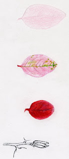
This is from my trip to the Buffalo Botanical Gardens on Jan. 11, 2008. I’m working from a photo of a stem with pink and green leaves, I still have to find out what kind of plant it is. It’s very pretty!
I’m working in an 8″x10″ sketch book, first I did a sketch with a mechanical pencil. I tried to scan my progress with the color pencils in stages. I’m working with my new Coloursoft Color Pencils from Derwendt and a few Prismacolor Color Pencils.
The bottom twig tip I outlined with a very fine point sharpie marker, then worked the CP in. I’m still not sure how I’ll approach the branch, I might do a watercolor wash then CP but the paper is pretty thin and it might not work too great. We’ll see!
Me painting with sketchbook and watercolor palette in one hand.
I decided to put that little travel watercolor palette to test. I picked up a gorgeous iris and lily yesterday, sketched it out and started the first stages of painting. My objective here was really to test out the palette, watercup arrangement and holding the light board all in one hand. I want to see if I can use it like this in the field without an easel for little studies. You can click on any picture to see enlarged views.
My travel watercolor palette with watercups attached
I show a close up of the arrangement so you can see the watercups; they are actually for holding mediums for oil painting, designed to hold the liquid even when tipped slightly on a hand held palette. They worked fantastic! I had to get over the habit of looking for my watercup on the table! You can see the ‘sticky tack’ or ‘blue tack’ in my palette. Yesterdays blog explained that better, so they get tested today and it worked wonderfully! Yay..two experiments that worked.My hand got a bit tired from holding the board and palette but this set up is supposed to be for quick studies, I worked on it longer than I would in the field.
The pictures are to show the stages of my painting, start to finish.
Iris pencil sketch
starting to lay in some colors
Putting on the blues, make sure yellow is dry first
I painted this 4″ x 6″ oil painting on an early November day, sunny, cold and gorgeous. I have updated this post with photos of the day out in the field, please see below.
"Oak Tree"
The great thing about painting or drawing outside, en plein air is what you observe…hear, see, feel, smell. This day it was the visit of the bees and teeny tiny spiders. It sounds creepy but when you’re used to treking around in nature you learn to just observe the critters for what they are and do, and not get ‘creeped out’!
Burnt Umber sketch with bee
So as a wasp kept landing on my painting and easel, I figured it was interesting. I took pictures of him of course.This shows the first stage of my painting, I used a ‘wipe off’ method here; you paint Burnt Umber on the masonite board and brush it out so it’s a medium value. Then you ‘wipe off’ with a rag and your finger or a brush, the areas that are lighter. It’s like sketching with value, it’s very freeing as you won’t try to catch details you just look for the big shapes and wipe them out. If you don’t like it you brush it back on, easy! Then you lay in darks and bring out shadow shapes with more burnt umber. I have my board attached to a piece of cardboard that has clear tape covering it. There is another small canvas ready to go next to it and they are both attached temporarily with ‘sticky tack’ or ‘blue tack’.
spider on easel
Then every time I started to paint, a tiny spider would appear hanging from the brim of my baseball cap, I’d lift him off with his thread of silk and put him in the grass, then another would appear on my easel. My guess was they were ‘sailing’ on their threads down from the beautiful oak tree.
The most up to date information about my artwork, nature sketching adventures, or step by step demonstrations. Search using Categories or Tags, or use the search box in the left column.
Please sign up below to get notified when I post new articles.


head close up final re")


wc iris 4 cro resz")


