I thought I’d show you the progress on my illustration of the ‘mouse family’ and some other little studies.
(click on them for larger view)
Work in progress, adding watercolor to the ink drawing.
It looks so different than it did as just a pen and ink drawing! They are starting to come to life more with the added color and fur. I’ve been so busy with other things that this illustration is going slowly. What I did here I did in one evening while watching a movie, if I could just sit down one more time it’ll be finished. So she says!
I’ve run out of opportunities to paint from ‘real’ colored leaves as they’ve all gone to the dark side in my yard, they’re all brown and blackish. But I did take lots of reference photos and that will serve me well as usual. I have a decision to make about the leaf in the mommy’s hand, it blends in with her and the baby maybe a little too much? I may add a purpley maroon, something with alizarin crimson? I’ll be adding just a touch more color to the leaves but I don’t want them to overwhelm the mice either. I do like the touch of blue in the background, it helps to show the mushroom better.
Before I forget I’ll show you a little study I did after Beatrix Potter’s mushrooms.
Watercolor study after Beatrix Potter
It’s from a painting with more mushrooms but this little one and the grasses were all I needed to study the colors she used. This was great for me to do before diving into the color of my painting, especially because I wasn’t working outside from real life. I just love and adore her paintings!
A small watercolor study of Moneywort done in springtime.
This is a small study I did in the spring of Moneywort. It likes to grow in wet areas so my land is filled with the stuff! Wonderful in late spring as it covers itself with little yellow flowers; my ditches along the lane seem to be filled with gold! I don’t know if the name refers to the yellow flowers (like gold) or the round leaves looking like coins? I found out something interesting, it’s a native to Europe and was introduced to America for use as ground cover and as an indoor hanging plant. Ha! I never would have thought to use it inside! Well anyways, I remember sitting in a lawn chair on a cold spring day, in a flooded area of my yard when I did this. I watched the little Nursery Web Spiders scampering over the water and over the plants. How great it is to study from life! That’s why I love Nature Sketching so much.
Study of a small wildflower (weed) that grows in my grass.
And this is another favorite ‘weed’ I like that grows around anything not moving! haha…It seems to grow at the edge of everything but I don’t mind, it has tiny pretty flowers and neat rounded leaves that remind me of a tiny geranium. I haven’t yet looked it up, guess I should. Oh by the way, the bees love it! Don’t go killing everything that grows in your grass, as long as it’s green it looks fine! Look closer at some of those weeds, they can be pretty and the bees need them.
I just thought I’d show these because I feel it’s important to always study from real life. Even if it’s a tiny study done quickly, it will help you to look closer at what’s really there, and you will remember it. Especially when it comes to color, the photos you take will not be as accurate as what your eye sees at the time, in that lighting.
Well I hope you enjoyed seeing my progress and other studies. I’ve been playing around with adding some new colors to my watercolor field palette, so we’ll see how that goes. Leave me comments if you like, I always love hearing what you think!
Click the picture above to see another cute mouse painting I did! If you hover over it (in my shop) you can see an enlarged image. Go to this link to see some other new children’s illustrations in my shop!
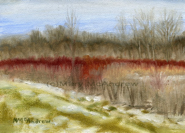
This is a little (5 x 7″) oil painting I did “en plein air”, or translation… “while standing in the snowy field freezing my fingers off”! What I wanted to do was study the colors in oil and not get too caught up in the finished look of a painting. It was a good exercise in study of color for me, it would not have been as successful if I did it from a photograph.
My oil field kit, closed.
I rigged up a little field kit for oil painting, just for taking out on hikes. Here’s a picture of the kit closed, it’s a plastic case you can buy at an office supply department. I’ve only used it this once but hope to work with it more and ‘tweek’ it. The main objective was to keep it as light as possible.
Here it is open to show you the metal pencil case and use of 'sticky tack'.
This shows the kit open with two areas of gessoed canvas ready to use. Notice the four dots of ‘sticky tack’ on the left, they’ll hold the lid of the metal pencil case when I want to paint, using the lid for mixing. I used tape to make loops to hold brushes; just put tape sticky sides together to make it ‘not’ sticky in the middle.
I created a loop of tape to slide my medium cup into.
I used the tape in the same way here, keeping it sticky on the ends but not in the middle, I created a loop that my medium cup would slot onto. At the angle I would hold the kit, the cup would not come off! It was then held from behind with a dab of ‘sticky tack’.
Here is my field kit in action!
I held the homemade kit in one hand, using my arm for support, and painted with my right hand. It’s all in my reach and I brought no tubes of paint. Notice my fingers are holding one brush at the ready and the other ‘dirty’ or ‘in use’ brushes are kept on the left of the hinge, clean ones to the right in the loop.
Of course Ginger was along for the adventure and waits patiently to continue with our walk!
I put a squeeze of my colors in a metal pencil case and put some in a pill box from the pharmacy before I left the house. The pill box was an experiment and I wasn’t really satisfied with it, it gets too messy on the lids and doesn’t keep the paint really airtight. Since then I’ve moved to using contact lens cases that screw shut…we’ll see how the paint lasts in them as they’re all back in England and I won’t see them until spring!
This shows you my view of the field as I worked.
The above picture shows you the view I had as I worked, it also illustrates how dull the colors look on a photograph and how I perceived the colors with my eyes to be a bit more vivid. This is why working in the field is so important whether you are oil painting, using watercolors, pastels…etc.
When I came back home, I stuck the little study up on a wood post in my living room using ‘Loctite” sticky tack. I hung there for ages and I enjoyed looking at it whenever I walked by. It wasn’t until I found a great frame and laid it on top that it popped out and said “HEY…I’m a good little painting!” hahah…yes sometimes my paintings talk to me…don’t yours? It also told me to stop ignoring it and get it framed so it could have a proper place on the wall! Yes…yes, the voice of guilt, this painting actually was done last year (12/31/10) and since I traveled to England it got sort of forgotten!
I thought I’d add a series of posts that introduce my new watercolor crayons, a few old ones, and how to start using them in hopes that some of what I do may help someone else.
When I first bought watercolor (or water soluble) crayons I tried them and didn’t like them at all! I thought the colors garish and harsh. I thought “what a lot of money for these little things and I’m not going to use them!”. Well I’ve only recently pulled them back out and have been playing with them. I’ve learned from using watercolor pencils, go lightly at first until you know just what your colors will do when you wet them.
Please click on pictures to see them bigger.
Water soluble crayons in a tin
Here’s the set of colors I started with, Caran D’Ache Neo colors and one or two Derwent Watercolor crayons. I also show a “crayola wax crayon” and explained in another post (below) how I used it. I cut them in half (oh heavens yes I did!) to make them lighter to carry in my sketch bag and I could fit more; here I show them in an “Altoids” mint tin. The other halves go into a baggy for later or to carry in another kit.
I took them out into the field and did some small landscape studies using these few crayons. There are links at the end of my post you can click on to read about them. After doing them I was feeling more enthused about my crayons, I think it’s time to look for more colors!
New Tin of Watercolor Crayons, Staedtler "Karat Aquarell" Neocolor II
More colors in other brands…landscape colors hopefully. I thought I’d try these Staedtler “Karat Aquarell” neo color II, they were reasonably priced online. Because I’ve been desperate for sunshine this spring, it was gorgeous that evening so I sat on my front steps to do my color charts.
New Watercolor Crayons, wow look at all those colors!
Here’s the crayons! Woohoo….they look nice! I’m hopeful that some of those greens might be what I was looking for.
Getting ready to wet the colors and have some fun!
First I want to stress that before you do any paintings with ANY media, watercolors, color pencils, oils etc, you should ALWAYS do some color charts of all your colors. This will help you to get to know the colors as they really look on paper (or canvas) and get familiar with how to handle them.
In my sketch journal, I rubbed a small spot of color and wrote in permanent ink pen the colors name next to it. It helps to also put an initial for the name brand too or label it at the top as I did. Prepare one row and do the wash before you color the next set of spots, just so you don’t run out of room. Keep it neat because you can refer back to these charts again and again as you get to know your colors.
Color Charts of two brands of Watercolor Crayons
After you make your dry spots of color take a waterbrush or regular watercolor brush and water, wet the bristles and touch it to the color spot. Notice how as you ‘rub’ the color it releases and becomes like watercolor. If you rub a lot you can blend the spot right out for an even tone, but leave some intense color there, drag your brush as you rub back and forth, to one side to pull color away. Then lift your brush to stop, don’t rub too far out, keep ’em neat. Now your ready to put on any more spots you may need to and wet them; leave room for labeling them. After wetting a color rinse your brush and wipe or rub on a paper towel to make sure all color is cleaned off it.
As you can see, I did my new crayons on the left, my original crayons on the right so I can compare them.
Color Charts with my comparing colors close together in the centre.
Now to have some more fun, it’s time to compare colors from different sets so I can decide which ones are too similar to carry around with me. This is a ‘getting to know you’ exercise now and VERY important! The more you play with your colors the better your choices will be when you’re painting. Sometimes when I haven’t painted in a certain media in awhile, I’ll go through and do color charts just like this. So you can see the middle is a riot of colors!! I grouped the blues, then greens then browns and goldie colors, all good for landscapes. Label, label, label!!
( I really like how this page looks with all the color swatches, I decided to make note cards and t-shirts of it!! See the links at the end of this post 😉 )
More color play to further test some out.
Ok, then the page adjoining that one had to be used for more testing, wow, am I going to use all these pinks?
My Watercolor Crayons + Waterbrush
After all this playing I ended up with a pile of cut crayons (yes I cut my new crayons in half too! Yikes how awful!) So I searched through my favorite shelf of odds n ends, containers etc for my field kits, and found a plastic case from I think, a small first aid kit. I love that it’s plastic = lightweight! This is a picture from my previous blog post where I used the big flat water brush.
Here are the blog posts I’ve done so far using the crayons, in order of date posted:
I know it seems out of place, this painting of snow when it’s Spring (at least it’s trying to be spring!) but I found I had never posted this and would hate to have it forgotten! So here’s a short post about a cold, snowy walk in January! If you click it you’ll see prints of it in many sizes.
"Field at Long Lane Farm" watercolor
I did this little 7 x 7″ painting in my journal while standing in the lane that goes out to the fields on my farm. I love the subtle colors of winter, the red tipped bushes and the cool blues in the snow. On a good sunny day you can have to most intensely blue colored skies and high contrast clouds. Not that you’ll ever hear your weather man call them that! “today there’s a chance of high contrast clouds with rain” hahaha.
Seed heads along the walk
Here are some notes I wrote as I paused to look at some dead seed heads.
Watercolor pan, brush and waterbottle
And this shows you what I used, not a waterbrush but a ‘proper’ watercolor brush, just used the one and a plastic bottle for water. In the winter you can’t use the waterbrushes that are so popular as the water tends to freeze as you paint on the paper.
Hope you enjoyed the late posting…I hope we can all say goodbye to winter weather soon!
Here’s some prints and note cards of this little watercolor in my shop:
(if you are viewing this from your email subscription, please visit my blog on the actual website to see the video and links properly)
Today I went for a walk with Ginger. We ventured forth out into the wet lanes and fields, the mud sucking at our feet, water swirling as we waded. Not all my land is wet mind you, but this time of year it certainly is in some areas. I start my post off today with my drawings of the little snail I met while out walking, because I knew you’d be curious to see him.
Little Golden Snail Sketches
I did these studies actually back at my studio while looking at him under a magnifying glass. I did some while in the field (you’ll see below) but it was so small it was hard to really get a good look at him while I sat on a log! So he came home for a visit. I first lightly sketched him with pencil then drew with a permanent ink pen and then watercolor on that. After I drew the swirly curly border I drew over it with one watercolor pencil then just dragged a wet waterbrush over all of it to soften it and make the color bleed out a bit.
Now back to our walk.
Secret Circle Lane
This is “Secret Circle Lane”, as wet as it always is in springtime; (click it for high res. view in my shop) how pretty reflecting the sky like that! Ginger and I crept quietly along through this water because I heard an interesting call from some kind of frog along with the zillions of peepers that were singing.
Here’s a short video clip I shot while standing in the water, just to let you hear the sound of the Peepers calling.
my boots
Ah yes, the trusty boots! Can’t go anywhere without these mud boots or “Wellies”. Well these boots weren’t made for “walkin” they were made for “sloshin”!! I did see some interesting little critters in the water before our feet disturbed it, some snails and a few water beetles.
me
Oh, and there’s me…had to show you my favorite hat of all time and my Dad’s hunting coat! The hat I bought in England at a farm supply shop, where they sell the expensive horsey equipment and clothes. Well it WAS expensive too, BUT well worth ever penny! It’s waterproof, lined for warmth, has a flap that drops down over your ears and makes it fit your head like a helmet and has an elastic cord that goes under your chin for high winds. When the wind blew hard on the high hills of Northumberland, my wonderful hat stayed put!! The other nifty thing is it has a little button on the brim you click and you get two settings of led lights! High power beams!! I’m telling you we’ve used it to find our way on paths past dusk and it’s great for visiting old castle ruins because you can point your beam into dark places that you wouldn’t have seen before. I should get paid money to promote this hat!
And the wonderful old Woolrich hunting coat my dad gave me so I love it. He used to put it on when going out hunting, I still remember seeing him in the kitchen with the pants on with bright red suspenders and laughing playing like he was Santa! It is covered with pockets and has a special pocket at the back for carrying your ‘game’ home in. I have been known to carry sketchbooks there and always keep a spare kitchen size garbage bag for sitting on wet ground.
Crocuses in Aspen Hall
I told you before that we planted flowers in “Aspen Hall”, here’s two little crocuses I wanted to sketch. Click to see a note card of it where you can zoom in and see it bigger.
golden snail
I love the close up pictures of this pretty little golden snail. I spotted him on the ground amongst the leaf litter, but in the sun he glistened like gold. I took my tiny Olympus camera on the macro setting and shot this picture through a close up part of my magnifying glass! It really works at getting a little closer. Click on the pictures to view note cards that you can view close up.
golde snail pointy end up!
Here’s another shot of him, I love the form of the shell twisting up like that.
Studying the snail closely for sketches
Now this picture is important because it shows you how tiny he was and when you need reading glasses to see things better, it doesn’t help. The other thing that made it difficult to draw him in the field was sitting on one little log made my back hurt terribly so I was not comfortable. I wrote my notes and did some little sketches anyways.
golden snail peeking at me
Another great shot, I love the patterns in the shell that the sunlight catches. And notice the subtle color that runs up through those eye stalks? I notice how well it matches the dead stick he was crawling on.
My Journal page
Here’s my actual journal page from my time sitting in “Aspen Hall”, go ahead and click it to read it.
Tiny Golden Snail with metallic gold watercolor paint added.
Now I had a little more fun with the snail studies I did by using some metallic watercolor paint on them. I took some pictures of the snail paintings tipped at an angle to catch the sun and really show the metallic watercolor paint I added on top. It was a lot of fun using it and really made it look like the snail did, it sparkled in the sun!
Golden Snails in watercolor with gold metallic watercolor over.
And one more shot showing the glitter in the full sun.
I hope you enjoyed our walk today and you didn’t even have to get your feet wet! 😉 Don’t forget to visit my SHOP by clicking the pictures above to see note cards of the little golden snail or the landscape photos in this post.
Here’s a note card using the watercolor studies:
Speaking of snails I’m honored to say there’s a wonderful blog written by two talented women one of which was inspired by my posts about the snail I found and did studies of while I was in England! Have a look here: “The Dao of Doing”
(This post is done AFTER returning home to NY…gosh I miss my Northumberland!)
Come along with me as I do a small oil painting in a very gorgeous location in the Coquetdale (River Coquet Valley) area of Northumberland, England. I think of all the areas I’ve traveled around in Northumberland, the Coquetdale is one of the most beautiful and always catches me by surprise when we drive along it’s long winding path through the valley. It has quite a few meanders before reaching the North Sea which makes it that much more picturesque to an artist, it’s curves reflected in the sun as a shimmering snake in a green velvet valley.
Painting while looking over the River Coquet
There I am! We hiked up this great high hill and entered the Bronze Age Celtic ring fort at the top. It’s surrounded by a deep ditch, as was the practice for all ring forts, though I guess a few thousand years ago it would have been deeper and very impressive. After exploring the fort and ditch I settled down inside a ditch with my back to the VERY brisk wind! While I painted I had my hood up to keep the wind off and you notice I’m wearing fingerless gloves, a must for outdoor painting!
For my set up, my favorite wooden field easel and a backpack with attached stool. This is a popular one found in many art supply catalogs but I altered it (as usual!), I took the backrest off by hammering on it until it came away. With the backrest off, I can now sit on it in any direction I like, sometimes the bars of the seat hurt the back of my legs and I feel less attachments equals less weight. I’m put a camping inflatable pillow on the seat, makes it a bit better. All in all, I don’t usually sit when painting outdoors, I find it tiresome to my back; usually I stand up and feel freer with my painting and you can move around to keep warm.
My View Over Coquetdale
Here’s a view of what I saw, you may wonder how my masonite board is staying up so magically on the easel? The wonders of Blue Sticky Tack never cease!! I use it all the time, I have some little dots of it on the easel to hold small boards like this, just where I want them. With a small board, I don’t like the wood of the easel’s clamp to get in the way.
stage 1-View Over Coquetdale
When in the field I usually don’t pencil sketch the scene on the canvas, but use either Burnt Umber thinned with mineral spirits, or pick a color in the landscape and sketch directly with the brush. Just pay attention as you divide up your canvas with the horizon line placement and other important elements. If you get it wrong in the beginning, it’ll always be wrong! I go for blocking in big shapes in the ‘nearest’ color to it’s overall color.
When I started this one I blocked in some really bright green, later I decided I should have tried to match the color better to begin with. I just wanted to get it going, so I painted into the wet oil to adjust the color. You’ll notice my river color is quite light, just laying it in to mark it, I’ll adjust the color later. I wanted to have a wet base to paint into. I painted the sky with an all over tone of blue with the gradation of dark to light, later I’ll add the clouds. I also started to establish where the dark areas are, the tree lines.
Stage 2- View Over Coquetdale
Now I’m set up back at home and continue working from my laptop where I have photos of the scene. I’m sorry I missed a few stages with the photos as I got involved with the painting! I studied where the background mountains should go and toned down blueish green for them. I continued to study where the tree lines were and payed close attention to the light and dark areas of the hills and tree clumps. Don’t put too much detail in the distant trees, just let them describe the curve of the hills as their lines criss cross and disappear. I also started to tuck darks under the tree lines and to the shadow side of them. You begin to notice the tree line on the left front is different than the ones on the right. They are different types of trees so the form and colors are different.
Stage 3- View Over Coquetdale
Picking out a little more detail of the hills in the mid-ground, I add some lights to define the hills and more detail to the tree lines. I lightly defined the little dirt road in the front left and a ‘hint’ of a fence, but kept it soft and also added more light to the left field. I put a small path that crossed the field in the middle but then later decided it was just too much of a distraction and took it out. I also added some lights to the trees on the right, you can see they are more pointy than the other trees as they are pines.
Stage 4- View Over Coquetdale
Above you can see I’ve added some darker (but still bright) blues to the river, taking care which direction I stroked it on. I added some yellow to the fields on the left to warm it up and cut down on the lightness. I added more bushes and detail to the front right side by the bank.
Completed "View over Coquetdale" 6x8" oil
The completed painting,6 x 8″ in oil, click it to view it larger in my Gallery of Landscapes. Here you can see I’ve added just a little more detail on the bank and sheep (whitish dots!) on the hills. One thing you notice when driving about the countryside of England are sheep just about everywhere! No hill would be complete without some of these white dots. Of course I didn’t just make blobs but made sure they had a bit of a long shape and slightly darker underneath, it’s just to ‘hint’ at a sheep, not to paint one in full detail at such a distance.
To view prints, note cards and more with this painting, click the links below to see them in my shop! (You can personalize any of them with your own text.)
Good morning everyone and Happy St. Patrick’s Day to you! I’ve always loved St. Patrick’s day, it was a day I could wear green to school and even be bold enough to wear that pin that said, “Kiss Me I’m Irish!”…of course I was too shy to really want anyone to kiss me! But somehow I felt more special on this day because I was able to identify with my family roots that my dad always talked about.
My love of Celtic design developed over the years, I love making up my own letters in the style of the “Book of Kells” and was thrilled as an adult to finally view the real deal in Dublin at Trinity College. They only display one page a day and you are limited to a set time you can view it for, not good for those who may want to sketch from it.
Here’s a few products in my Celtic Collection shop that feature my original designs, you won’t find them anywhere else! Just click on the picture to view that page in my shop, click on my name to see my entire shop.
Here’s one that was inspired by the ancient letters like the Book of Kells. It’s great for anyone with a last name starting with “Mc” like me! If you look closely at the bottom left area of the M, I put a tiny paintbrush with rays coming from it’s tip and circles along it representing colors on a palette. It’s fun to put little things like this in that no one notices!
This design is the “Celtic Mandala”, I was inspired when my brother Chris got engaged, so with thoughts of love and eternal bonds I created this with swans entwined to create the symbol for infinity, doves for love and the “Never Ending Knot” that I think represents love very well. These mugs (there are several mug options) have been a popular item with my customers!
And here’s one more, the first of many to come, the “Celtic Angel Dude”! I created this for my 2009 Christmas card and it’s been a big hit with customers. He is cute but not overly, his little bare toes sticking out while standing on that ‘Celtic’ style cloud. And check out the snowflakes, they are all originals made up by me to look Celtic. People use this card all year to send friends, and there is also a sticker, a mug and t-shirts with his image.
Well enjoy today and I hope you visit my shop to look at my original designs. Just so you know, if you buy 10 or more note cards of ANY designs you get a discount; the more you buy the higher the discount. And I have to say, I’ve ordered the cards myself and the quality is superb! Heavy card stock and super glossy finish, you can add any text you want to ANY of the items! Have Fun!!
This watercolor was commissioned by a lady for her husband’s 80th birthday! He loves groundhogs (just like me) and she really liked the groundhogs I had sketched on my blog this past summer, so she asked me to do a painting. Here’s the finished painting and below it I’ll share the stages of painting as I worked on it, along with how I changed or corrected areas as I went.
my set up 1
Above is my set up, an artists’ table easel box type thing that you can put oils paints in underneath, I have it filled with color pencils at the moment. I like it because you can change the angle to work on, I altered it though by drilling holes right up the front panel so I can change the height of the little shelf that you put your painting on while you work. (Yes, I love using my power drill!)
my watercolor pan palette
When I work on little watercolors, I like to keep my palette of colors close to the work. The paint dries out quickly in the tiny brushes so it helps to have it all close by. I set my pan of colors on a little wooden box and I can keep other supplies in here instead of all over my table. This pan is also what I use in the field, I have so many colors in it, I really don’t need to set up my big huge palette that I use in my studio for big paintings. When I worked on the painting, I had several pictures of groundhogs to the left of it for my reference, I used sticky tack (blue tack) to hold things in place on the Plexiglas surface.
my set up 2
I really created this set up because I wanted to work where the wood stove was, right in the middle of my living room. You can see the cold snow outside my window! So it’s like my little studio island, a plastic table 4′ x 2′, complete with laptop, small lamp, bundles of color pencils and some other piles of ‘stuff’. (ahmm…there’s a dark chocolate bar hidden in the box too, well you know, gotta keep the ‘ol strength up!)
groundhog 1
This is the first stage of the painting, a light pencil sketch that I lighten first by tapping over it with a kneaded rubber eraser. Before I started I decided to make this a 5 x 7″ painting to fit a standard mat, so I lightly trace the inside of an 8 x 10 mat (5 x 7″ opening). Then I wash in a simple background of trees and start to place the long grasses and dandelions I want around this plump little groundhog.
groundhog 2 blocking shape
I like to try to keep some spontaneity in my paintings especially in the backgrounds. Here’s a little trick you can try to keep it loose while protecting areas; I grab a piece of paper or plastic to block or protect an area. This piece was just the right curve for his back, when it’s covered I can very freely stroke my brush right over the area with out it looking contrived and stiff.
groundhog 3 blocking shape
You can see above the protected area of his back.
groundhog 4
In “groundhog 4” I have laid in some light body washes and beginning some fur areas, starting on the darker areas first. Notice I have left a light ‘cut out’ looking edge to him, this is so I can go back later and stroke color into it to make it look like fur, but also he’ll stand out a bit from the background. I also started to push the darks around the grass blades in the front left.
groundhog 5
In “groundhog 5” you can see I darkened around the dandelions, added some grasses in front and also added some more tone and fur strokes on his body. Keep looking for the dark and light areas of his body; sometimes you show this by adding strokes or by adding whole washes to an area. If you look at his tail here I want to point out that I didn’t just paint in a tail shape, I put dark bits around where the grass went over it and it looks much more natural.
groundhog 6
In “groundhog 6” you can see I have put a light wash of green in the background, then washes of brown in the foreground. I then added more grasses and darks around the dandelions, foreground and his body. I developed the arm and shoulder area more now, also added more to the head.
groundhog 7
I developed the grasses around him in “groundhog 7”, pushing the darks in places.
Now I’ll show you some close up pictures of parts of the painting as I did corrections. I find it interesting to look back on how I changed things and I know my readers really like to see this, you can learn a lot by looking at how another painter reworks things to correct them.
correcting the back 1
When I painted more of the grasses in I was able to see his back silhouette better; I then realized that it looked too straight. So I gently re-wet the area along the edge (above) and rubbed a bit with my brush to lift the color then I blotted it with a clean paper towel. I repeat this as many times as nessesary to lift what I need to, you can’t always lift everything though!! Take care also not to lift other areas.
correcting the back 2
To reshape the back I carefully put down the dark green grass colors further out from the original back line. (above) Then you have to soften where needed so it all looks ‘right’ together.
Below I show a close up of an area that when I thought I had finished the painting, I looked back and decided to fix. That blade of grass pointing at his head looked ok in the beginning when it was lighter, but now was too strong.
blades of grass 1
Below is the area that I changed.
blades of grass final
Here’s some close ups of the head as I changed it. The mouth I found difficult to do, it was a give and take between showing details and sort of softening them, but then that’s the essence of painting! Notice the careful biulding of darks on the head to shape it’s 3 Dimensional feel, the changing of the black area of the mouth and the developing of the dark area under the jaw.
Head close up #1
Head close up #2
Head close up #3
#4 Final head close up
I ended up going over the entire head at the end and added darks here and there…sculpting until it looked just right.
Once again here is the painting finished and ready for it’s new owner!
"Groundhog" finished
The original is sold but SHOP for gifts, note cards, prints, t-shirts etc with this image on it in my Zazzle shop! Go to www.zazzle.com/marymcandrew*This will take you to my shop where my artwork and designs are listed, go to the Small Mammals folder to find the groundhog designs or just type Groundhog into the search box. You can add your own text to customize gifts! If you want it on something you don’t see, just email me to ask!
Welcome to my Blog!
The most up to date information about my artwork, nature sketching adventures, or step by step demonstrations. Search using Categories or Tags, or use the search box in the left column.
Please sign up below to get notified when I post new articles.