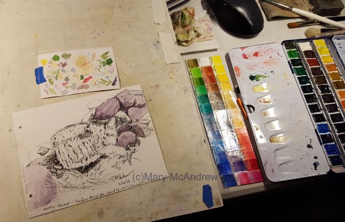
I did this study back at the end of December, the sketch was done outside and I painted it near the woodstove heat at night! I’ve included lots of pictures to show some stages of painting and other fungi I found.
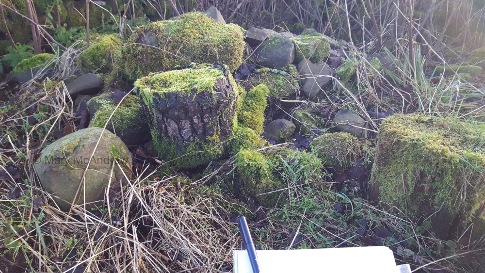
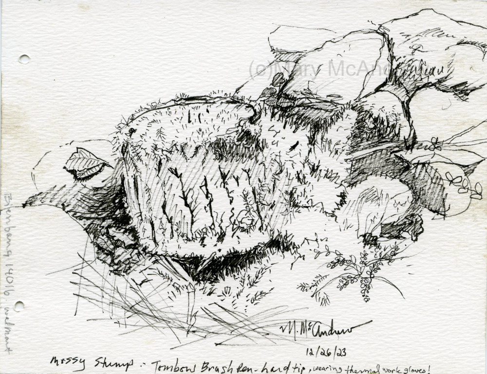
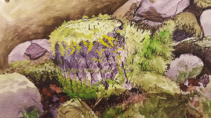
My view of the stump and rocks covered by moss.
This is the view I had from my place on the damp, cold ground. It’s just a pile of rocks and old stumps but I’m drawn to the deep cracks and crevices that connect them all like a puzzle. When I draw this kind of subject, I usually get a bit lost with all the crevices and rocks, but being that it’s a natural subject, you can just adjust it as needed so it looks ok.
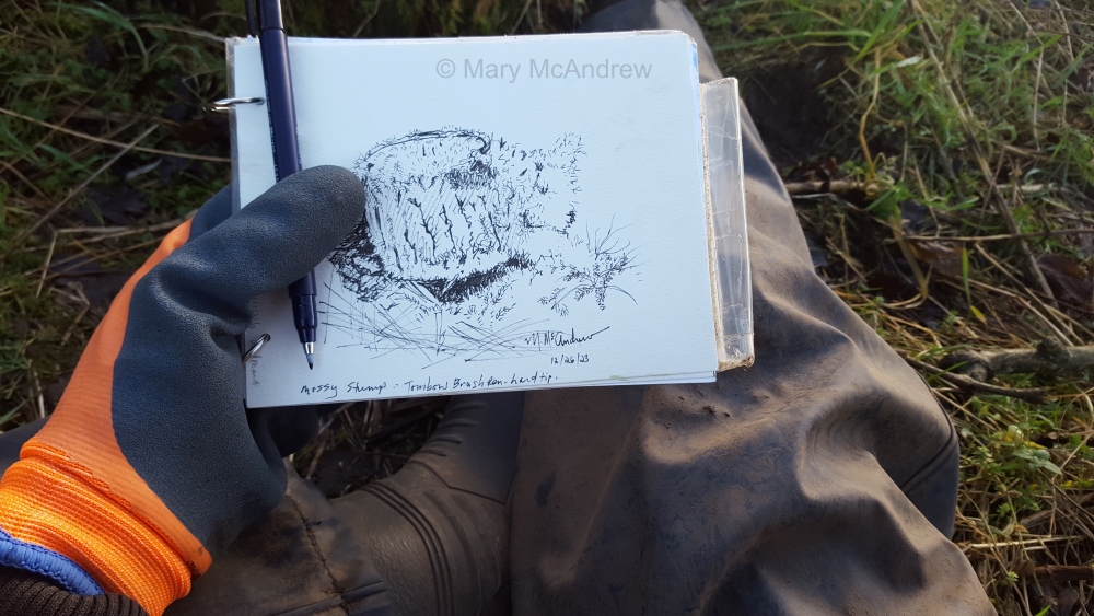
My sketch in progress.
Above shows the size of my sketchpad and the thick thermal gloves I wore. I also had my rubber gardening pants and Wellies on because it was so cold and wet on the ground.
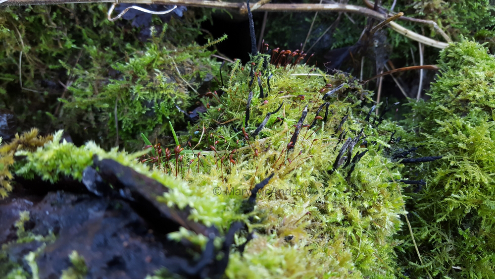
Deadman’s Fingers on the old stump.
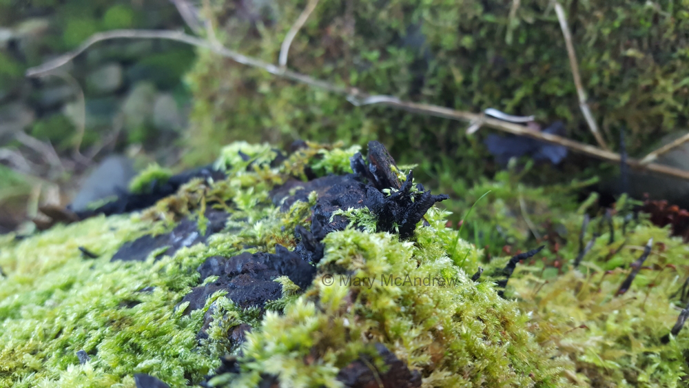
The pictures above and below show the interesting fungi that grows out of the stump. The fungi is either Xylaria polymorpha (Deadman’s Fingers, what a name eh?) or Xylaria longpipes. The guide says Xylaria, “look for: hard, tough, usually dark brown to black, clustered finger-like fruit body on dead wood.” Well the black fungi on this stump is much skinnier than what the book shows, but maybe it’s because it swells up at a certain time of year?
Another view of the fungi, Deadman’s Fingers, and lots of soft moss.
Mossy old stump with many interesting fungi growing on it.
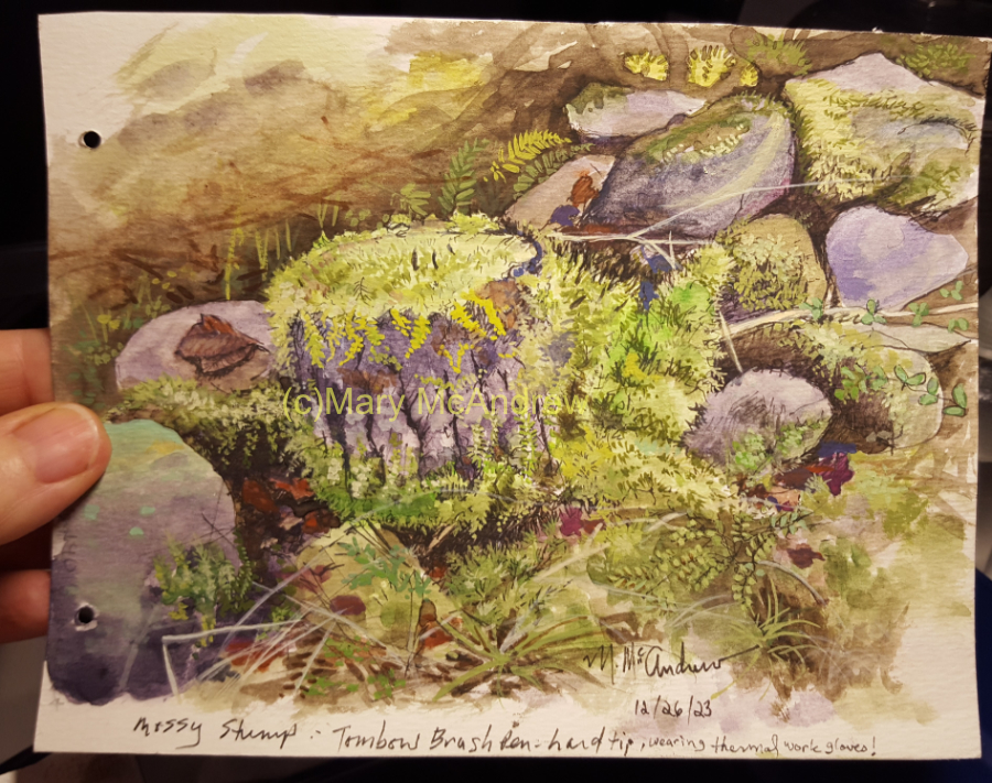
This is the sketch I did outside in my small field sketchbook. As it says on the bottom of the drawing, I wore thick, thermal work gloves while drawing, a difficult task! And I used a new pen I’ve not tried yet, “Tombow Brush Pen”, hard tip, I thought it would be better for making quick marks in the cold. I also bought the softer tip version, which is in my field bag to experiment with also.
Painting at night from photo reference, using my new Van Gogh watercolors.
Above shows my Van Gogh watercolor set, the color chart I did of each paint and the sketch on my board. I always keep a small bit of watercolor paper for testing colors nearby.
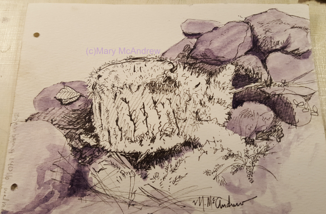
First layer of watercolor.
I used a color called “Moonglow” by Daniel Smith. It’s a dull purple color I’ve used before for underpainting rocks and like experimenting with it.
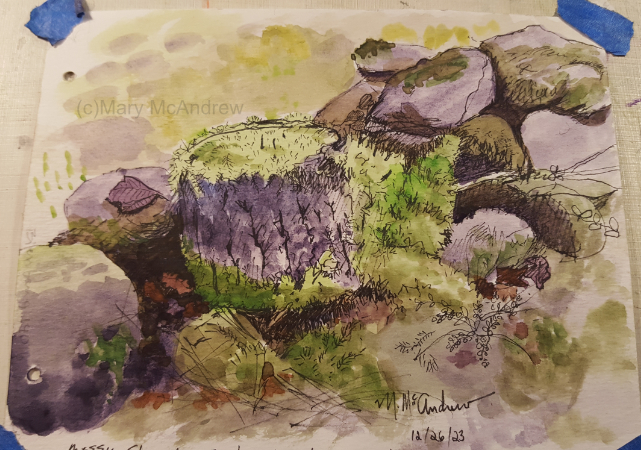
Above shows more layers of watercolors to build up colors.
Adding gouache for the mosses.
Now that the watercolor layers are on I start to add gouache, which is opaque and is great for building up the texture of the moss. If you plan ahead, the gouache can really stand out nicely, especially on dark areas.
Finished study.
This is the study finished, I took this with my cell phone camera at night in regular lamp light, but the warm hue is pretty close to the original.
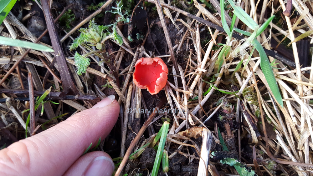
Scarlet Elfcup – Sarcoscypha austriaca, beautiful little red cups hiding in the grass.
Every year, since we’ve moved to our property in the Scottish Borders, I’ve spotted this tiny Scarlet Elfcup growing. It springs up in Autumn under the huge ancient Ash tree in our paddock, but so small I have to be careful not to step on it. I picked up a few sticks and placed them to form a square around it, just to help me see it and not step on it.
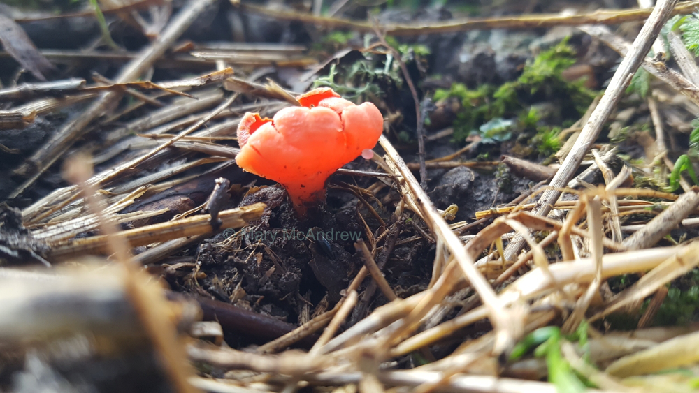
A second Scarlet Elfcup!
This year I was lucky and found yet another little Scarlet Elfcup. I’m hoping it spreads more every year.
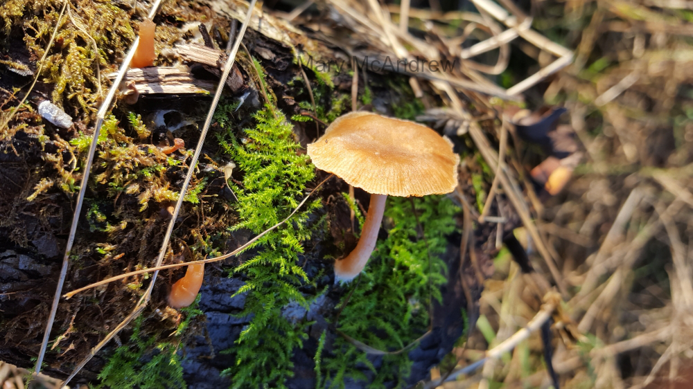
Mushroom growing on dead Hawthorn branch.
I don’t know what kind of mushroom this is on a fallen dead Hawthorn branch. You can see several stalks from others that broke off, they are quite small and delicate.
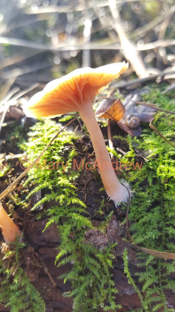
Underneath the tiny mushroom.
Here is a view from underneath the mushroom, showing the gills. I love the fine, soft looking white threads around it’s base, I’m not sure what they are.
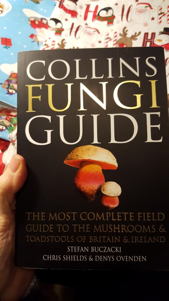
The best Christmas present ever!
This was my favorite present from my husband this Christmas, over the new clothes, treats and bath powders etc, I was so excited about getting this book! Does that make me a ‘Nature Nerd’?
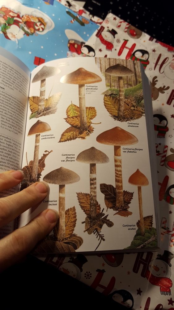
It’s full of clear illustrations.
The book is full of clear, well painted illustrations. The introduction is full of clear diagrams and information about fungi in general and it’s a great place to study to learn more about them. Though the book is well illustrated, I still find it very difficult to positively identify each mushroom I find. I belong to a group or two on Facebook for mushroom and fungi identification in the UK, I don’t know what I’d do without them!
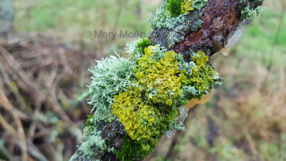
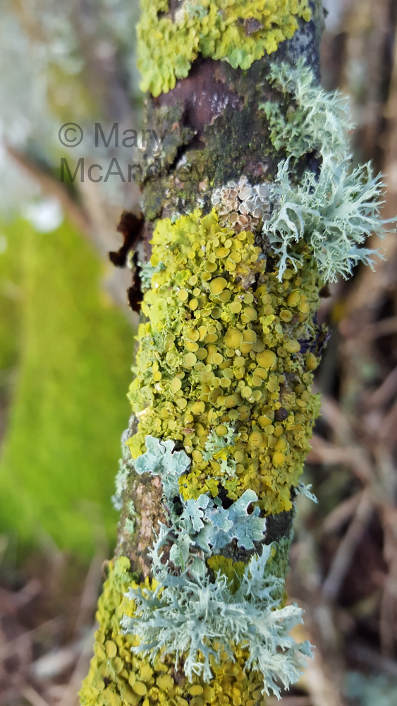
Gorgeous lichens on fallen branch.
This is a branch I picked up under the old Ash tree, covered with lichens. I’m learning more about lichens as they really are fascinating and beautiful, BUT I admit it’s super hard to identify different ones unless I share it on the Facebook lichens group where the experts can tell me what it is! I know there are different groups of lichens like Foliose, Crustose and Fruticose. I should’ve shared these pictures on the Facebook group to find out what kind these were, I will sometime. But as an artist the first thing I’m drawn to are the colors, the textures and form. I’m just fascinated as I look closer, at all the little cups and branches!
I mean look at all the tiny little round ‘plates’ on this lichen and then the difference in their colors. I love the limey green yellow color of the crusty one and the pale mint green of the branched foliose one. If I do some painting studies of lichens then I’ll find out the names of them too and share them. I bought a book on Lichens by Frank S. Dobson, but really it’s still waaaay over my head! I never knew there were so many kinds.
Well I guess that’s enough pictures and talk about mushrooms and lichens! Even though I don’t post updates a lot, I am working very hard on finishing up the first draft of my first Children’s Book. It’s all new to me so it’s taking much longer than it probably should! I’m also messing around with updating and changing things on my website and adding a proper shop, but these things take time when you do it all yourself. It’s frustrating when all I want to do is paint and admittedly work in the garden!
Please leave comments or ask questions, I love reading the comments from all over the world.
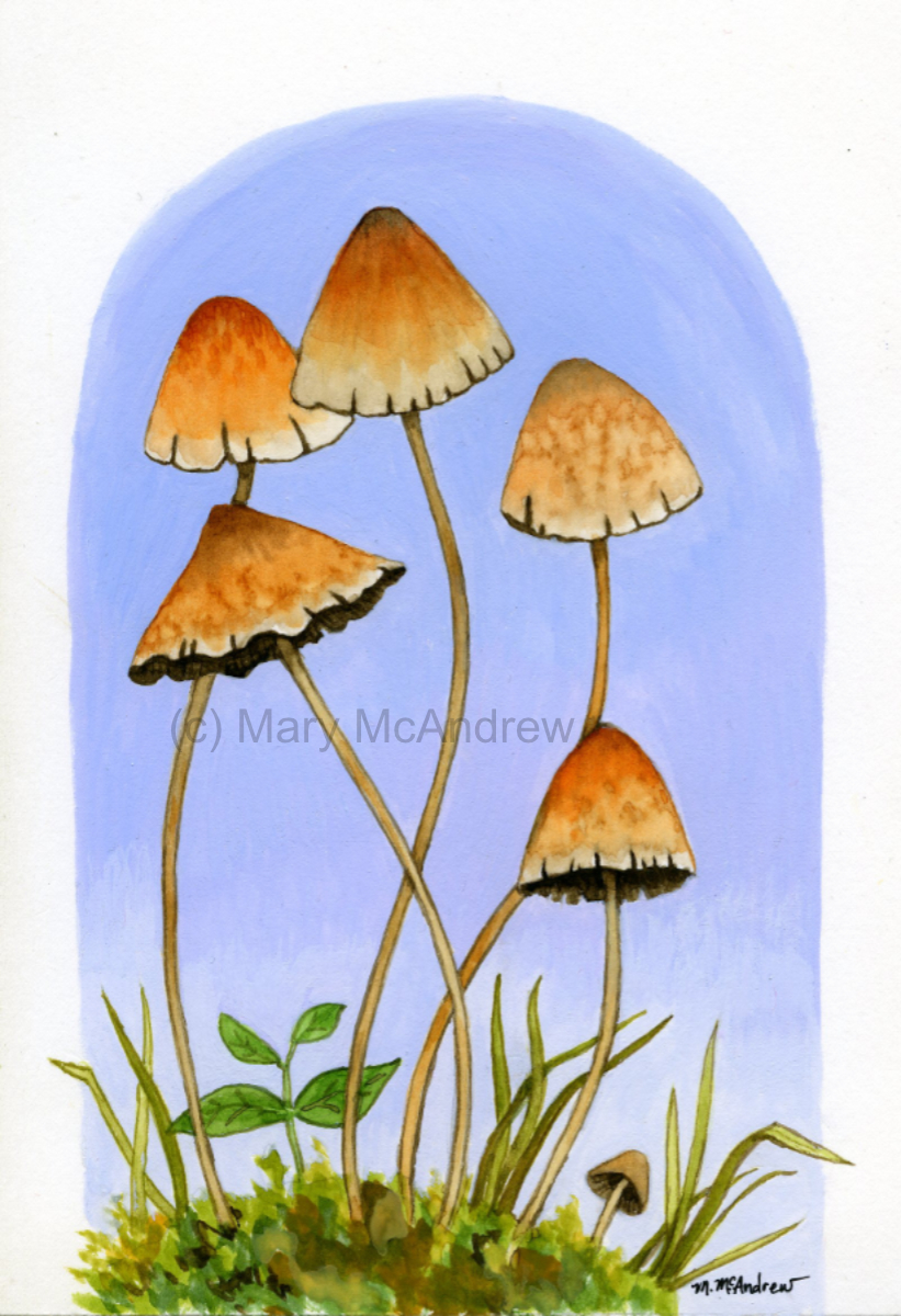
The painting above I did while following a Youtube video, something I’ve never done before. It was fun to try colors and techniques that someone else was doing. Mine came out very different because I played around with making the speckled spots with my own technique of dropping water onto the paint. What I liked also was the idea of using gouache to paint the background, something I never tried before. I did mine in the blue tones, lighter towards the bottom. It’s good practice to do in gouache, which are harder to keep even and flat looking. I thought the blue would offset the orangey tones in the mushroom caps.
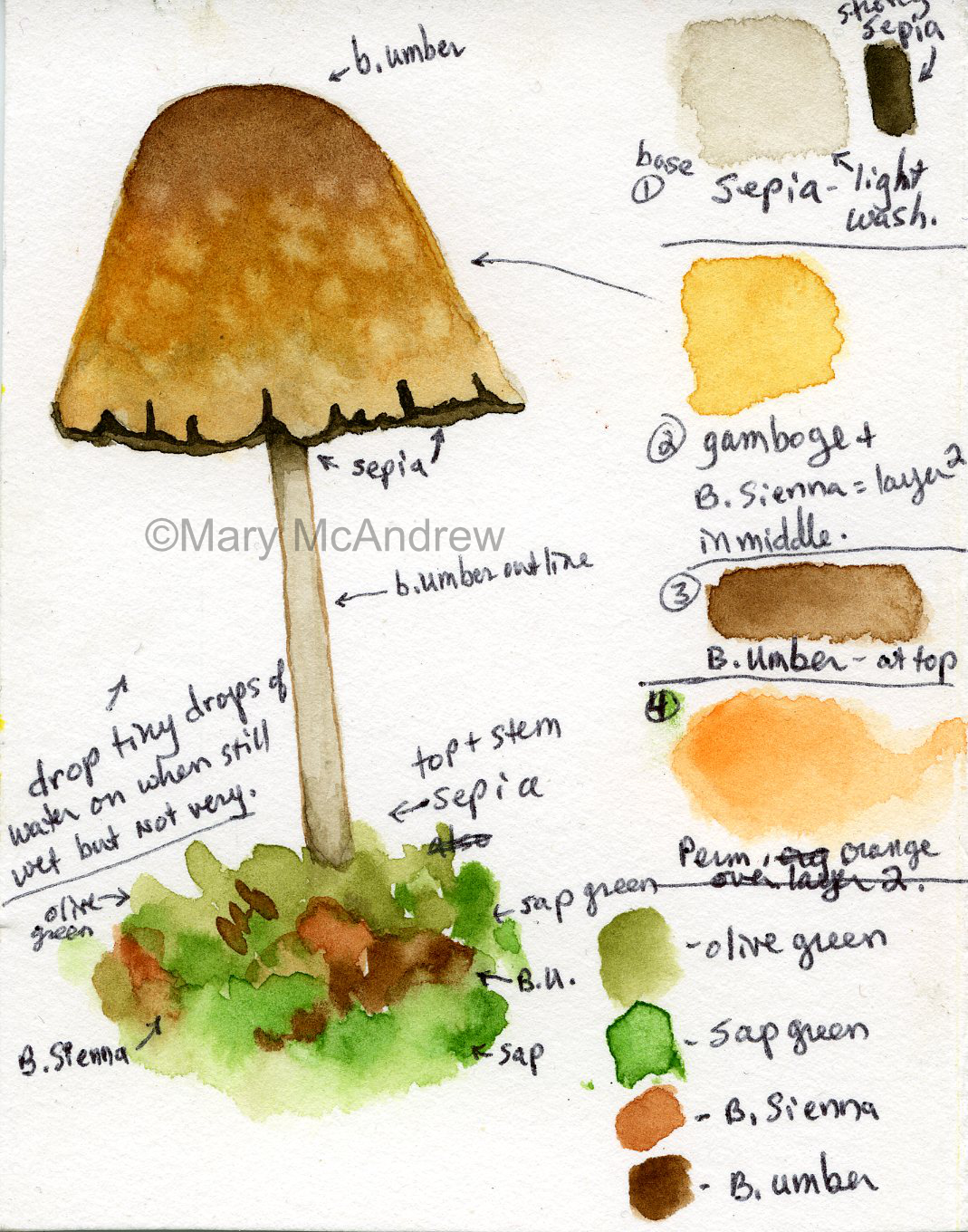
Mushroom watercolor with notes.
I like taking pictures of mushrooms when we go out walking and love doing studies from them. Over the years I’ve paid a bit of attention to the different types but have never really gotten into learning the various families of fungi. Some people go nuts learning what mushrooms are edible, I would NEVER go that far! But I would like to learn at least the different groups. The study above is just made up, not from a real mushroom. It uses similar colors that were used in the study from the video, I noted them next to the study so I can refer back to it if needed later. I think the best thing I learned was using sepia, usually such a dark color, very watered down, was perfect for the ‘mushroom’ color of the stem.
Colorful mushroom study.
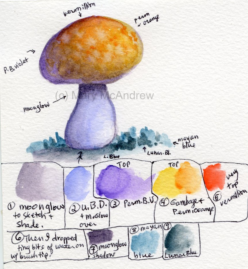
The study above was really fun to do. I thought I’d try using purples for shadows and let it get quite vibrant. The oranges of the cap really sing with the purples next to them! I used “Moonglow” by Daniel Smith, in the darker shadows. This is a great color to lay in shadows, as it’s pretty toned down in chroma, or dull. I liked putting the bright yellow on the right which really glows. I used Lunar Blue and Mayan Blue (both Daniel Smith) for the blues on the ground, mostly just to play with them as I don’t use them much.
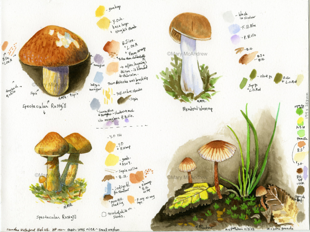
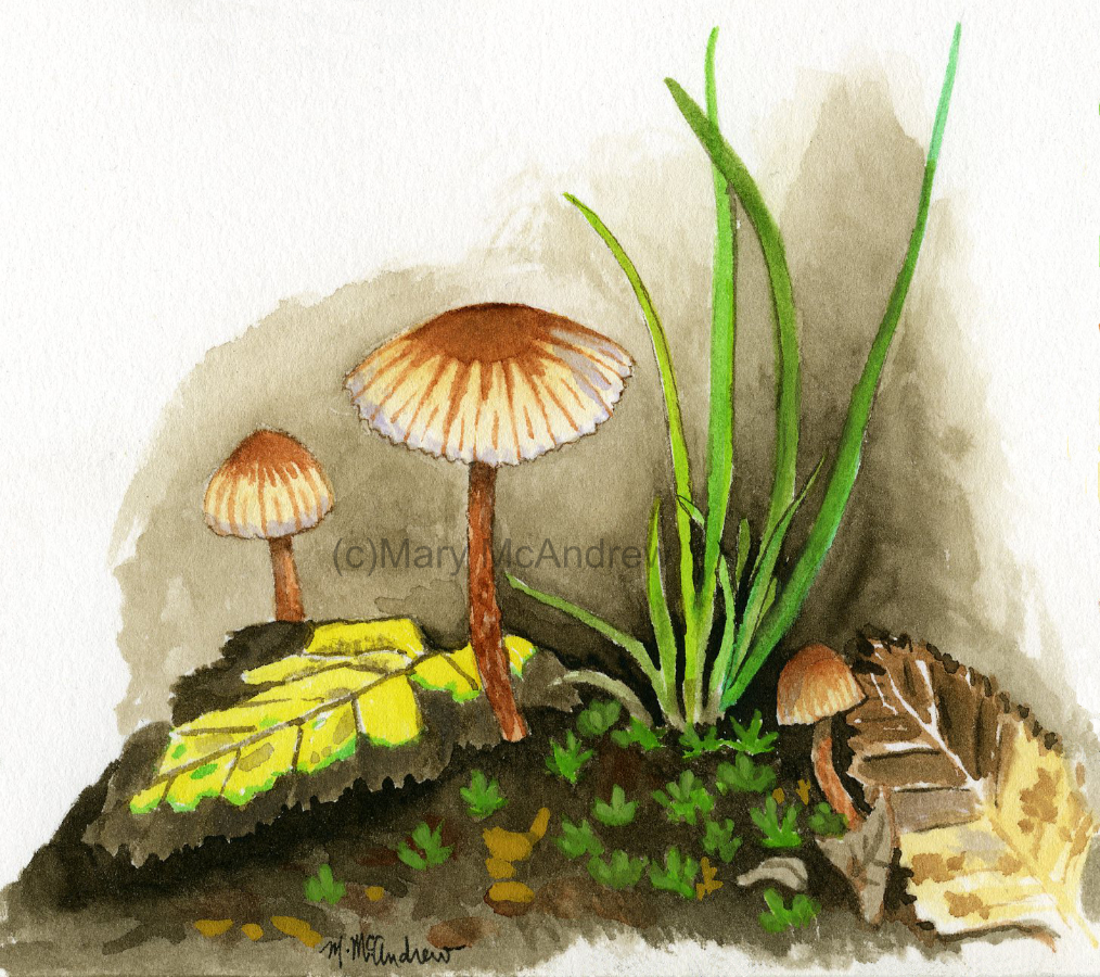
Complete page of mushroom studies in watercolor.
The studies above are all on the same sheet, what a fun time I had doing these! I put color swatches next to each one and labeled them, so I can refer back to them as reference. These mushrooms are all from photos of real mushrooms, only the bottom right one is from my own garden, the rest were just images online.
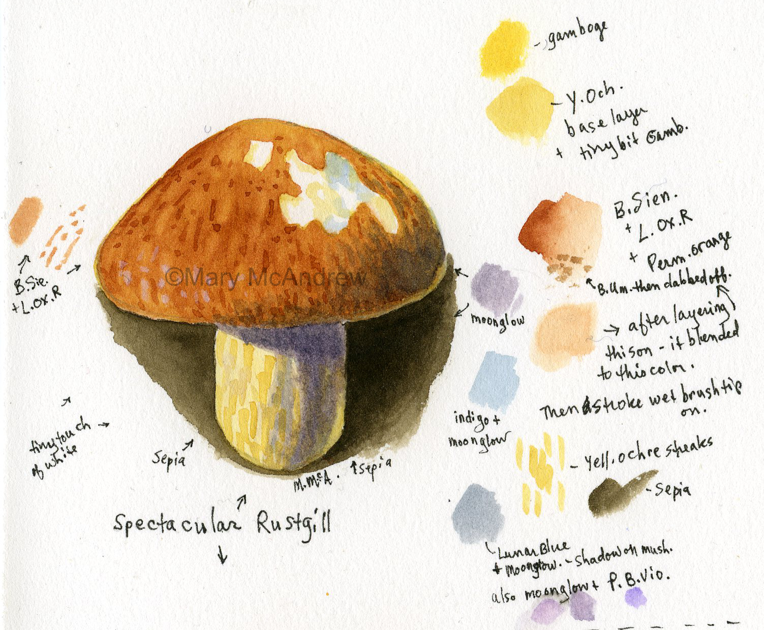
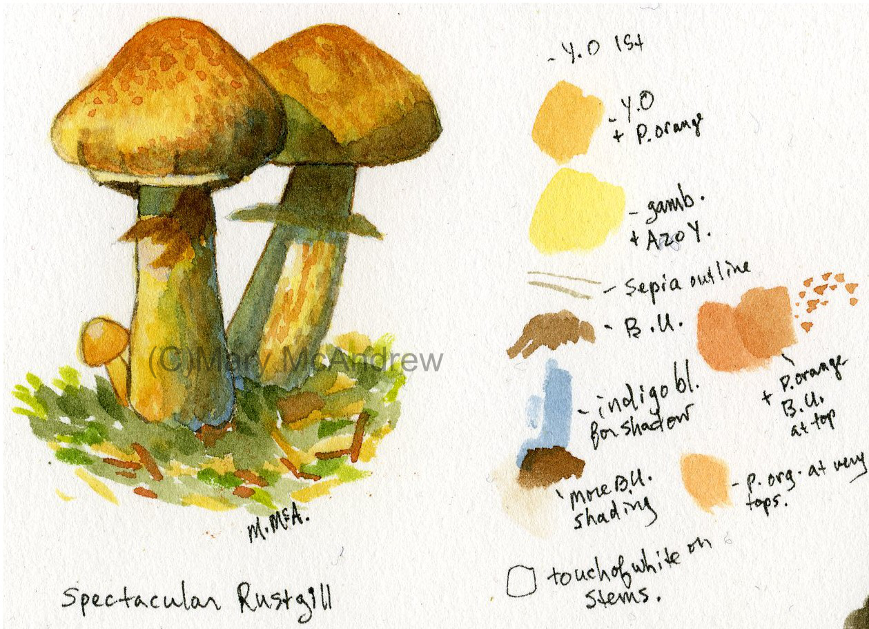
Spectacular Rustgill #1, mushroom, watercolor with notes.
The mushroom above is a “Spectacular Rustgill”. I really like how the cap looks, especially where it’s been chewed on. I used the purple “Moonglow” as the shadow under the cap.
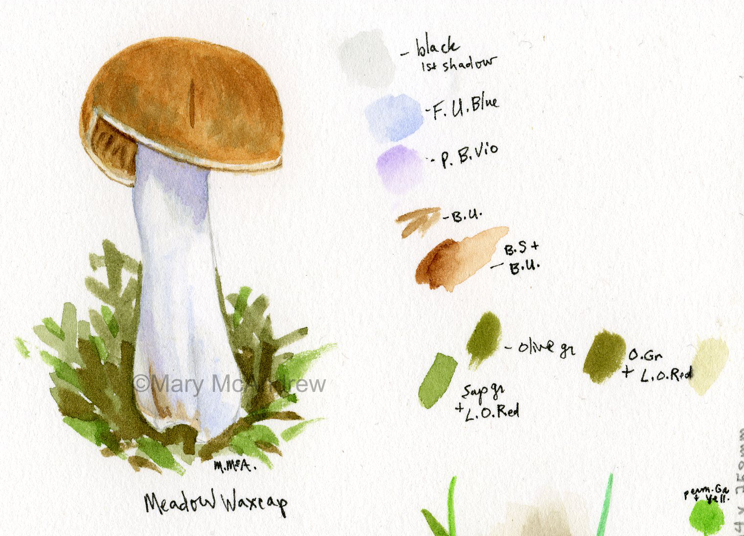
Meadow Waxcap with notes.
This is a “Meadow Waxcap”, another one I’ve never seen in real life.
Spectacular Rustgill #2, watercolor with notes.
Two more of the “Spectacular Rustgill” mushrooms, well three if you count the teeny one at the base. I like how this one came out with the shadows and colors.
Tiny mushrooms in vegtable garden, watercolor.
The study above was from a photo I took in the vegetable garden. While weeding under the brassicas I saw these tiny mushrooms and snapped some pictures using my cell phone. I had to get on my elbows to get close enough, and as usual suffered some pretty muddy patches on my coat. I like the fragility of these tiny types of mushrooms and the way the color streaks down the cap. They really were very tiny and delicate.
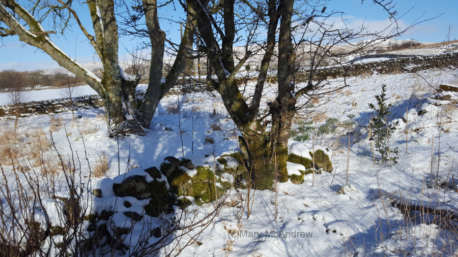
We had about two inches of snow last night, everything is covered in a soft white blanket. All our flowers that were finally coming up are now covered but at least the daffodils haven’t bloomed yet.
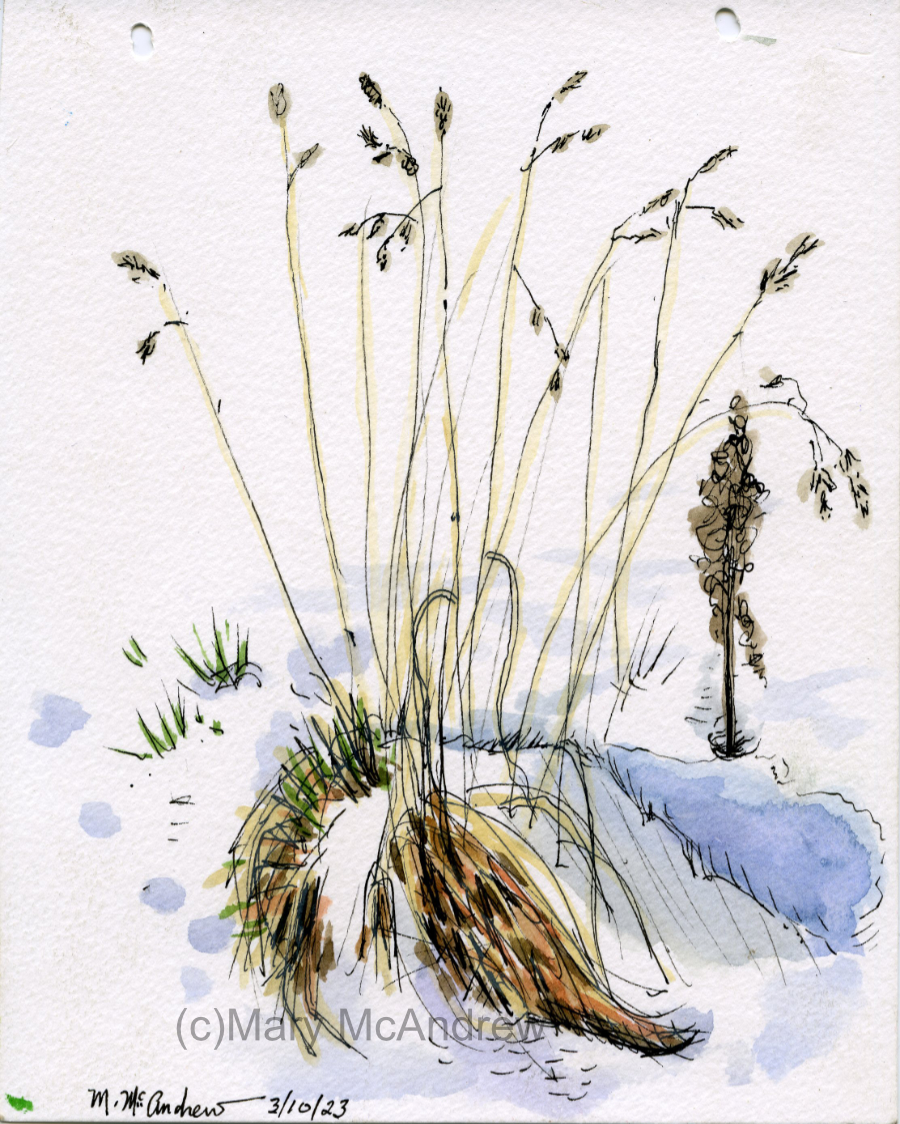
Above is the Hawthorn I painted not long ago, and I’ll be putting a post up about that soon. I’m following fox tracks in the snow and they led here, then it jumped up on the wall and walked behind the tree! I love following tracks in snow to see what story it tells, guessing at what happened in the night.
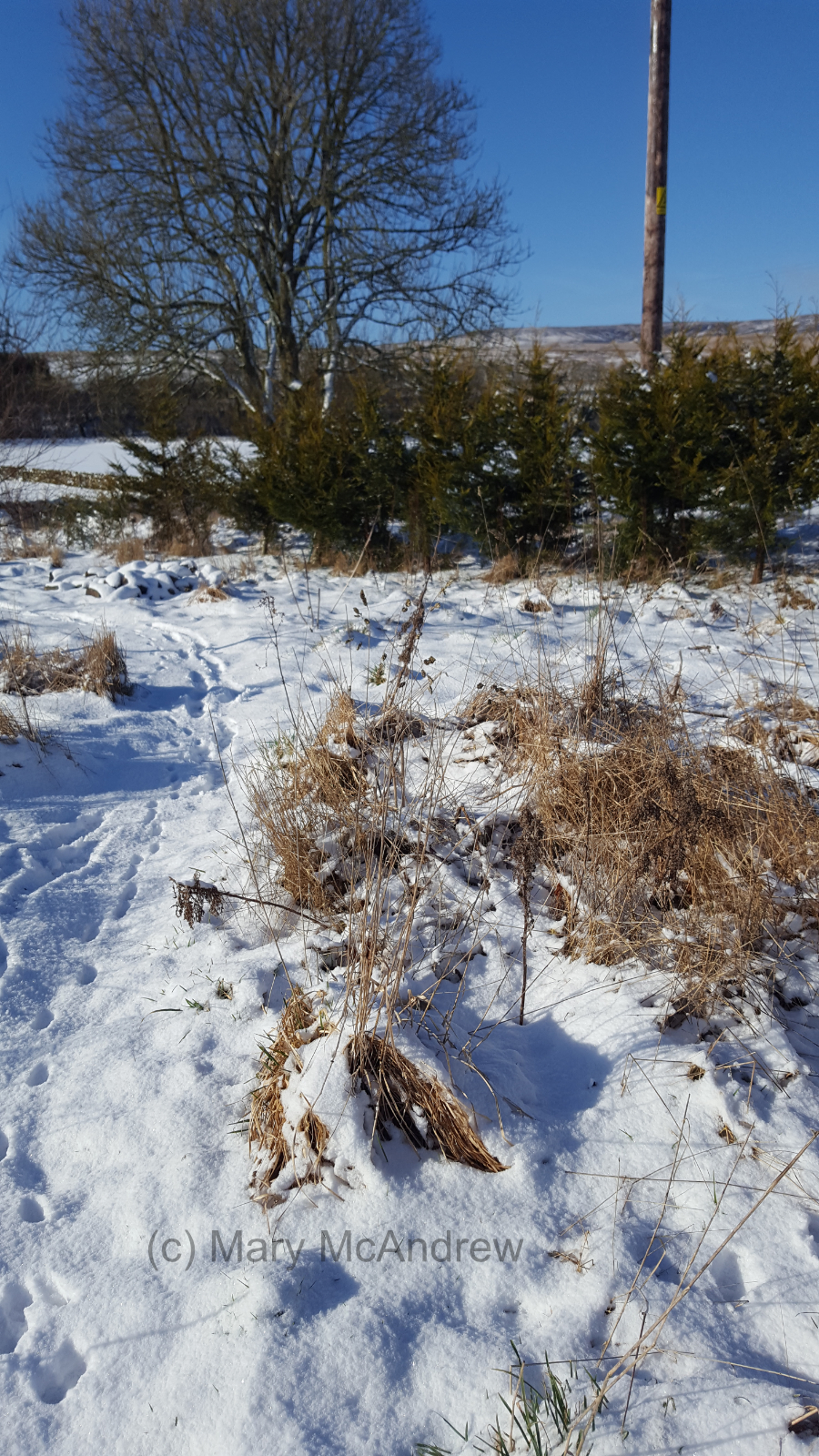
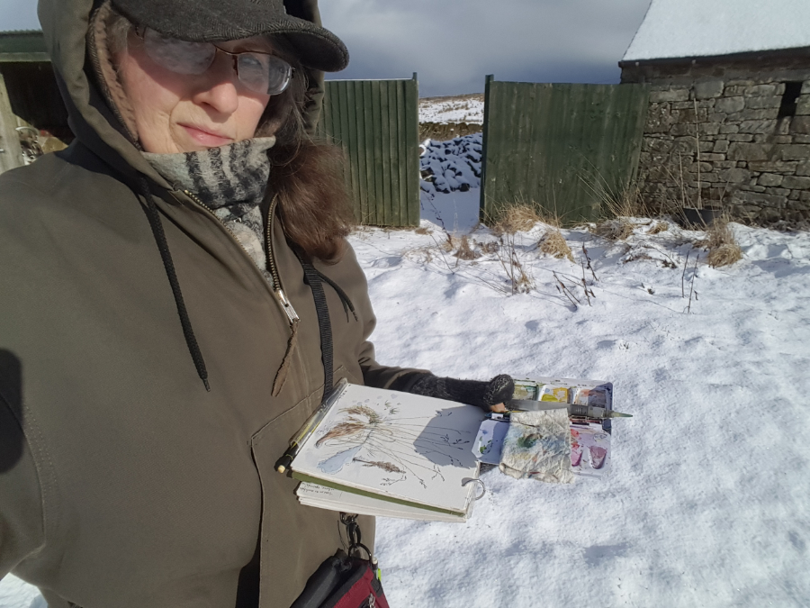
The tracks led here also, where a fox jumped and hopefully got a vole! I did a Youtube video talking about it and will link it at the end. The grass clump above is what I decided to draw.
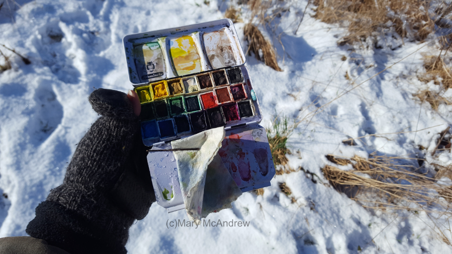
Here’s my little field watercolor palette, holding it in one hand with my fat mittens on!
It’s hard to take pictures while holding things!
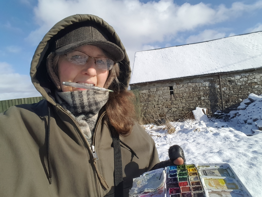
I was trying to show how I hold the sketchbook against me and the palette, both in the same hand. I used to have a small hard panel that I would clip them to, I’ll have to revisit that idea! Kind of like a clipboard but skinnier.
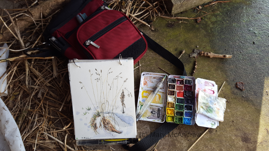
Here’s my field kit I used today, it’s a small one. I stepped into the wood shed a minute so I could put things down to take a picture and video tape.
“Grasses in the Snow”, watercolor and ink
My finished little study, I like how it came out. I put together a short Youtube video about doing this sketch and I show my field kit. Find it RIGHT HERE, give me a like and leave a comment if you can!
I’ll be sharing another post soon, about the Hawthorn tree and Mossy Wall, with lots of stages of painting to see. I’m also saving my pennies (pence?) to buy a new printer so I can get back to offering prints and note cards, stay tuned!!
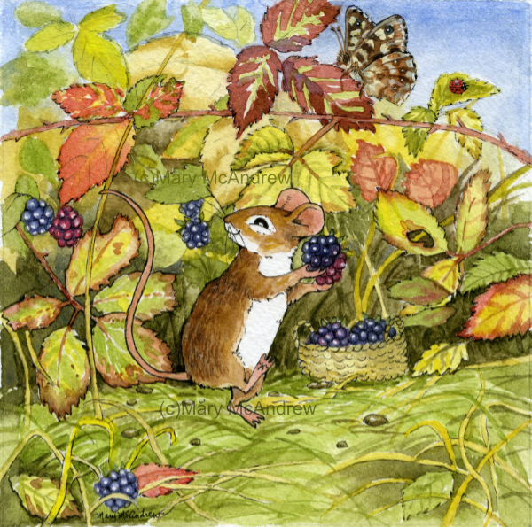
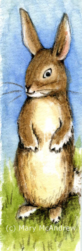
I’m excited to share my latest little illustration called “Blackberry Picking Mouse”. It’s done mostly in watercolors with only a tiny touch of gouache and it measures 6″ x 6″. It’s not for any book in particular, I just enjoy making up little scenes using mice, bunnies etc., especially when they are in nature.
“Blackberry Mouse” watercolor, ink and a touch of gouache.
I’ve created a video on my youtube channel where I talk a bit about it and then show a slide show of the stages of painting beginning to end. It’s really great to watch and see what parts appear next and see how I’ve changed some things. When you watch it, keep an eye on the butterfly!
I have a few little (square) mouse paintings I’m working on, they make such a nice collection! I’m planning to make a note card collection with them if I can save up enough to buy a printer.
Follow this link to watch the video on my channel, and please leave me a comment there of what you think about it. https://www.youtube.com/watch?v=94qef86aFeI It would be doubly great if you subscribe and share my links, that would really help me get started on the channel!
I’m finding it fun to shoot videos when I’m out in the garden, where I’ve been spending most of my time. Capturing from the beginning, our living here in Scotland in a very old stone cottage. I’m hoping to do more sharing there of my going out field sketching or maybe to show stages of painting like the “Blackberry Picking Mouse” illustration.
It really fires me up when my readers leave me comments so please do leave them here or definitely on the Video! Cheers and enjoy!
PS. I have a private video I’ll be sharing here on the website soon, of a walk Gary and I took, it’s just music playing, no talking. I really like it but we’ve decided for this one to keep it just for the folks who find it here on my website!
It’s been such a long time since I posted here on my blog. We’ve all been through quite a lot the past two years haven’t we? Well to add to my stress and at the same time happiness, we’ve moved from England to the Scottish Borders! Moving during a pandemic when they kept closing the borders was so stressful, but we’re moved now and getting settled in.
This is one of the first paintings I did at our new place, while standing in our back garden looking at the hills and sky. It’s a very small watercolor and I wrote the names of birds I could hear at the bottom while I painted.
We are still discovering just how beautiful our new area is, the Borders are wild and quiet, just what we like. The whole process of moving and settling in and creating new garden beds has and continues to, take lots of my time.
I unpacked paintings I hadn’t seen since I moved to England, has it been 6 years? More? They are like old familiar friends, and now many are hanging up where I can see them.
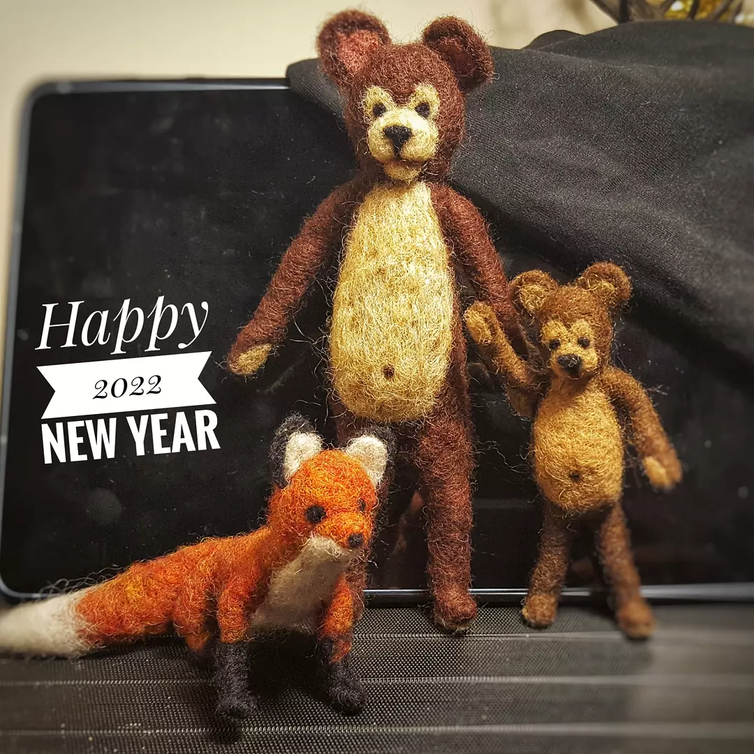
I will be focusing on getting a new printer set up and organizing proper selling of my prints and originals from my website. I’ve never had the chance to really do it right! Now I also have the fun little needle felted characters which I look forward to making available to buy soon.
Some new friends! I love creating these one of a kind characters, totally posable and unique!
I have a YouTube channel that has been sitting waiting also, so lately I’ve been adding videos so I can get back into it. Now with the house, gardens, new studio set up, new lands to explore, I’ll have lots to share there! Please go look, “Like” and hopefully “Subscribe” to follow my endeavours! Here’s the link: https://www.youtube.com/channel/UCnrD9rYXZ6KWYeDRElAvGyw I’ll get better at it as I go, I’m learning a new video editor called “ShotCut”.
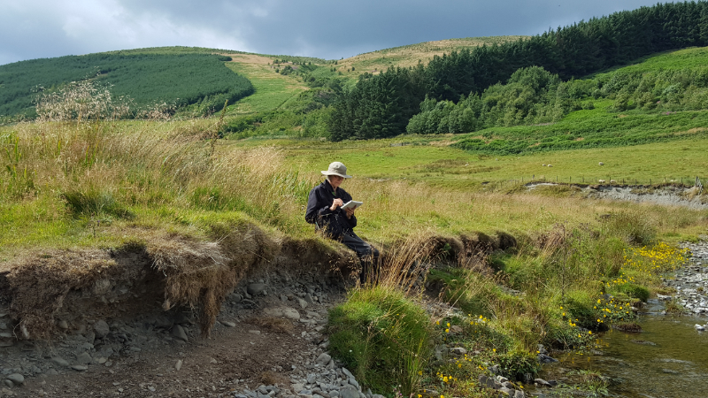
Here I’m sketching along the river near our house, just up the valley. I need to get out to do this more often, the garden has been keeping us both busy!
I have really missed sharing here and can’t wait to get back to it. I have lots of new artwork to add to the Gallery too. What’s been holding me back in many areas is just figuring out how I want to redesign my website Galleries. I’m also having trouble receiving email notifications when someone leaves a comment! I need to find help for that issue with Word Press.
Finally I got my watercolors and color pencils set out, here I am working on an illustration for my new granddaughter, I’ll share more about that later!
So, has anyone missed me? What have you kept busy with during this pandemic and are you OK? I miss talking to the great people who leave comments for me here, you always inspire me to keep creating!
I’ll share some pictures below of our area and some more studies.
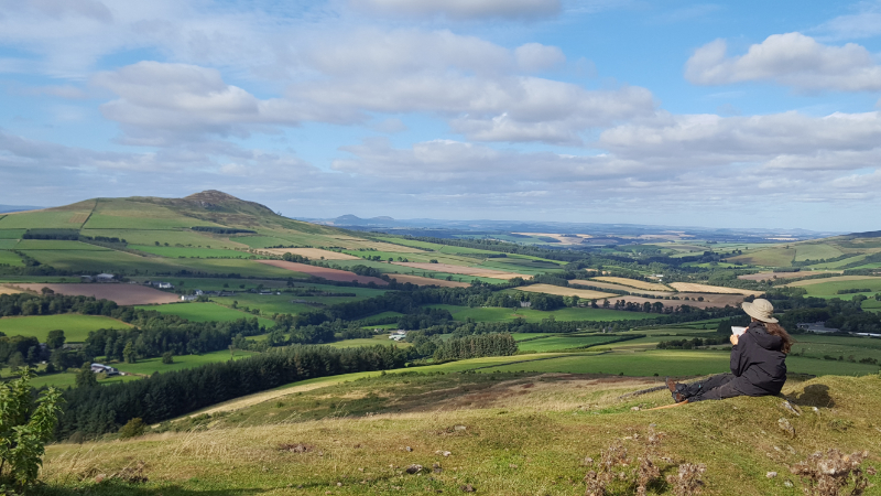
Sketching “Rubers Law” from the top of “Bonchester HIll”, and boy was it windy and cold! Very hard to draw, but look at that view!
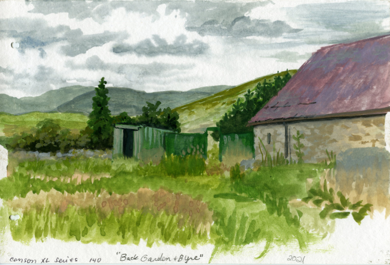
This is a small unfinished gouache study of our back garden and byre (barn).
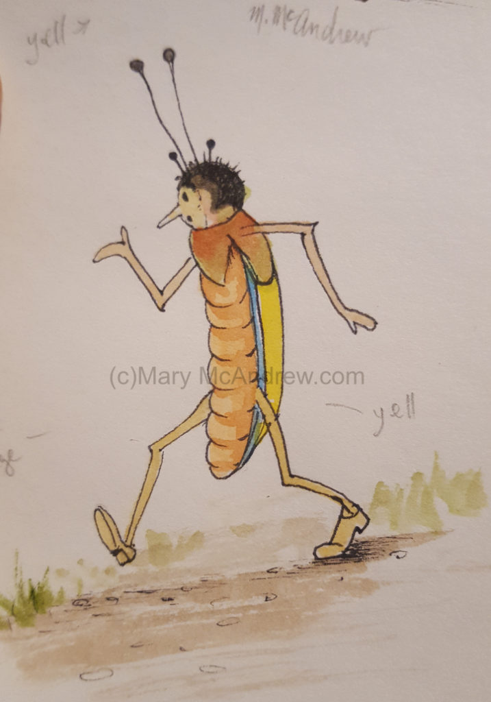
One of my illustration studies, I love the ‘old style’ like this and find drawing bugs really fun!
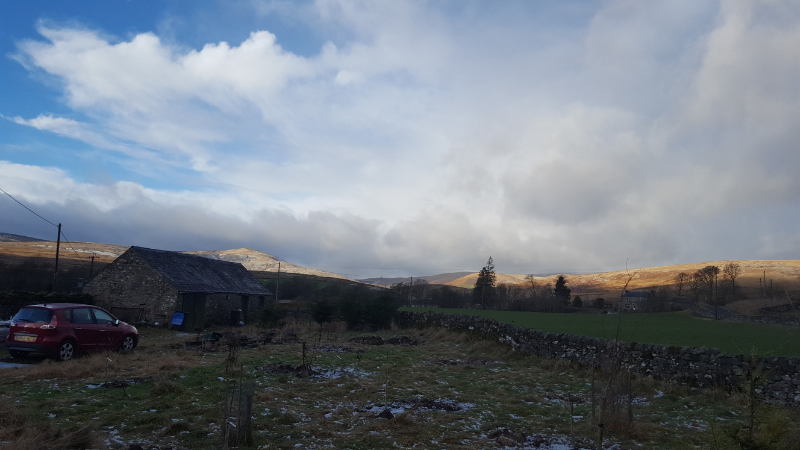
On a cold day, the sun is lighting up the hills far to the west. This is looking over our garden in the front where we are creating a small orchard.
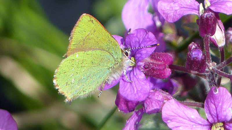
There’s also new wildlife to discover here, this is a Green Hairstreak butterfly, with metallic green wings! It flew up out of nowhere when I was by the byre and settled on the Honesty I had planted. I was so excited!
Well that’s all for now, so much to share! Please don’t be shy, leave me a comment and I’ll check back here to reply to all. I hope you’re all keeping well, see you soon with another post or YouTube video!
Hello and welcome back for Watercolor Paper Testing – Part 2! My last post I had done some small tests to get started, and explained about the fall I had. Well I’m pretty much healed from that and getting back on track.
Hello there!
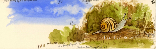
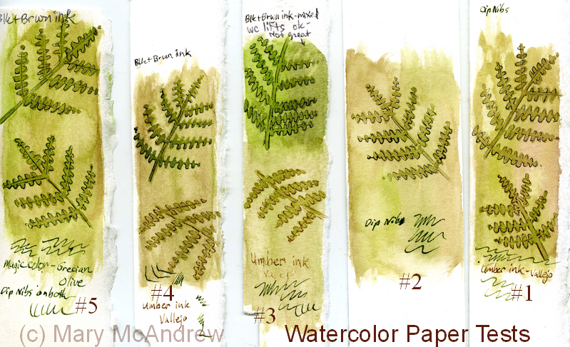
First I want to say, if you just go by what I say worked for me, it might help you decide on a paper you’d like to use, BUT WAIT! I highly recommend doing some testing of your own, you can follow my example or try new things on your own. I made a list of the techniques I was most likely to use and then did a simple, similar picture on all of them. I used 11 different papers, all ordered from Jackson’s Art Supply, my test sizes varied from about 5″x6″ to 3″x 6″, so they were small. It took me several days, of sitting down when I could, to work on each test criteria.
1.First label all your test peices of paper with what the paper is, the weight, type etc. One nice thing I ordered was the St. Cuthbert’s Mill sample pack of seven different papers; it only cost .50p and the peices were large enough to really play around with. Each of them was fully labeled too.
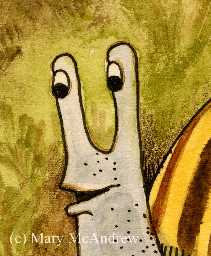
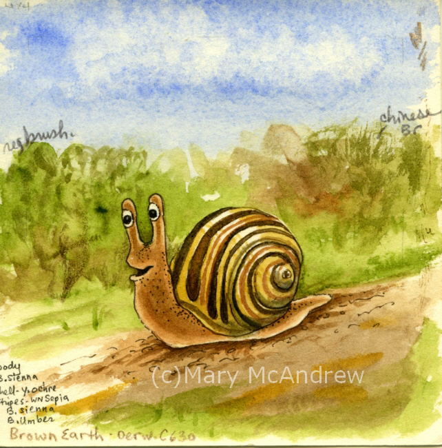
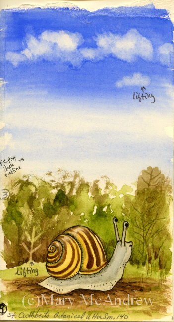
2.Make a list of the techniques you want to test on notebook paper; I will include my criteria list below. I decided to do one character (snail) on each and a simple dirt path, green bushy background and a sky with clouds. The sky allowed me to do a big simple graded wash, drop water in for clouds, and test by lifting with clean wet brush.
Clouds
3.Do one technique at a time on each one in succession. This way you’ve got the same colors mixed, and can use the same brushes to compare how they go on each paper. Write down what you thought after each thing you test or you’ll forget. I did this on note paper then after I was all done I wrote them down on the back of each paper test. So years from now you can dig around and find them you’ll know what’s what.
OK, here’s my list of criteria I tested: (all done on dry, unstretched paper)
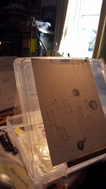
Can you trace through the paper using a black ink line drawing underneath? I traced different snails on each one.
Does pencil erase easily?
Wash layers- do they stay or lift too easy when new layers go on? Tested in bush areas, ground and sky (I wet paper with a brush first for this one).
Lifting- do dry watercolors lift off when you rub/lift using damp brush and paper towel? On each I lifted a tree shape, like “stems” in the green bushes. Then on most I also lifted some of the dry blue sky.
Dry brush technique. Mostly the bushes and some ground areas on each.
Draw with dip nib and ink. I drew each snail with dip ink and nib, going over the pencil lines I traced.
Scratch wet paint areas to see if dark lines appear. You’ll see some thin lines of color in the bushes, these were made by scratching into the wet paper where paint was laid down.
Color pencil on dry watercolor areas, how do they go on? I mostly did this in the bushes around the snail, some on the ground using dark browns.
Permanent ink pen, ease of drawing on paper? Used to outline each snail and some details on the ground.
Clouds on damp blue sky, drop clear water on and some lifting with paper towel.
In general how does paper take the paint?
(other things you may want to test that I did not: using masking fluid, scraping off dry layers of paper with sharp knife, dropping salt on wet paint, whatever you may usually do when painting)
Please click each picture to see it enlarged.
Testing ability to trace through the paper from my drawing.
This is my simple set up for tracing I used on this project, (sorry for the dark picture) it’s a clear plastic flat “scrapbooking” type container. I like using these containers to hold my illustrations and lately have been using one as an easel/drawing table. I put a peice of rubber shelf liner underneath it, and can tuck reference photos and drawing stuff inside. I hold the top up with different sizes of masonite or plexiglas depending on the angle I want; here I used plexiglas so it lets more light through. I put a strong little lamp behind it on the table and set my drawing that I’ve inked in black on top. Next you lay your watercolor paper on top and trace! *Note- I taped a carpenters pencil along the bottom to keep papers and boards from sliding off, it works pretty good for now. *Note 2- you can also trace using a bright window; tape your inked drawing up and then your watercolor paper on top. Use light pencil lines, don’t score into the paper, you’ll want to erase most of your lines anyways so draw light!
Now I’ll post pictures of each sample and tell what paper it was along with what I thought about it. Prices listed were at the time I bought them. Click on pictures to see larger.
Beginning sample for watercolor paper test.
This sample has no number because it’s a scrap peice of watercolor paper I grabbed and for each technique I gave it a go on here 1st as a warm up! If you’re worried about messing up your paper don’t be afraid to loosen up on some scraps first! this helped me to think of what techniques I wanted to try.
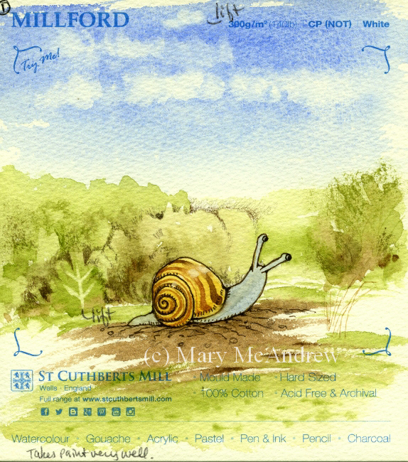
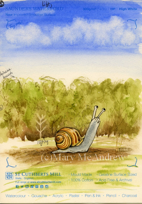
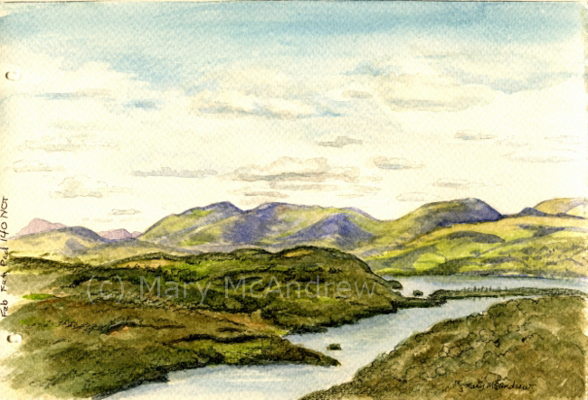
#1 St. Cuthbert’s Mill, Millford, 140lb, CP (NOT) White
#1 St. Cuthbert’s Mill, Millford, 140lb, CP (NOT) White. 22″x30″ sheet = £ 4.10, 9″x12″ cut peice = .82p. (all papers with blue type on them are from the St. Cuthbert’s Mill sample pack) 1. Traced through well enough, a bit rough. 2. Erases well. 3. Washes went on great, no hard edges. 4. Lifting dry color- this paper worked well. You can see the little ‘tree’ stem area in the green bushes, that was done by lifting, and at the top in the sky. 5. Dry brush was good, rough areas in bushes. 6. Ink and Nib- went on well, a bit rough but good. 7. Scratch test-worked but wasn’t very strong, may need to try more. 8. Color pencil- great, bit of texture. 9. Permanent ink pen- ok, a bit rough for long drawn curved lines (snail shell). 10. Clouds- worked well, soft edges. 11. Paper took the paint really well, nice texture on ground edges, blue sky washes even.
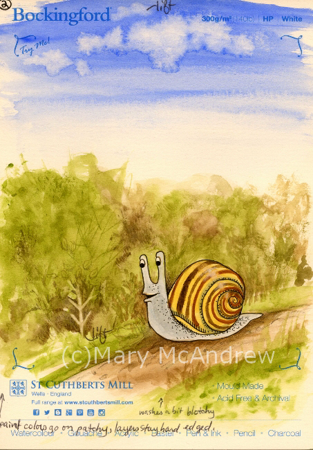
#2 St. Cuthbert’s Mill, Bockingford, 140lb, HP White
#2 St. Cuthbert’s Mill, Bockingford, 140lb, HPWhite. 22″x30″ sheet = £ 2.10, 9″x12″ cut peice = .42p. 1. Traced through very well, smooth. 2. Erases well. 3. Washes- went on blotchy or patchy, layers hard edged. 4. Lifting dry color- worked well, see ‘tree’ shape and tiny cloud at top. 5. Dry brush-ok, not bad but a bit blah because of paper smoothness. 6. Ink and Nib- went on well, smooth. 7. Scratch test- worked. 8. Color pencil-good. 9. Permanent ink pen- very easy to draw with, smooth. 10. Clouds-Interesting, with water dropped in it formed harder dark edges, which I could have softened with lifting, but it was neat. 11. Was harder to float washes, paint colors got patchy.
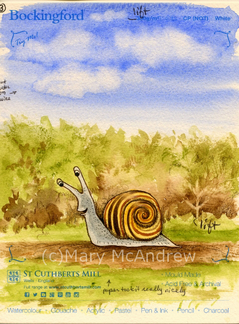
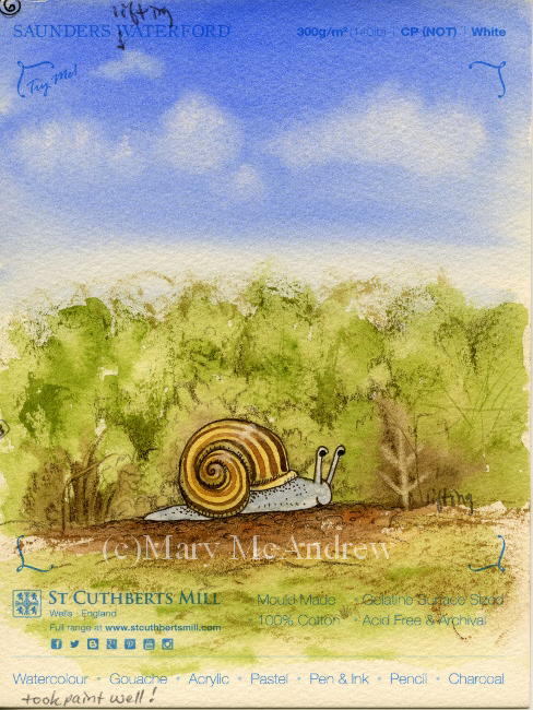
#3 St. Cuthbert’s Mill, Bockingford, 140lb, CP (NOT) White
#3 St. Cuthbert’s Mill, Bockingford, 140lb, CP (NOT) White. 22″x30″ sheet = £ 2.10, 9″x12″ cut peice = .42p. 1. Traces well, tiny bit rough. 2. Erases easy. 3. Washes- great, easy to add water to. 4. Lifting dry color- did well. 5. Dry brush- worked really well. 6. Ink and Nib- worked ok, tiny bit rough. 7. Scratch test- worked ok. 8. Color pencil-good. 9. Permanent ink pen- good, a bit bumpy for drawing. 10. Clouds-excellent! Soft edges were perfect and harder edges on bottom edges looked good. 11. Paper took paint nicely.
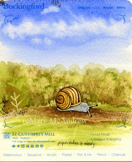
#4 St. Cuthbert’s Mill, Bockingford, 140lb, Rough White
#4 St. Cuthbert’s Mill, Bockingford, 140lb, Rough White 22″x30″ sheet = £ 2.10, 9″x12″ cut peice = .42p. 1. Traced through well enough, a bit rough. 2. Erases well. 3. Washes- layered well. 4. Lifting dry color- worked rather well. 5. Dry brush- pretty good, rough areas in bushes and ground. 6. Ink and Nib- worked ok, a bit rough. 7. Scratch test-worked, a bit pale. 8. Color pencil- not as good, a bit too rough for me. 9. Permanent ink pen- well, a bit rough. 10. Clouds- worked well, wash went on nice, made clouds really well. 11. Paper took the paint really well, nice textures too.
#5 St. Cuthbert’s Mill, Saunders Waterford, 140lb, HP High White
#5 St. Cuthbert’s Mill, Saunders Waterford, 140lb, HP High White 22″x30″ sheet = £ 3.60, 9″x12″ cut peice = .72p. 1. Traced through well. 2. Erases well. 3. Washes- went on nicely. 4. Lifting dry color- ok, not as easy as others, lifting small patch on blue sky was bad. 5. Dry brush- worked great, rough areas above bushes. 6. Ink and Nib- worked ok, a bit bleedy. 7. Scratch test-worked really well. 8. Color pencil- worked well easy to draw on to paper. 9. Permanent ink pen- great. 10. Clouds- worked well, I put clouds on with a bit too much water. 11. Paper took the paint well.
#6 St. Cuthbert’s Mill, Saunders Waterford, 140lb, CP (NOT) White
#6 St. Cuthbert’s Mill, Saunders Waterford, 140lb, CP (NOT) White 22″x30″ sheet = £ 3.60, 9″x12″ cut peice = .72p. 1. Trace through-a bit rough, not as thin, can trace but not as easy. 2. Erases well. 3. Washes- went on really well. 4. Lifting dry color- not so good, soft edges. 5. Dry brush- worked great, rough areas in bushes and ground. 6. Ink and Nib- worked ok, not too bad. 7. Scratch test-worked ok. 8. Color pencil- worked well, especially for rough textures. 9. Permanent ink pen- very well. 10. Clouds- worked well, nice and soft, blue wash went on really well. 11. Paper took the paint really well.
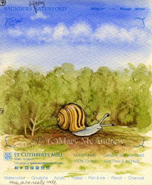
#7 St. Cuthbert’s Mill, Saunders Waterford, 140lb, Rough White
#7 St. Cuthbert’s Mill, Saunders Waterford, 140lb, Rough White 22″x30″ sheet = £ 3.60, 9″x12″ cut peice = .72p. 1. Traces through well-a bit rough. 2. Erases well. 3. Washes- very good. 4. Lifting dry color- worked well but not with sky color. 5. Dry brush- worked great, rough areas in bushes and ground. 6. Ink and Nib- worked ok, a bit rough. 7. Scratch test-worked ok. 8. Color pencil- worked well, especially for rough textures. 9. Permanent ink pen- well but can be bumpy. 10. Clouds- blue wash went on well, clouds did really well. 11. Paper took the paint really well.
#8 Canson, Moulin du Roy, HP
#8 Canson, Moulin du Roy, HP 22″x30″ sheet = £ 3.10, 9″x12″ cut peice = .62p. 1. Traces through really well, feels thinner. 2. Erases well. 3. Washes- beaded up a lot, wouldn’t go on in some areas! 4. Lifting dry color- worked very well, even on the sky patch. 5. Dry brush- worked ok to good. 6. Ink and Nib- draws well. 7. Scratch test-not great. 8. Color pencil- worked well. 9. Permanent ink pen- nice, easy to draw. 10. Clouds- worked well, don’t get too wet, it gets blotchy. Paper towel lifts easily because color doesn’t soak in too fast. 11. Paint beaded up at first then was ok.
#9 St. Cuthbert’s Botanical Ultra Smooth, 140lb
#9 St. Cuthbert’s Botanical Ultra Smooth, 140lb full sheet = £ 2.20 (slightly smaller than the others), 9″x12″ cut peice = .55p. 1. Traces through really well, smooth. 2. Erases well. 3. Washes- a bit patchy in areas. 4. Lifting dry color- worked well. 5. Dry brush- worked well. 6. Ink and Nib- ok, a bit bleedy. 7. Scratch test-ok to pretty good. 8. Color pencil- worked very well. 9. Permanent ink pen- nice, easy to draw. 10. Clouds- worked well, color lifted well, clouds a bit hard edged. 11. Paper takes paint ok to well.
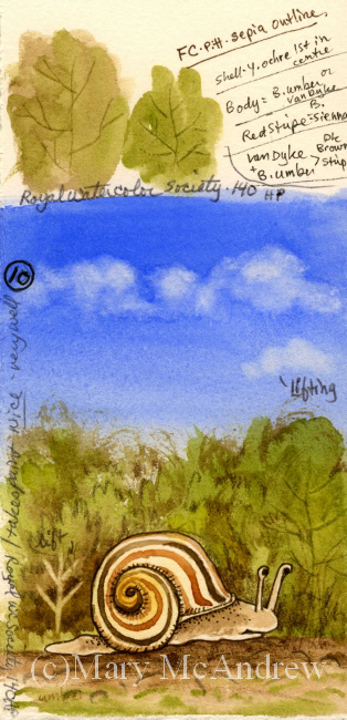
#10 Royal Botanical Society 140lb, HP
#10 Royal Botanical Society 140lb, HP 22″x30″ sheet = £ 4.70, 9″x12″ cut peice = .94p. 1. Traces through well, smooth. 2. Erases well. 3. Washes- went on nice. 4. Lifting dry color- worked well, a bit pale on sky patch. 5. Dry brush- worked well. 6. Ink and Nib- works fine. 7. Scratch test-worked well. 8. Color pencil- worked well. 9. Permanent ink pen- great, easy to draw. 10. Clouds- blue color went on nice, clouds went on very well. 11. Paper takes paint very well.
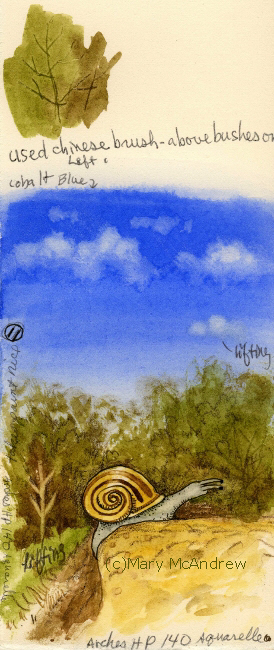
#11 Arches Aquarelle, 140lb, HP
#11 Arches Aquarelle, 140lb, HP 22″x30″ sheet = £ 5.40, 9″x12″ cut peice = £ 1.08. 1. Traces through very well, smooth. 2. Erases well. 3. Washes- went on well. 4. Lifting dry color- worked really well. 5. Dry brush- worked well. 6. Ink and Nib- worked ok to good. 7. Scratch test-worked well. 8. Color pencil- worked very well. 9. Permanent ink pen- very good, easy to draw. 10. Clouds- blue wash went on well, clouds lifted with brush and paper towel. 11. Paper takes paint nicely.
That was the last one! Whew! You can see this kept me busy for awhile. A few of the papers didn’t take the paint nicely at first, they beaded up or skipped areas. For those papers I think I would try wetting the paper first and stretch it, then see how they act. Or just take a larger peice and really wet it then play around on it. After I did the tests I wrote the price per full sheet on the backside, then figured out how much one cut 9″ x 12″ peice would be, depending on how many you could get out of a full sheet.
So what’s my verdict you’re wondering? I have to admit it’s still hard to say! For the price and how they performed for me, I have four I want to explore further.
Saunder’s Waterford HP High White- seems to work well, price moderate but a bit more than the others I liked.
Bockingford CP (NOT) white- worked well, rougher than what I’m used to, very affordable
St. Cuthbert’s Botanical Ultra Smooth- love the smoothness, low price, worked well but sometimes patchy, need further testing.
Moulin du Roy- I want to test some more, because it beaded up, but I like the feel of it and the price.
On the ones I liked I draw a little star and fill it in with really bright golden yellow, so it’s easy to spot when I’m digging in my folders.
PLEASE DO leave some comments about the paper you use and why you like it!! It would be great for everyone to share some ideas and papers that work for them here.
Happy Spring everyone, springtime posts coming soon!
Happy Spring from our village in Northumberland, England!
Since moving to England I’ve had to look elsewhere when it comes to buying my art supplies. Back in Clarence Center N.Y., I had lots of local choices for supplies, and I really miss being able to go look at and ‘feel’ things in person. Nothing beats feeling the spring of a brush on your hand or the roughness of a sheet of paper. Of course I ordered supplies online too, if you ordered enough it was cheaper, but it always helps to see it in person first and maybe test it out.
Where we live now there’s nothing close by, you have to drive to Newcastle for choice; so shopping online is more convenient. Last year I ordered some watercolor paper from Jackson’s (jacksonsart.com) online and was happy with the price and it came pretty quickly. I meant to write a post about my tests but alas never got the time, maybe I’ll post those simple tests later. This time around I ordered seven different papers but two I didn’t bother to test yet, they aren’t anything I would use for my illustration but I couldn’t know that until I saw them in person! I also ordered a sample pack of papers that are big enough to do tests on, I’ll include them in my next round of testing.
Here are the five I started testing:
1. Canson Moulin de Roy HP
2. St. Cuthbert’s Botanical Ultra Smooth 140
3. Royal Watercolour Society HP 140
4. Saunders Waterford HP 140 High White
5. Arches Aquarelle HP 140
The Arches is the most expensive, but it’s the one I picked from my last testing, as working best for my illustrations. I’m hoping some of these cheaper options will be just as good so I can make it my ‘go to’ paper and get really familiar with it!
When my new full size sheets of paper come they mostly measure 22″ x 30″ or 56cm x 76cm each. I then lay them out stacked up on my cutting board and figure out the best way to cut them up to get the most sheets. I’ll draw a little thumbnail on scrap paper to figure it out, then mark the watercolor paper for cutting. So I cut the sheets, leaving a big chunk uncut, and some small strips.
(click on pictures to see larger)
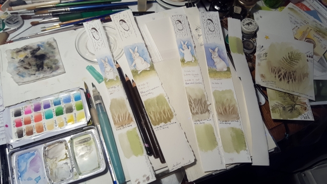
Test strips being worked on and my tiny field palette (lid is partly closed, those aren’t my paints!).
For this post I’m just showing you the little bit of testing I’ve done so far. I have long strips from each paper on which I did small quick sketches/tests. Next I will use bigger peices and do a small study to get a feel for the paper with my inks and color pencils added.
All 5 test strips together.
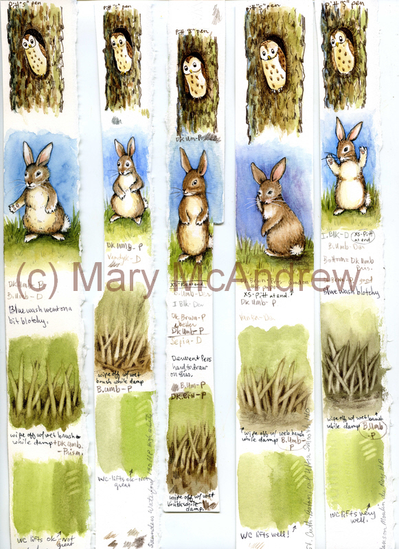
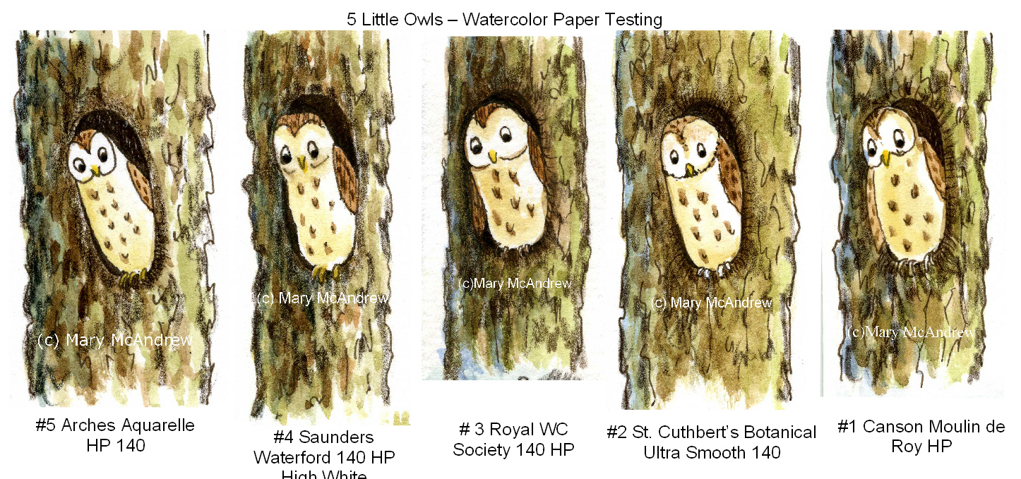
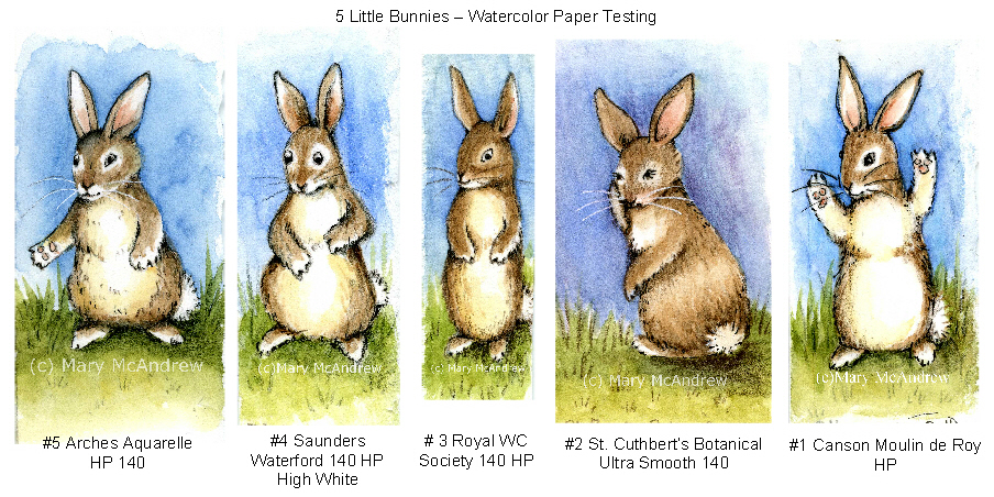
Above shows all 5 strips laid out on my scanner, they were only 1″ to 1 1/2″ wide so you can imagine how small the bunnies and owls were! The strips are numbered L to R 5,4,3,2,1.
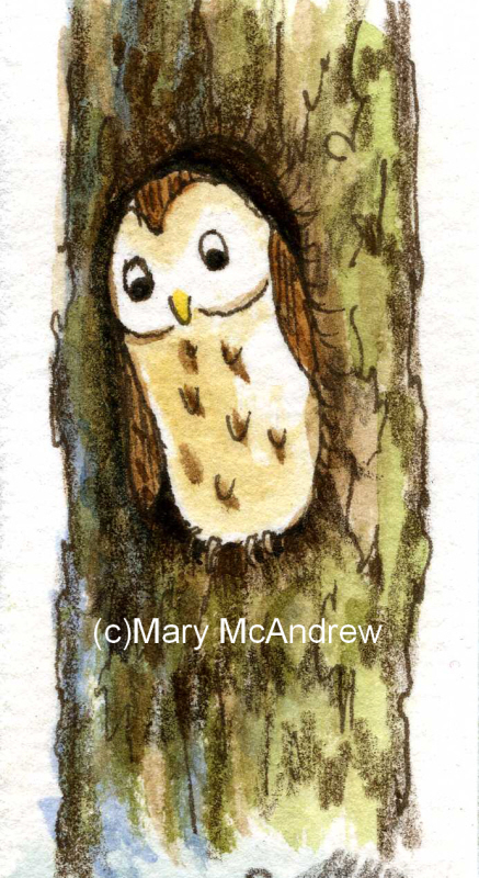
5 Little Owls
For the owls I did light pencil sketch then drew with Sepia Pitt “S” permanent ink pen, then watercolor on dry paper, then some color pencil last. The color pencil was brown or black and used for shading areas. They all were just great for using the ink pen and color pencil showed up on the tooth of the paper. Good so far!
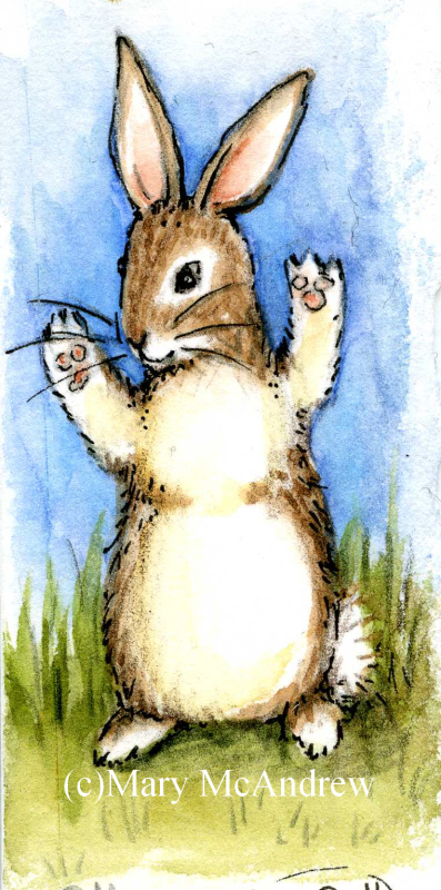
5 Little Bunnies in a row.
It’s always good to practice bunnies! Isn’t it funny how each one looks like a different personality? For these I did a light pencil sketch then watercolor for all the color. Then I used various brown colored pencils for shading and some outlineing and at the end, a touch of black Pitt permanent ink “XS” pen. Doing the tiny washes showed me I will definitely need to do washes on larger paper to really see how it behaves. I want to see if layers lift too easily or does it get blotchy?
On the owls and bunnies I was also trying out different color pencils, my familiar Prismacolors, Derwent Coloursoft and some new Derwent “Studio” pencils. The “Studio” pencils are harder than the pencils I’m used to, so they will hold their point longer but not sure if I’ll like them yet!
Back side of test strips, dip nib testing.
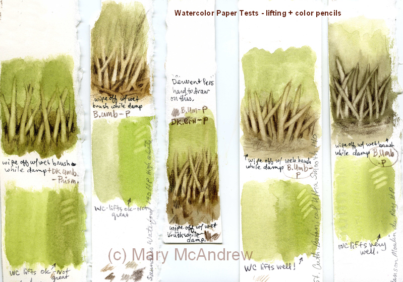
On the backside of the strips I did a quick wash, let it dry then painted some Bracken leaves. When they were dry I used my dip ink nibs to try out some new inks I ordered, I’m very excited about them so far! I tested “Magic Colour – Grecian Olive” and “Vallejo – Umber”, both are acrylic permanent ink and the Magic Colour is made in England (yay! or should I say hoorah!) I did get some special empty markers that you can fill with this type of ink, but need to play around with that more. What I need to test here is, how well do my nibs work on the papers? They were all smooth enough that I cuoldn’t see much difference, next time I’ll try them on semi damp paper for bleeding.
Test of lifting and color pencils.
For the test above I did a simple wash of green and brown then while it was damp lifted color using a clean damp brush. Repeatedly wiping and cleaning the brush and dabbing the paper with paper towel, to help lift moisture and color. Then when it was dry I used color pencil to pick out the marks. The green area was just a quick area to try lifing color after it had dried. All did ok, the St. Cuthbert’s Botanical and Canson Moulin du Roy lifted the cleanest and brightest; though this might not be a good thing when adding washes, we’ll see when I do larger studies.
One Happy Bunny!
PS. Just wanted to mention on a more personal note, one of the reasons I did tiny strips was because I injured myself and sitting in the chair to work just kills me right now. I fell and cracked a rib or two and definitely injured the muscles in my back! But what’s so unbelieveable is that I could do that in a muddy sheep field! I was walking alone along a very old line of trees in a muddy field. I thought, I need a stick so I won’t slip so much….I broke a long stick off a big dead branch on the ground then tried to break it again with my foot on the bottom. Well it still had quite a bit of spring in it and as it resisted I slipped and the branch kind of sprung and I got thrown back against the base of this huge old tree! AY CARUMBA IT HURT! The tree had huge rounded burly roots and that’s exactly what I slammed my side into. Wish I had fallen in the mud! So once I sat up, avoided crying and took inventory of what was working, I had to get up and walk 1.25 miles home. This included climbing over two or three slippery farm gates, muddy fields and a steep road home. I guess there’s not much you can do for cracked ribs but take pain killers and I hate doing that. So I have but avoid overdoing it and now am not taking much. It’s gettiing better and you’d think, “ah, I can’t walk much but at least I can sit and work in the studio”, well no, I can’t concentrate on anything other than small stuff! So, now you’re caught up on me, don’t worry I’m pretty healthy so I should heal quickly (she says!)
I’ll try to work on more testing of these papers and update you on that as I go.
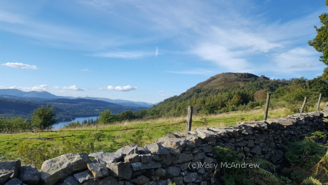
This past summer my husband and I tried to pop out to the Lake District when we could. Unfortunately time slipped by and we only got out there a few times for the day, except of course when my son visited and I got to stay in Keswick two days with him! (but that’s another story). On this occasion we explored Kendal, then some small tarns but the best part was walking up Gummer’s How and having a picnic. (please click on photos to see larger views)
The Chocolate House, Kendal.
First we stopped in Kendal and had a quick run around, but lingered a little longer in the Chocolate House. It’s a very small shop filled with all kinds of chocolates and candies. To be honest I didn’t buy any this time, I just didn’t feel in the mood….I must have been NOT feeling myself! Well it’s a reason to go back again.
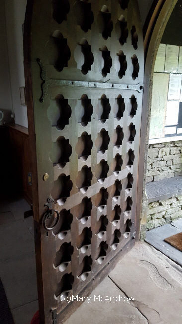
An amazing old door on a small church we visited.
This is an amazing old heavy wooden door on a small church we visited.
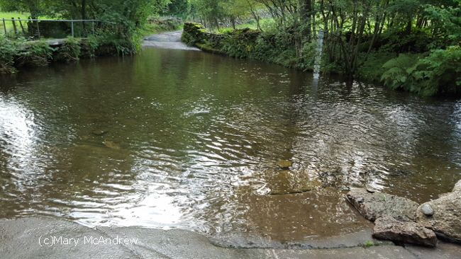
A very scary ford to cross.
This is a ford we came to, I’ve never seen one this wide! There was no sign saying not to cross it but I told Gary I’d get out of the car if he tried! It looked far too deep.
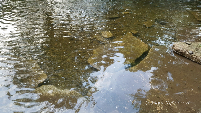
I’m so glad we decided not to cross this ford!
We drove around the long way and this is the ford from the other side. It was awful, the ground was all broken up from previous flooding, and it must have been 2 1/2 feet deep! There should have been a sign to warn people!
Gummer’s How, waiting for us to come up!
This is Gummer’s How and you can just see Lake Windermere at its base. Time to get our boots on and get walking.
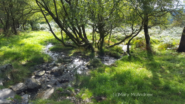
There were some really pretty areas on our walk up.
We passed small grassy glades and this one had a small stream that sounded so refreshing.
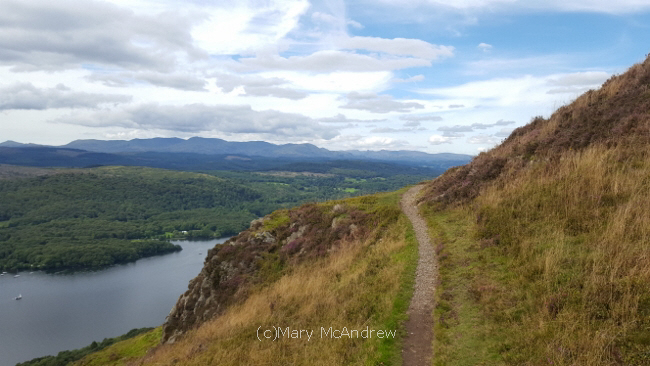
This is the path that curves around towards the top
As we get near the top the path goes close to the edge and you get a great view of Windermere. I had to stop and take it in, though Gary said to keep on, he knew the view got better!
Now don’t get jealous of this next photo! It looks like a scene from the “Miss Potter” movie and I love that!
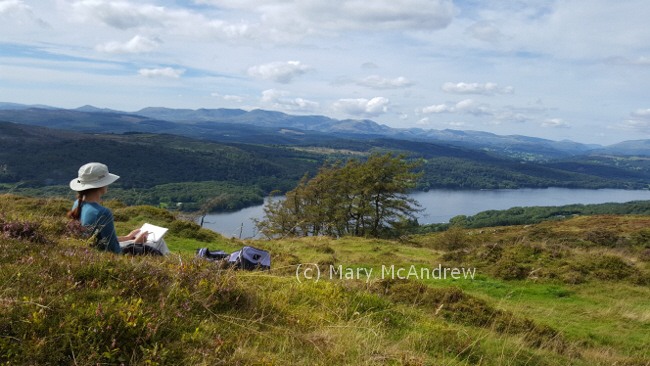
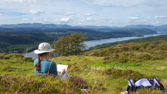
Settling down to do a watercolor of the view at Lake Windermere.
Of course my big plan was to do a watercolor study up top and I’m happy to say I did. Many times we walk and when we’re at the top of our hill I don’t feel like painting or there’s just no time.
The day couldn’t get more perfect!
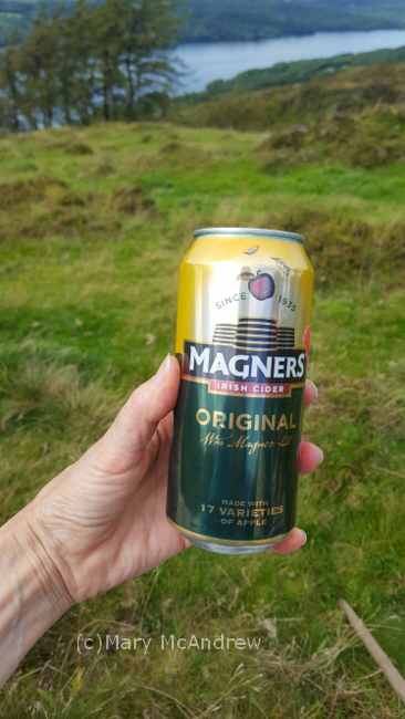
After our picnic of Ploughman’s sandwiches (cheese and pickle), various biscuits (cookies) and a can of apple cider we shared, I settled down on some soft mossy heather to draw.
This apple cider was nice with our picnic.
It helps to carry a plastic bag to sit on, the ground is usually very damp so I always have one tucked in my field kit.
My small sketchbook and travel palette balanced on my knees.
The difficult part is translating that huge expanse of landscape to your small pad, I focused in on several of the distant mountains and first sketched with pencil.
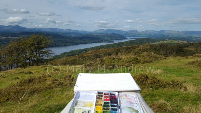
This shows how far I got while working in the field.
The above picture shows how far I got in the field. One of the best things about painting or drawing outside, is all the things you see as you sit there! We heard loud airplane engines and then two really big military airplanes flew right up the lake; it was below us and that perspective made it even more exciting! They must have been returning from an airshow?
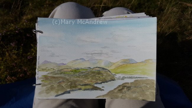
Finished watercolor of “Lake Windermere from Gummer’s How”
Here’s the finished watercolor (above). The most challenging thing (as always) was the changing shadow patterns on the hills. You can sit and gaze all day at the moving shadows from the clouds, picking out brilliant greens in one area then fading to appear in another spot. It helped me greatly to look at photos I shot when I finished up details at home. I had to pick a bit from many to fit what my painting was showing.
Click on this Wikipedia link to read more about Gummer’s How. I love the quote by Wainwright at the end, I guess I don’t have to hang up my boots just yet!
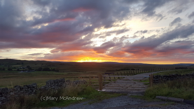
The end of a very nice day, this was the sunset as we drove through the Pennines back to Northumberland. I hope you enjoyed the extra photos today, though I know August is long since gone, I’ll always remember our hike and painting on Gummer’s How.
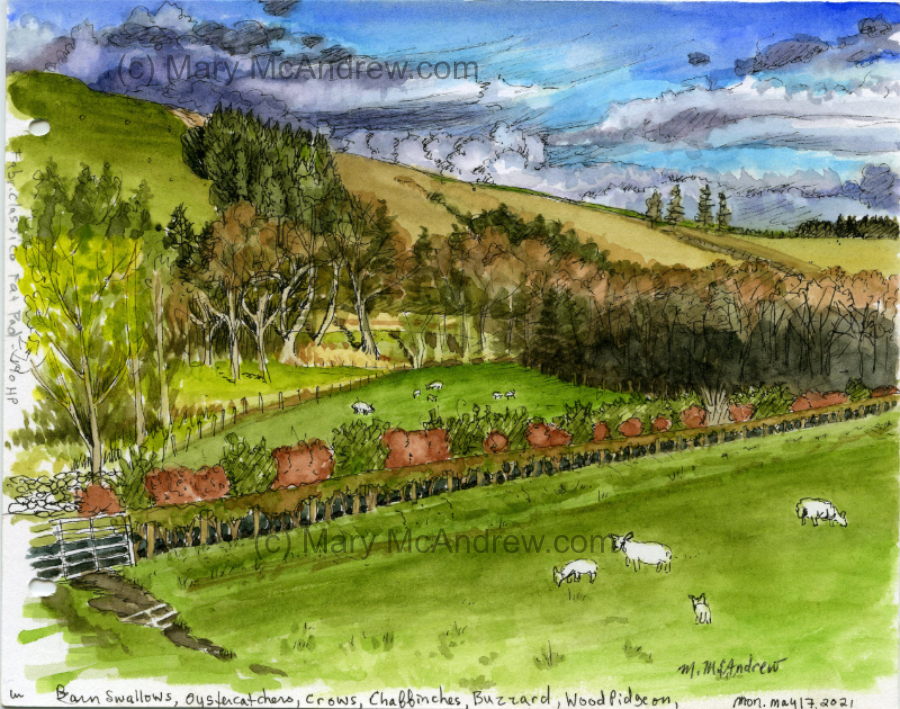
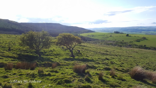
The end of May was very chilly here, wool sweaters and extra layers to peel off when the sun did decide to shine. Gary and I have continued our walks of course, especially when the rain holds off. Most of our walks are later in the day and we don’t have much time for me to sit and paint. But today we went with the intention that I’d sit and do a study of distant hills. Yay!
The view I painted was in this direction, looking up Coquetdale.
We had a ramble around on Lordenshaws, which is situated right next to the well known Simonside Hills, a favorite place for walkers. Lordenshaws is a much more gentle hill and an easy walk but still offering great views.
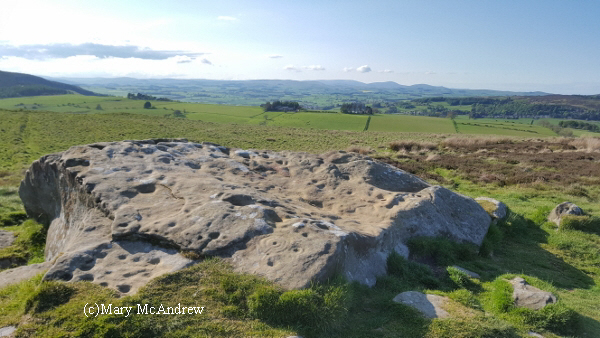
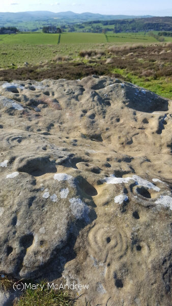
Here’s the largest cup and ring marked stone at Lordenshaws with the marvelous view in the distance of Coquetdale.
I love that there are ancient cup and ring marked stones to see as you walk, made about three thousand years ago!
Here’s more of a close up to see the rings and the ‘holes’ are the cup marks.
This shows the markings or carvings a bit closer. It’s amazing to think of how long ago they were made and we always have a wonder about the people that made them. What were they like? What did they think of and what do the marks mean? No one can answer that for sure.
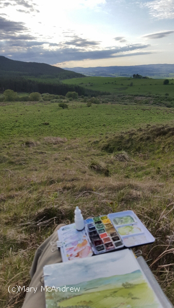
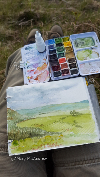
View I had of the hills and Coquetdale valley.
Though there are many views, I decided to paint this one, with Simonside being just to the left and the view of Coquet valley coming from behind it. I liked the distant hills with fields marked by lines of hedges and then the nearer farm fields just at the base of Simonside. (It’s very hard to see any detail in this photo, because the sun was in front of me getting low.)
Painting with cold hands as the sky constantly changed.
I tried to get as much done as possible, then at home I looked at the photos I took on the computer, and tried to touch it up. It’s always best to get as much done in the field as possible, as the colors are never the same on the computer! The hard thing is when you work outdoors, especially in the chilly evening air, your hands get cold and your back aches…well mine does. So I try to work quickly.
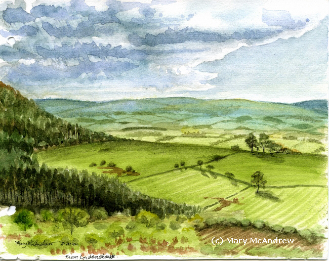
Finished! “View From Lordenshaw’s” watercolor, 5.5″x7″
Here’s the finished painting, only 5.5″ x 7″, including the ring holes!
More posts to come, it’s been such a busy summer I am far behind! Please sign up your email (upper right) to recieve notification of new posts.
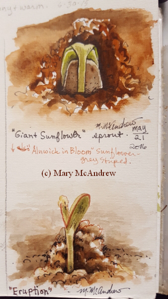
It’s gardening time again! I started a variety of seeds on the window sill and we’re really looking forward to the sunflowers! The spring has been so cold that I waited a bit to plant, but we can hope for warmer weather. Now the sprouts have been moved outside and a few are planted. Fingers crossed, we’ll see what happens!
Sunflower seeds sprouting.
Above are two very small studies of the sunflowers sprouting; I LOVE when seeds sprout! After messing around with my sunflower sprouts, I decided to get outside, now that the sun is actually shining!
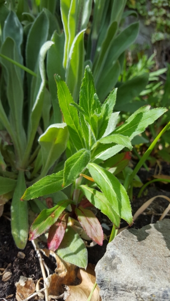
Photo of the plant I did the watercolor study of.
I wanted to do a small study of some plants and decided on this one. I liked how the tips of the leaves at the bottom of the plant are reddish, a good alizarin crimson red. I’m almost positive it’s a weed, but who cares? It looks good for a study.
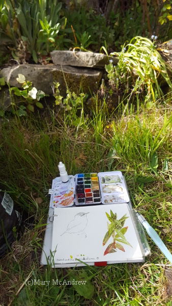
My sketchbook and paint kit, where I sat in front of the garden.
I sat on the grass and the plant was about eye level in a low bed. I clipped my sketchbook and the tiny paint kit onto a stiff peice of cardboard, then I could hold it in one hand. I used a waterbrush to paint and the tiny white bottle is water that I can squirt onto the pan for extra wetness, I also use it to wet my colors.
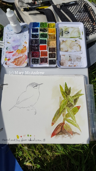
Close up of my kit and sketchbook.
Here it is a bit closer. The sketch of the bird was done from a dead wren that my husband’s cat killed. 🙁 I would usually like to do a study from it but just didn’t have time, so I traced it’s outline. Poor sweet little thing. Happily though, the wrens are nesting behind our house, under the seat of an old bicycle! We keep the cat well away from there!
Coming up soon, a post about an adventurous hike and some watercolors that were inspired by it. (it involves little mice!)
To get automatic updates when I post, sign up your email in the subscribe box in upper right column.
The most up to date information about my artwork, nature sketching adventures, or step by step demonstrations. Search using Categories or Tags, or use the search box in the left column.
Please sign up below to get notified when I post new articles.