Lots of Mushroom Studies

Many studies in watercolor with a touch of gouache. I show my color notes next to each mushroom.
A Love of Nature, Place and Story
Many studies in watercolor with a touch of gouache. I show my color notes next to each mushroom.

Sketching some grass outside in the snow. I show my field painting kit, bag, palette, sketchbook, and link to a video I did too. I talk about fox tracks in the snow.

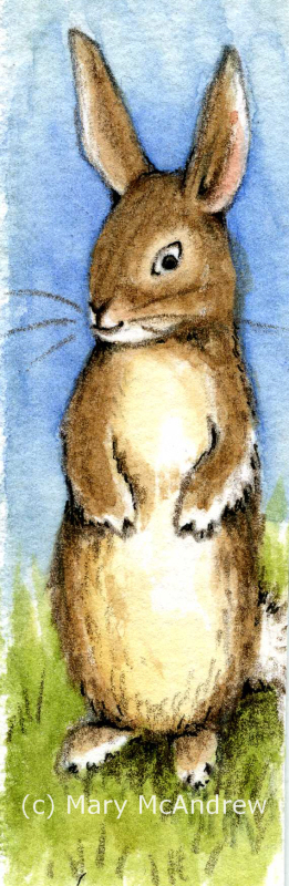
My latest little illustration called "Blackberry Picking Mouse". It's done mostly in watercolors with only a tiny touch of gouache and it measures 6" x 6". It's not for any book in particular, I just enjoy making up little scenes using mice, bunnies etc., especially when they are in nature.
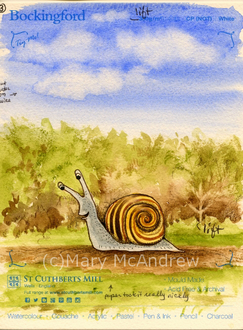
Hello and welcome back for Watercolor Paper Testing – Part 2! My last post I had done some small tests to get started, and explained about the fall I had. Well I’m pretty much healed from that and getting back…
Since moving to England I’ve had to look elsewhere when it comes to buying my art supplies. Back in Clarence Center N.Y., I had lots of local choices for supplies, and I really miss being able to go look at…
The end of May was very chilly here, wool sweaters and extra layers to peel off when the sun did decide to shine. Gary and I have continued our walks of course, especially when the rain holds off. Most of…

Ok, so I know it’s summertime so why am I talking about spring? Well I still have sketches and paintings to share that are from late winter and spring before I share my recent work. You’ll notice my winter and…

A small chuckle for you today! (Click for clearer view) I have to blame my Fiance for this silly thought, as we joked around about bananas going bad; then I jump right in and make it real by creating the…

Do you remember when I took that walk in November, hunting for acorn caps? Well I wrote about a little White Aster I came across, alone in the field. Here is what I wrote in that post: “And one little…

It’s been weeks since I’ve been out in the field sketching, and now that I’ve been out I feel renewed! I guess that’s how we should feel in Spring. I put on my Wellies or “Mud Boots” grabbed my sketch…