Support This Site

If you like what I do please support me on Ko-fi

Watercolor Paper Testing – Part 2

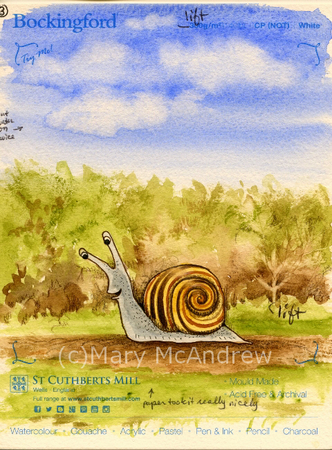
Hello and welcome back for Watercolor Paper Testing – Part 2! My last post I had done some small tests to get started, and explained about the fall I had. Well I’m pretty much healed from that and getting back on track.

Hello there!

Hello there!

First I want to say, if you just go by what I say worked for me, it might help you decide on a paper you’d like to use, BUT WAIT! I highly recommend doing some testing of your own, you can follow my example or try new things on your own. I made a list of the techniques I was most likely to use and then did a simple, similar picture on all of them. I used 11 different papers, all ordered from Jackson’s Art Supply, my test sizes varied from about 5″x6″ to 3″x 6″, so they were small. It took me several days, of sitting down when I could, to work on each test criteria.

1.First label all your test peices of paper with what the paper is, the weight, type etc. One nice thing I ordered was the St. Cuthbert’s Mill sample pack of seven different papers; it only cost .50p and the peices were large enough to really play around with. Each of them was fully labeled too.

2.Make a list of the techniques you want to test on notebook paper; I will include my criteria list below. I decided to do one character (snail) on each and a simple dirt path, green bushy background and a sky with clouds. The sky allowed me to do a big simple graded wash, drop water in for clouds, and test by lifting with clean wet brush.

Clouds

Clouds

3.Do one technique at a time on each one in succession. This way you’ve got the same colors mixed, and can use the same brushes to compare how they go on each paper. Write down what you thought after each thing you test or you’ll forget. I did this on note paper then after I was all done I wrote them down on the back of each paper test. So years from now you can dig around and find them you’ll know what’s what.

OK, here’s my list of criteria I tested:  (all done on dry, unstretched paper)

  1. Can you trace through the paper using a black ink line drawing underneath? I traced different snails on each one.
  2. Does pencil erase easily?
  3. Wash layers- do they stay or lift too easy when new layers go on? Tested in bush areas, ground and sky (I wet paper with a brush first for this one).
  4. Lifting- do dry watercolors lift off when you rub/lift using damp brush and paper towel? On each I lifted a tree shape, like “stems” in the green bushes. Then on most I also lifted some of the dry blue sky.
  5. Dry brush technique. Mostly the bushes and some ground areas on each.
  6. Draw with dip nib and ink. I drew each snail with dip ink and nib, going over the pencil lines I traced.
  7. Scratch wet paint areas to see if dark lines appear. You’ll see some thin lines of color in the bushes, these were made by scratching into the wet paper where paint was laid down.
  8. Color pencil on dry watercolor areas, how do they go on? I mostly did this in the bushes around the snail, some on the ground using dark browns.
  9. Permanent ink pen, ease of drawing on paper? Used to outline each snail and some details on the ground.
  10. Clouds on damp blue sky, drop clear water on and some lifting with paper towel.
  11. In general how does paper take the paint?
  12. (other things you may want to test that I did not: using masking fluid, scraping off dry layers of paper with sharp knife, dropping salt on wet paint, whatever you may usually do when painting)

Please click each picture to see it enlarged.

Testing ability to trace through the paper from my drawing.

Testing ability to trace through the paper from my drawing.

This is my simple set up for tracing I used on this project, (sorry for the dark picture) it’s a clear plastic flat “scrapbooking” type container. I like using these containers to hold my illustrations and lately have been using one as an easel/drawing table. I put a peice of rubber shelf liner underneath it, and can tuck reference photos and drawing stuff inside. I hold the top up with different sizes of masonite or plexiglas depending on the angle I want; here I used plexiglas so it lets more light through. I put a strong little lamp behind it on the table and set my drawing that I’ve inked in black on top. Next you lay your watercolor paper on top and trace! *Note- I taped a carpenters pencil along the bottom to keep papers and boards from sliding off, it works pretty good for now. *Note 2- you can also trace using a bright window; tape your inked drawing up and then your watercolor paper on top. Use light pencil lines, don’t score into the paper, you’ll want to erase most of your lines anyways so draw light!

Now I’ll post pictures of each sample and tell what paper it was along with what I thought about it. Prices listed were at the time I bought them. Click on pictures to see larger.

Beginning sample for watercolor paper test.

Beginning sample for watercolor paper test.

This sample has no number because it’s a scrap peice of watercolor paper I grabbed and for each technique I gave it a go on here 1st as a warm up! If you’re worried about messing up your paper don’t be afraid to loosen up on some scraps first! this helped me to think of what techniques I wanted to try.

#1 St. Cuthbert's Mill, Millford, 140lb, CP (NOT) White

#1 St. Cuthbert’s Mill, Millford, 140lb, CP (NOT) White

#1 St. Cuthbert’s Mill, Millford, 140lb, CP (NOT) White. 22″x30″ sheet = £ 4.10, 9″x12″ cut peice = .82p. (all papers with blue type on them are from the St. Cuthbert’s Mill sample pack) 1. Traced through well enough, a bit rough. 2. Erases well. 3. Washes went on great, no hard edges. 4. Lifting dry color- this paper worked well. You can see the little ‘tree’ stem area in the green bushes, that was done by lifting, and at the top in the sky.  5. Dry brush was good, rough areas in bushes. 6. Ink and Nib- went on well, a bit rough but good. 7. Scratch test-worked but wasn’t very strong, may need to try more. 8. Color pencil- great, bit of texture. 9. Permanent ink pen- ok, a bit rough for long drawn curved lines (snail shell). 10. Clouds- worked well, soft edges. 11. Paper took the paint really well, nice texture on ground edges, blue sky washes even.

#2 St. Cuthbert's Mill, Bockingford, 140lb, HP White

#2 St. Cuthbert’s Mill, Bockingford, 140lb, HP White

#2 St. Cuthbert’s Mill, Bockingford, 140lb, HP White. 22″x30″ sheet = £ 2.10, 9″x12″ cut peice = .42p. 1. Traced through very well, smooth. 2. Erases well. 3. Washes- went on blotchy or patchy, layers hard edged. 4. Lifting dry color- worked well, see ‘tree’ shape and tiny cloud at top. 5. Dry brush-ok, not bad but a bit blah because of paper smoothness. 6. Ink and Nib- went on well, smooth. 7. Scratch test- worked. 8. Color pencil-good. 9. Permanent ink pen- very easy to draw with, smooth. 10. Clouds-Interesting, with water dropped in it formed harder dark edges, which I could have softened with lifting, but it was neat.  11. Was harder to float washes, paint colors got patchy.

#3 St. Cuthbert's Mill, Bockingford, 140lb, CP (NOT) White

#3 St. Cuthbert’s Mill, Bockingford, 140lb, CP (NOT) White

#3 St. Cuthbert’s Mill, Bockingford, 140lb, CP (NOT) White. 22″x30″ sheet = £ 2.10, 9″x12″ cut peice = .42p. 1. Traces well, tiny bit rough. 2. Erases easy. 3. Washes- great, easy to add water to. 4. Lifting dry color- did well. 5. Dry brush- worked really well. 6. Ink and Nib- worked ok, tiny bit rough. 7. Scratch test- worked ok. 8. Color pencil-good. 9. Permanent ink pen- good, a bit bumpy for drawing. 10. Clouds-excellent! Soft edges were perfect and harder edges on bottom edges looked good. 11. Paper took paint nicely.

#4 St. Cuthbert's Mill, Bockingford, 140lb, Rough White

#4 St. Cuthbert’s Mill, Bockingford, 140lb, Rough White

#4 St. Cuthbert’s Mill, Bockingford, 140lb, Rough White 22″x30″ sheet = £ 2.10, 9″x12″ cut peice = .42p. 1. Traced through well enough, a bit rough. 2. Erases well. 3. Washes- layered well. 4. Lifting dry color- worked rather well.  5. Dry brush- pretty good, rough areas in bushes and ground. 6. Ink and Nib- worked ok, a bit rough. 7. Scratch test-worked, a bit pale. 8. Color pencil- not as good, a bit too rough for me. 9. Permanent ink pen- well, a bit rough. 10. Clouds- worked well, wash went on nice, made clouds really well. 11. Paper took the paint really well, nice textures too.

#5 St. Cuthbert's Mill, Saunders Waterford, 140lb, HP High White

#5 St. Cuthbert’s Mill, Saunders Waterford, 140lb, HP High White

#5 St. Cuthbert’s Mill, Saunders Waterford, 140lb, HP High White 22″x30″ sheet = £ 3.60, 9″x12″ cut peice = .72p. 1. Traced through well. 2. Erases well. 3. Washes- went on nicely. 4. Lifting dry color- ok, not as easy as others, lifting small patch on blue sky was bad.  5. Dry brush- worked great, rough areas above bushes. 6. Ink and Nib- worked ok, a bit bleedy. 7. Scratch test-worked really well. 8. Color pencil- worked well easy to draw on to paper. 9. Permanent ink pen- great. 10. Clouds- worked well, I put clouds on with a bit too much water. 11. Paper took the paint well.

#6 St. Cuthbert's Mill, Saunders Waterford, 140lb, CP (NOT) White

#6 St. Cuthbert’s Mill, Saunders Waterford, 140lb, CP (NOT) White

#6 St. Cuthbert’s Mill, Saunders Waterford, 140lb, CP (NOT) White 22″x30″ sheet = £ 3.60, 9″x12″ cut peice = .72p. 1. Trace through-a bit rough, not as thin, can trace but not as easy. 2. Erases well. 3. Washes- went on really well. 4. Lifting dry color- not so good, soft edges.  5. Dry brush- worked great, rough areas in bushes and ground. 6. Ink and Nib- worked ok, not too bad. 7. Scratch test-worked ok. 8. Color pencil- worked well, especially for rough textures. 9. Permanent ink pen- very well. 10. Clouds- worked well, nice and soft, blue wash went on really well. 11. Paper took the paint really well.

#7 St. Cuthbert's Mill, Saunders Waterford, 140lb, Rough White

#7 St. Cuthbert’s Mill, Saunders Waterford, 140lb, Rough White

#7 St. Cuthbert’s Mill, Saunders Waterford, 140lb, Rough White 22″x30″ sheet = £ 3.60, 9″x12″ cut peice = .72p.  1. Traces through well-a bit rough. 2. Erases well. 3. Washes- very good. 4. Lifting dry color- worked well but not with sky color.  5. Dry brush- worked great, rough areas in bushes and ground. 6. Ink and Nib- worked ok, a bit rough. 7. Scratch test-worked ok. 8. Color pencil- worked well, especially for rough textures. 9. Permanent ink pen- well but can be bumpy. 10. Clouds- blue wash went on well, clouds did really well. 11. Paper took the paint really well.

#8 Canson, Moulin du Roy, HP

#8 Canson, Moulin du Roy, HP

#8 Canson, Moulin du Roy, HP 22″x30″ sheet = £ 3.10, 9″x12″ cut peice = .62p. 1. Traces through really well, feels thinner. 2. Erases well. 3. Washes- beaded up a lot, wouldn’t go on in some areas! 4. Lifting dry color- worked very well, even on the sky patch.  5. Dry brush- worked ok to good. 6. Ink and Nib- draws well. 7. Scratch test-not great. 8. Color pencil- worked well. 9. Permanent ink pen- nice, easy to draw. 10. Clouds- worked well, don’t get too wet, it gets blotchy. Paper towel lifts easily because color doesn’t soak in too fast. 11. Paint beaded up at first then was ok.

#9 St. Cuthbert's Botanical Ultra Smooth, 140lb

#9 St. Cuthbert’s Botanical Ultra Smooth, 140lb

#9 St. Cuthbert’s Botanical Ultra Smooth, 140lb full sheet = £ 2.20 (slightly smaller than the others), 9″x12″ cut peice = .55p. 1. Traces through really well, smooth. 2. Erases well. 3. Washes- a bit patchy in areas. 4. Lifting dry color- worked well.  5. Dry brush- worked well. 6. Ink and Nib- ok, a bit bleedy. 7. Scratch test-ok to pretty good. 8. Color pencil- worked very well. 9. Permanent ink pen- nice, easy to draw. 10. Clouds- worked well, color lifted well, clouds a bit hard edged. 11. Paper takes paint ok to well.

#10 Royal Botanical Society 140lb, HP

#10 Royal Botanical Society 140lb, HP

#10 Royal Botanical Society 140lb, HP 22″x30″ sheet = £ 4.70, 9″x12″ cut peice = .94p.  1. Traces through well, smooth. 2. Erases well. 3. Washes- went on nice. 4. Lifting dry color- worked well, a bit pale on sky patch.  5. Dry brush- worked well. 6. Ink and Nib- works fine. 7. Scratch test-worked well. 8. Color pencil- worked well. 9. Permanent ink pen- great, easy to draw. 10. Clouds- blue color went on nice, clouds went on very well. 11. Paper takes paint very well.

#11 Arches Aquarelle, 140lb, HP

#11 Arches Aquarelle, 140lb, HP

#11 Arches Aquarelle, 140lb, HP 22″x30″ sheet = £ 5.40, 9″x12″ cut peice = £ 1.08. 1. Traces through very well, smooth. 2. Erases well. 3. Washes- went on well. 4. Lifting dry color- worked really well.  5. Dry brush- worked well. 6. Ink and Nib- worked ok to good. 7. Scratch test-worked well. 8. Color pencil- worked very well. 9. Permanent ink pen- very good, easy to draw. 10. Clouds- blue wash went on well, clouds lifted with brush and paper towel. 11. Paper takes paint nicely.

That was the last one! Whew! You can see this kept me busy for awhile. A few of the papers didn’t take the paint nicely at first, they beaded up or skipped areas. For those papers I think I would try wetting the paper first and stretch it, then see how they act. Or just take a larger peice and really wet it then play around on it. After I did the tests I wrote the price per full sheet on the backside, then figured out how much one cut 9″ x 12″ peice would be, depending on how many you could get out of a full sheet.

So what’s my verdict you’re wondering? I have to admit it’s still hard to say! For the price and how they performed for me, I have four I want to explore further.

  • Saunder’s Waterford HP High White- seems to work well, price moderate but a bit more than the others I liked.
  • Bockingford CP (NOT) white- worked well, rougher than what I’m used to, very affordable
  • St. Cuthbert’s Botanical Ultra Smooth- love the smoothness, low price, worked well but sometimes patchy, need further testing.
  • Moulin du Roy- I want to test some more, because it beaded up, but I like the feel of it and the price.

On the ones I liked I draw a little star and fill it in with really bright golden yellow, so it’s easy to spot when I’m digging in my folders.

PLEASE DO leave some comments about the paper you use and why you like it!! It would be great for everyone to share some ideas and papers that work for them here.

Happy Spring everyone, springtime posts coming soon!

Happy Spring from our village in Northumberland, England!

Happy Spring from our village in Northumberland, England!

Watercolor Paper Testing

Since moving to England I’ve had to look elsewhere when it comes to buying my art supplies. Back in Clarence Center N.Y., I had lots of local choices for supplies, and I really miss being able to go look at and ‘feel’ things in person. Nothing beats feeling the spring of a brush on your hand or the roughness of a sheet of paper. Of course I ordered supplies online too, if you ordered enough it was cheaper, but it always helps to see it in person first and maybe test it out.

Where we live now there’s nothing close by, you have to drive to Newcastle for choice; so shopping online is more convenient. Last year I ordered some watercolor paper from Jackson’s (jacksonsart.com) online and was happy with the price and it came pretty quickly. I meant to write a post about my tests but alas never got the time, maybe I’ll post those simple tests later. This time around I ordered seven different papers but two I didn’t bother to test yet, they aren’t anything I would use for my illustration but I couldn’t know that until I saw them in person! I also ordered a sample pack of papers that are big enough to do tests on, I’ll include them in my next round of testing.

Here are the five I started testing:

1. Canson Moulin de Roy HP

2. St. Cuthbert’s Botanical Ultra Smooth 140

3. Royal Watercolour Society HP 140

4. Saunders Waterford HP 140 High White

5. Arches Aquarelle HP 140

The Arches is the most expensive, but it’s the one I picked from my last testing, as working best for my illustrations. I’m hoping some of these cheaper options will be just as good so I can make it my ‘go to’ paper and get really familiar with it!

When my new full size sheets of paper come they mostly measure 22″ x 30″ or 56cm x 76cm each. I then lay them out stacked up on my cutting board and figure out the best way to cut them up to get the most sheets. I’ll draw a little thumbnail on scrap paper to figure it out, then mark the watercolor paper for cutting. So I cut the sheets, leaving a big chunk uncut, and some small strips.

 (click on pictures to see larger)

Test strips and my tiny field palette.

Test strips being worked on and my tiny field palette (lid is partly closed, those aren’t my paints!).

For this post I’m just showing you the little bit of testing I’ve done so far. I have long strips from each paper on which I did small quick sketches/tests. Next I will use bigger peices and do a small study to get a feel for the paper with my inks and color pencils added.

All 5 test strips together.

All 5 test strips together.

Above shows all 5 strips laid out on my scanner, they were only 1″ to 1 1/2″ wide so you can imagine how small the bunnies and owls were! The strips are numbered L to R 5,4,3,2,1.

5 Little Owls

5 Little Owls

For the owls I did light pencil sketch then drew with Sepia Pitt “S” permanent ink pen, then watercolor on dry paper, then some color pencil last. The color pencil was brown or black and used for shading areas. They all were just great for using the ink pen and color pencil showed up on the tooth of the paper. Good so far!

5 Little Bunnies in a row.

5 Little Bunnies in a row.

It’s always good to practice bunnies! Isn’t it funny how each one looks like a different personality? For these I did a light pencil sketch then watercolor for all the color. Then I used various brown colored pencils for shading and some outlineing and at the end, a touch of black Pitt permanent ink “XS” pen. Doing the tiny washes showed me I will definitely need to do washes on larger paper to really see how it behaves. I want to see if layers lift too easily or does it get blotchy?

On the owls and bunnies I was also trying out different color pencils, my familiar Prismacolors, Derwent Coloursoft and some new Derwent “Studio” pencils. The “Studio” pencils are harder than the pencils I’m used to, so they will hold their point longer but not sure if I’ll like them yet!

Back side of test strips, dip nib testing.

Back side of test strips, dip nib testing.

On the backside of the strips I did a quick wash, let it dry then painted some Bracken leaves. When they were dry I used my dip ink nibs to try out some new inks I ordered, I’m very excited about them so far! I tested “Magic Colour – Grecian Olive” and “Vallejo – Umber”, both are acrylic permanent ink and the Magic Colour is made in England (yay! or should I say hoorah!) I did get some special empty markers that you can fill with this type of ink, but need to play around with that more. What I need to test here is, how well do my nibs work on the papers? They were all smooth enough that I cuoldn’t see much difference, next time I’ll try them on semi damp paper for bleeding.

Test of lifting and color pencils.

Test of lifting and color pencils.

For the test above I did a simple wash of green and brown then while it was damp lifted color using a clean damp brush. Repeatedly wiping and cleaning the brush and dabbing the paper with paper towel, to help lift moisture and color. Then when it was dry I used color pencil to pick out the marks. The green area was just a quick area to try lifing color after it had dried. All did ok, the St. Cuthbert’s Botanical and Canson Moulin du Roy lifted the cleanest and brightest; though this might not be a good thing when adding washes, we’ll see when I do larger studies.

(c)wc paper test strips- bunny 1 re2One Happy Bunny!

(c)wc paper test strips- owl 3 re

PS. Just wanted to mention on a more personal note, one of the reasons I did tiny strips was because I injured myself and sitting in the chair to work just kills me right now. I fell and cracked a rib or two and definitely injured the muscles in my back! But what’s so unbelieveable is that I could do that in a muddy sheep field! I was walking alone along a very old line of trees in a muddy field. I thought, I need a stick so I won’t slip so much….I broke a long stick off a big dead branch on the ground then tried to break it again with my foot on the bottom. Well it still had quite a bit of spring in it and as it resisted I slipped and the branch kind of sprung and I got thrown back against the base of this huge old tree! AY CARUMBA IT HURT! The tree had huge rounded burly roots and that’s exactly what I slammed my side into. Wish I had fallen in the mud! So once I sat up, avoided crying and took inventory of what was working, I had to get up and walk 1.25 miles home. This included climbing over two or three slippery farm gates, muddy fields and a steep road home. I guess there’s not much you can do for cracked ribs but take pain killers and I hate doing that. So I have but avoid overdoing it and now am not taking much. It’s gettiing better and you’d think, “ah, I can’t walk much but at least I can sit and work in the studio”, well no, I can’t concentrate on anything other than small stuff! So, now you’re caught up on me, don’t worry I’m pretty healthy so I should heal quickly (she says!)

I’ll try to work on more testing of these papers and update you on that as I go.

(c)wc paper test strips- bunny 3 reThis little bunny says good-bye!


Coffee Experiment on Watercolor Paper 1-20-08

The other day I did some experimenting with watercolor paper and instant coffee. I had seen this used for a background for classical drawings. Now that I’ve tried it I can see that a bit of practice and light-handed use of coffee is a good idea. The first ones I did with just wet paper, brushed on with a big ‘mop’ watercolor brush, then I sprinkled INSTANT coffee crystals all over it. (No it doesn’t matter if it’s decaf or regular! ) I then brushed it until it colored the paper, then I re-sprinkled it with a bit of coffee. I guess I could mix some coffee up with water first to use as a tint. The one where I used bristol board I brushed with a house painters brush, it gave it interesting streaks.

The second set of papers I used two different brown watercolor paints to tint the paper. I used one big 11″x14″ sheet that I taped to a board 1st. I wet it with water and the mop brush then brushed the color on. As it took on a sheen I sprinkled the coffee on and watched what it did…#1 is just coffee sprinkled and not touched, a little too heavy and spotty looking to me. #2 is same as #1 but then I brushed the coffee after awhile and re-sprinkled a tiny amount. #3 is same as #2 but I added salt and just left it alone. (note here…I just love using salt!! I love the random patterns it creates!) The sample pictures I posted here are cropped parts of the actual sheet I made. If I get a sheet I like I’ll scan it, save it and perhaps I can print it out to use for drawings without worrying about messing up a hand-painted sheet. Let me know if you ever use this technique and how it worked for you. I’ll be drawing with brown ink, brown pencils or pastels with some white chalk highlights on this paper. If I get time, I’ll post what I do with it!