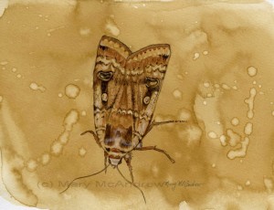
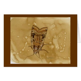
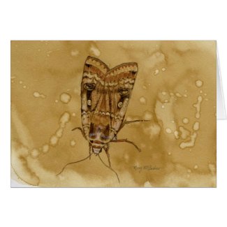
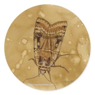
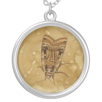
This moth is a little watercolor painting I did on coffee stained paper (click it to see it larger and clearer). Using instant coffee to stain your paper is something I taught in my Creative Journaling class. It’s great to use lightly on your paper to make it look antique or like parchment. Here I just played with it like watercolor and brushed it around, then splattered water drops into it. Let it dry totally then you can draw or paint on top of it as I did. I have a few small sheets that I did at the same sitting, so I can grab one when I’m in the mood and use it. I lightly sketched with pencil first then just used burnt umber, burnt sienna, black and a touch of white for highlight. This was from a “Yellow Underwing” moth I photographed last year.
I have always loved the illustrations of Arthur Rackham and it’s the works he did using mostly brown colors that inspired me to work with brown tones alone. Click on any of the illustrations to see cards or gifts I created in my shop! There’s more items coming in the category Vintage Illustrations.
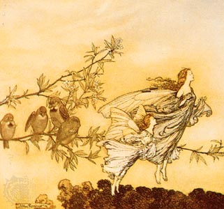
Just look at how gorgeous this painting is!! Sigh…I love his work. (Sorry I don’t have a bigger copy to view) The background is just subtle tone, there’s a hint of tree tops below and then the sparrows come into view as they nonchalantly go about their business of preening. The branch is laid out as a perfect design element reaching across the paper and reaching up to lead your eye but not take you totally away from the subject of the fairies. Yes, those fairies, painted lighter than the rest to really make them stand out, aren’t they wonderful? Not having pointy ears, pointy eyes, pointy hair, sexy clothes and striped socks. Good God some of the awful modern day interpretations of what a fairy is is shocking! Just plain tacky and awful!
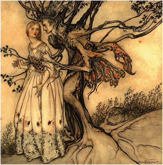
This is one of my favourites! SIGH….that’s how I feel when I look at work by another artist I revere. I love her dress, the attention to it’s detail but it doesn’t take over the attention of the piece, do you notice how the lower part blends into the tone of the ground and the skirt is the same as the background? It’s all married together, floating but on the same ground, do you know what I mean? Just like the tree roots coming from nowhere out of the paper and growing up into this tree that is alive. I love how he combined just enough elements that say man and tree at the same time, the fabric hanging adds a touch of color that picks up in her cheeks and it’s form adds a floating liveliness to the painting; movement. Not to mention the tenderness of the way they clasp hands….sigh.
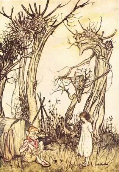
In “The Man in the Wilderness” above, I love the way he draws his trees to be just like people, look at the ‘arms’ of the one in the background reaching up to the sky. For a child (or adult) reading the story this illustration would be something to pause over, study and discover. They’d see the obvious girl and elf and think about what they are doing but then they’d look at the trees and realize with delight they have faces and arms! Here again I like how he’s used such simple color to make this illustration, just a simple bit of red and gold on the elf to show the main subject. I can’t wait to use the card in my shop (click picture to see) as an invitation or birthday card, “Can we meet for tea?” “May your day be full of discovery”. Oh, how about a funny one for your friend…”I know you’re kind of different….but I like you all the same!” haha
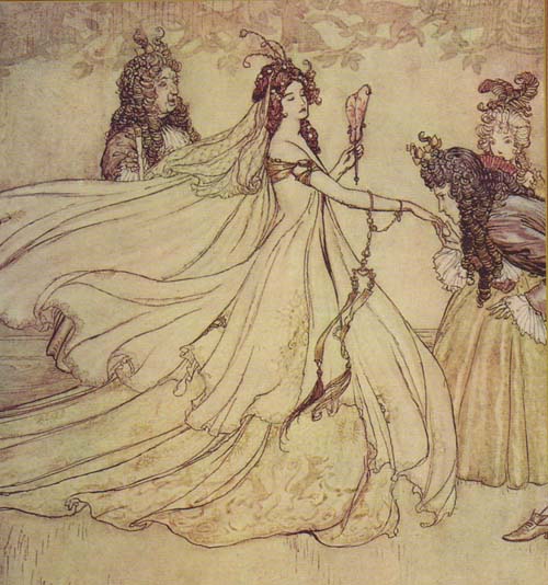
This illustration shows use of line at it’s best, do you notice how in some places it’s thicker and heavy then it gets thin and light? This is very important in drawing, good drawing. This one is definitely more of a drawing than a painting, hardly any range of values used, quite flat. It’s all about the lines and what lines!, all swirling and curling, sweeping like there is a magical breeze blowing just her skirts and delicate lace veil. To give some depth and interest I like how he put the pale leaves and branches at the top then used a light similar design on her skirt in just the front.
I have wanted to do drawings and paintings starting with a freely painted base of brown or parchment colored paper for ages. The moth is my first one I guess, though I’ve done paintings before that are monochrome browns, (Autumn watercolor, Etain oil, Twilight oil) they were never started on a freely tinted paper. By that I mean a piece of paper where you just play with the color and use water drops and salt to add interest and you end up with something that in itself looks good. I’ve played with coffee staining before (as you can see on this post) but never got around to painting on them. So I’m hoping to do some more starting with small studies like this moth. Hope you enjoyed my discussion on using browns and the great Arthur Rackham! (more sighs) Oh, and I found an excellent, though old, article written about a show of his works in London in 2002 here on the “Telegraph”.
Below are a few items I designed with the Moth painting on it, please click the picture to see them in my shop. Enjoy and let me know if you’d like it on another item!
Below, Sterling Silver necklace!
This is a beautiful moth painting. The coffee and the moth go great together and I bet it smells great too!I learned this technique a long time ago from Gerry Hodge from the Guild of Natural Science Illustrators.
Love this Mary! Your painting and the connection and inspiration of Arthur Rackham’s work. Tonal work is also a favorite of mine. Beautifully done.
Thanks Kathie, I know it’s just a small painting but that’s all I’ve had time and energy for lately. I’m longing to get back to doing some bigger work but just don’t feel settled right now. So it’s been good for me to do the insect studies etc. And I’ve always loved the old illustrators! I really want to do some landscape type things with Rackham’s work in mind. I think because I love drawing that’s what I love in his work…the drawn lines. Hope your painting is going well, what are you working on lately?
Thanks Mindy, I have a few small pieces of coffee stained paper but want to do more, just so I can ‘imagine’ what would look good on one and just pick it up to do it. I guess the idea of staining has been around awhile, many, many years ago (when I was in college;-) ) I took a tea bag that was from a rose hip type tea…kind of reddish, and smeared it all over a paper then drew a bird on it. I just found it the other day and thought, “I really should finish that!!” Now I don’t have the photo I was working from of course. It’s fun to experiment with different things as long as they don’t harm the paper over a long period of time. Thanks for stopping by.
Your work is lovely !! Hope to see more..
Anupama
Thank you Anupama, I’ll keep making it!
Do you know where the original is of the Flippant Fairies floating freely? I’d love to go see it.
Hi Caren, I’ve tried to look it up and in another article it just states that one as “in a private collection”; I’d sure love to see it too, I’d love to see ANY of his works! I am guessing it’s in England because the article I linked to this post says that there are wonderful pieces of his in America too, so I’m assuming it’s from the UK.
Thanks for stopping by,
Mary
You really are wonderful with watercolors. That moth is incredible.
Well thanks so much Maureen! I have a bunch of papers I colored so when I feel like it I can do new things on it, I’ll have to do some more. I checked out your blog and notice you like to draw architecture a lot, keep up the good work!