|
|
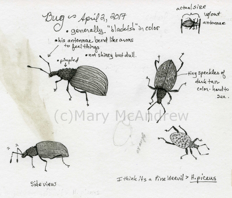
This will be short and sweet. Just a quick post to share some sketches I did of a little dark Weevil that came by today. He didn’t stop by for tea but I may do a character of him someday so you never know!
(click any pictures to see larger)
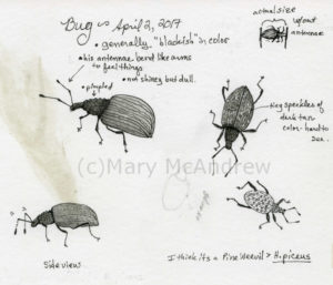 Enlarged sketches of the Weevil Above shows the small sketch page I did. It had a spot of color on it from when I was going to paint something, but this is just a study so it didn’t bother me. You can see in the upper right corner, I always draw two lines showing the bugs actual length. I hope the pictures aren’t too blurry, I only have my cell phone camera right now. I cropped and enlarged them so they may not be as nice as they could be! (getting a new camera is on my list!)
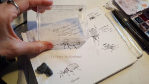 Weevil in my ‘bug’ container to study. Above shows the little container I’ve used for years as a temporary holder for bugs while I study them. None of them have ever held still, it’s so hard to draw them while they constantly walk about. I tried to draw the sketches much bigger than actual size to show more detail.
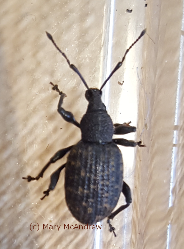
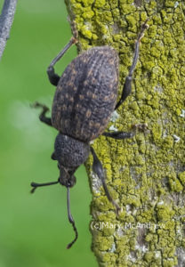 A great natural light picture when I released him. This is when I released him outside on the fence. You can see the tiny dots of tan on his back.
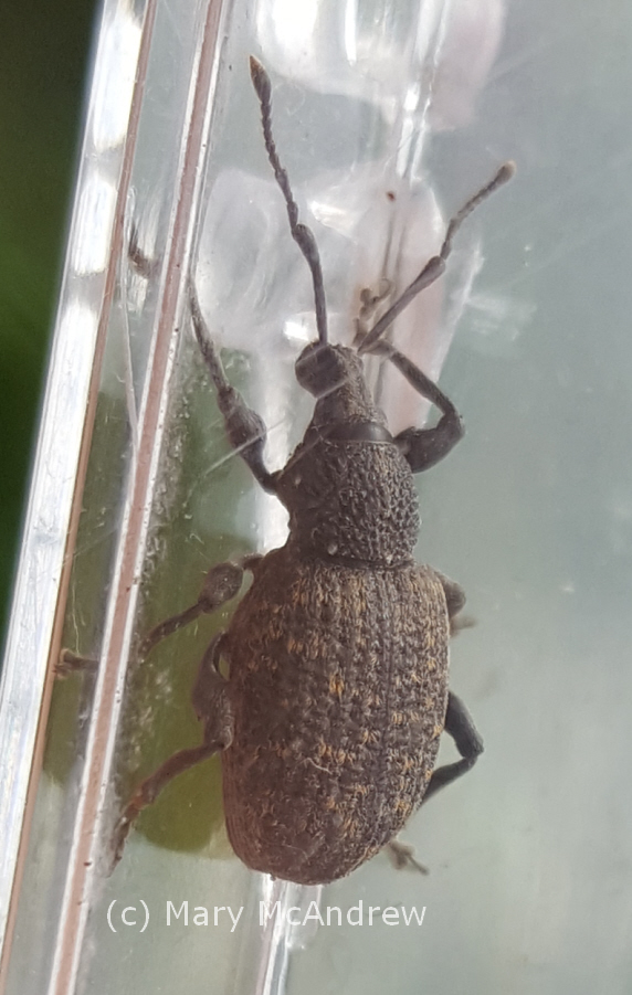
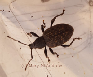
 Another nice shot of his texture and color. They must have a special substance on their feet because he was able to walk on all the slipper walls of this shiny plastic container.
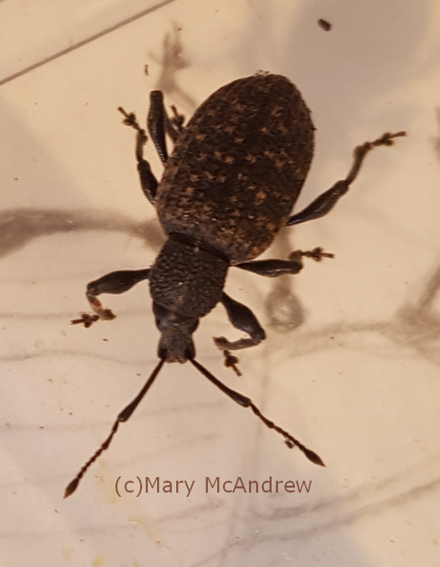
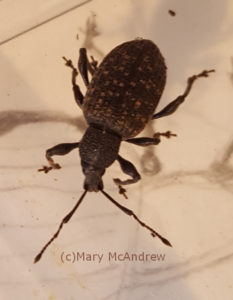
 And another shot, you can see his eyes. Look at those antennae! They were bent like an arm would bend at the elbow, and he poked them up and down to ‘feel’ or ‘smell’ (?) his way along.
 I like how this picture shows how he can bend his body a bit, or neck if he has one! Look at the interesting shape of his legs, and I like how he has his neck bent a bit.
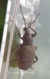 One last picture of him in the container. One last picture of him in the container, I like showing all the different angles. I find the legs so interesting and difficult to draw unless it’s from a photo. He walked constantly while I sketched him and reminded me of one of those wind up toys! I noticed how they moved opposite legs, just like any multi-legged creature would for balance.
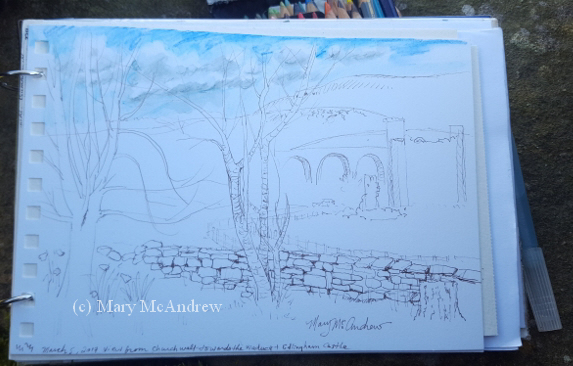
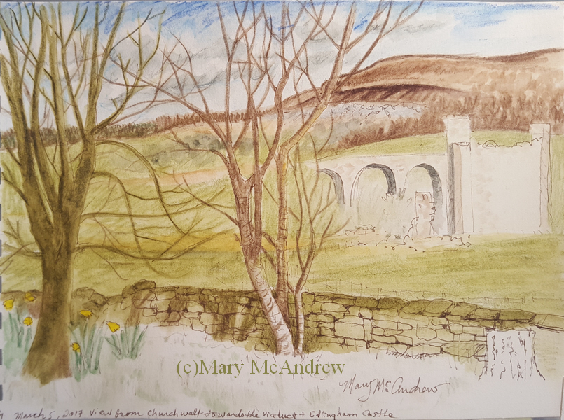
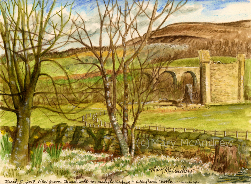
It’s been a long time since I used my watercolor pencils, so I thought I’d bring them out with me on this day (in March). The snowdrops were out in a thick blanket at the “St. John the Baptist” churchyard, Edlingham and the view in the distance with “Edlingham Castle”, the Viaduct and “Corby Crags” was great; so I thought I’d try to capture a bit of it.
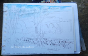 Beginning sketch I did while sitting on the wall of the churchyard. I took this picture with my cell phone as I sat on the cold stone wall of the churchyard, cold enough I was drawing with fingerless mittens on!
 This is how far I got working outside. Above shows how far I got working on it outside sitting on the churchwall. I got most of the important things drawn in the right place and color for a lot of it. I was very stiff and cold so had to stop!
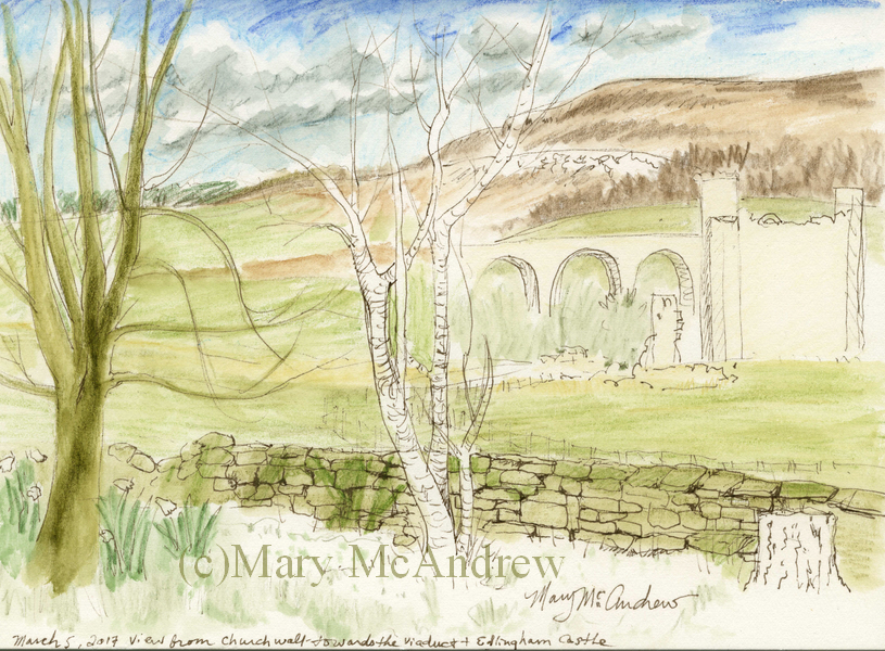
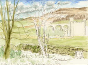
 This shows a bit more color laid on This shows a bit more color layers put on, more on the trees and background detailed a bit. You can’t see it but I also put some color on the castle.
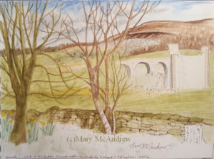
 Finished! In all it’s vividness and rich greens! That’s Edlingham Castle and the Viaduct in the background. This little painting really tidied up nicely! The fence ended up being a bit different than I planned but I think it’s ok. I wanted to leave the whites to show the snowdrops; I mostly showed them by using the greens around them. When I was done I used a white gel type pen and touched here and there helped really pull the flowers out more. I’m also experimenting with using Doc Martin’s Bleed Proof White, a non permanent white ink, to add touches of white (tree trunks).
I hope your Spring is shaping up nicely where-ever you may be! Happy Spring!
Hello and welcome back for Watercolor Paper Testing – Part 2! My last post I had done some small tests to get started, and explained about the fall I had. Well I’m pretty much healed from that and getting back on track.
 Hello there! First I want to say, if you just go by what I say worked for me, it might help you decide on a paper you’d like to use, BUT WAIT! I highly recommend doing some testing of your own, you can follow my example or try new things on your own. I made a list of the techniques I was most likely to use and then did a simple, similar picture on all of them. I used 11 different papers, all ordered from Jackson’s Art Supply, my test sizes varied from about 5″x6″ to 3″x 6″, so they were small. It took me several days, of sitting down when I could, to work on each test criteria.
1.First label all your test peices of paper with what the paper is, the weight, type etc. One nice thing I ordered was the St. Cuthbert’s Mill sample pack of seven different papers; it only cost .50p and the peices were large enough to really play around with. Each of them was fully labeled too.
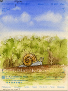
2.Make a list of the techniques you want to test on notebook paper; I will include my criteria list below. I decided to do one character (snail) on each and a simple dirt path, green bushy background and a sky with clouds. The sky allowed me to do a big simple graded wash, drop water in for clouds, and test by lifting with clean wet brush.
 Clouds 3.Do one technique at a time on each one in succession. This way you’ve got the same colors mixed, and can use the same brushes to compare how they go on each paper. Write down what you thought after each thing you test or you’ll forget. I did this on note paper then after I was all done I wrote them down on the back of each paper test. So years from now you can dig around and find them you’ll know what’s what.
OK, here’s my list of criteria I tested: (all done on dry, unstretched paper)
- Can you trace through the paper using a black ink line drawing underneath? I traced different snails on each one.
- Does pencil erase easily?
- Wash layers- do they stay or lift too easy when new layers go on? Tested in bush areas, ground and sky (I wet paper with a brush first for this one).
- Lifting- do dry watercolors lift off when you rub/lift using damp brush and paper towel? On each I lifted a tree shape, like “stems” in the green bushes. Then on most I also lifted some of the dry blue sky.
- Dry brush technique. Mostly the bushes and some ground areas on each.
- Draw with dip nib and ink. I drew each snail with dip ink and nib, going over the pencil lines I traced.
- Scratch wet paint areas to see if dark lines appear. You’ll see some thin lines of color in the bushes, these were made by scratching into the wet paper where paint was laid down.
- Color pencil on dry watercolor areas, how do they go on? I mostly did this in the bushes around the snail, some on the ground using dark browns.
- Permanent ink pen, ease of drawing on paper? Used to outline each snail and some details on the ground.
- Clouds on damp blue sky, drop clear water on and some lifting with paper towel.
- In general how does paper take the paint?
- (other things you may want to test that I did not: using masking fluid, scraping off dry layers of paper with sharp knife, dropping salt on wet paint, whatever you may usually do when painting)
Please click each picture to see it enlarged.
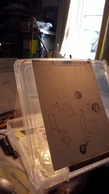
 Testing ability to trace through the paper from my drawing. This is my simple set up for tracing I used on this project, (sorry for the dark picture) it’s a clear plastic flat “scrapbooking” type container. I like using these containers to hold my illustrations and lately have been using one as an easel/drawing table. I put a peice of rubber shelf liner underneath it, and can tuck reference photos and drawing stuff inside. I hold the top up with different sizes of masonite or plexiglas depending on the angle I want; here I used plexiglas so it lets more light through. I put a strong little lamp behind it on the table and set my drawing that I’ve inked in black on top. Next you lay your watercolor paper on top and trace! *Note- I taped a carpenters pencil along the bottom to keep papers and boards from sliding off, it works pretty good for now. *Note 2- you can also trace using a bright window; tape your inked drawing up and then your watercolor paper on top. Use light pencil lines, don’t score into the paper, you’ll want to erase most of your lines anyways so draw light!
Now I’ll post pictures of each sample and tell what paper it was along with what I thought about it. Prices listed were at the time I bought them. Click on pictures to see larger.
 Beginning sample for watercolor paper test. This sample has no number because it’s a scrap peice of watercolor paper I grabbed and for each technique I gave it a go on here 1st as a warm up! If you’re worried about messing up your paper don’t be afraid to loosen up on some scraps first! this helped me to think of what techniques I wanted to try.
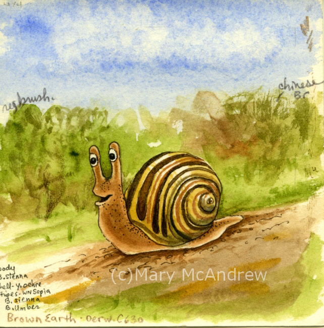
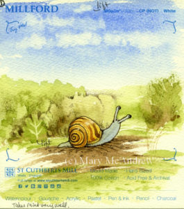 #1 St. Cuthbert’s Mill, Millford, 140lb, CP (NOT) White #1 St. Cuthbert’s Mill, Millford, 140lb, CP (NOT) White. 22″x30″ sheet = £ 4.10, 9″x12″ cut peice = .82p. (all papers with blue type on them are from the St. Cuthbert’s Mill sample pack) 1. Traced through well enough, a bit rough. 2. Erases well. 3. Washes went on great, no hard edges. 4. Lifting dry color- this paper worked well. You can see the little ‘tree’ stem area in the green bushes, that was done by lifting, and at the top in the sky. 5. Dry brush was good, rough areas in bushes. 6. Ink and Nib- went on well, a bit rough but good. 7. Scratch test-worked but wasn’t very strong, may need to try more. 8. Color pencil- great, bit of texture. 9. Permanent ink pen- ok, a bit rough for long drawn curved lines (snail shell). 10. Clouds- worked well, soft edges. 11. Paper took the paint really well, nice texture on ground edges, blue sky washes even.
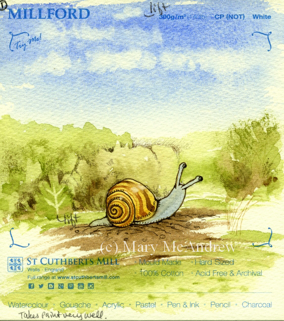
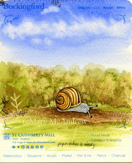
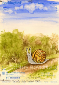 #2 St. Cuthbert’s Mill, Bockingford, 140lb, HP White #2 St. Cuthbert’s Mill, Bockingford, 140lb, HP White. 22″x30″ sheet = £ 2.10, 9″x12″ cut peice = .42p. 1. Traced through very well, smooth. 2. Erases well. 3. Washes- went on blotchy or patchy, layers hard edged. 4. Lifting dry color- worked well, see ‘tree’ shape and tiny cloud at top. 5. Dry brush-ok, not bad but a bit blah because of paper smoothness. 6. Ink and Nib- went on well, smooth. 7. Scratch test- worked. 8. Color pencil-good. 9. Permanent ink pen- very easy to draw with, smooth. 10. Clouds-Interesting, with water dropped in it formed harder dark edges, which I could have softened with lifting, but it was neat. 11. Was harder to float washes, paint colors got patchy.
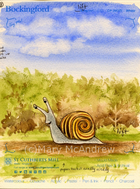
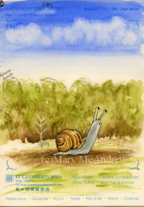
 #3 St. Cuthbert’s Mill, Bockingford, 140lb, CP (NOT) White #3 St. Cuthbert’s Mill, Bockingford, 140lb, CP (NOT) White. 22″x30″ sheet = £ 2.10, 9″x12″ cut peice = .42p. 1. Traces well, tiny bit rough. 2. Erases easy. 3. Washes- great, easy to add water to. 4. Lifting dry color- did well. 5. Dry brush- worked really well. 6. Ink and Nib- worked ok, tiny bit rough. 7. Scratch test- worked ok. 8. Color pencil-good. 9. Permanent ink pen- good, a bit bumpy for drawing. 10. Clouds-excellent! Soft edges were perfect and harder edges on bottom edges looked good. 11. Paper took paint nicely.
 #4 St. Cuthbert’s Mill, Bockingford, 140lb, Rough White #4 St. Cuthbert’s Mill, Bockingford, 140lb, Rough White 22″x30″ sheet = £ 2.10, 9″x12″ cut peice = .42p. 1. Traced through well enough, a bit rough. 2. Erases well. 3. Washes- layered well. 4. Lifting dry color- worked rather well. 5. Dry brush- pretty good, rough areas in bushes and ground. 6. Ink and Nib- worked ok, a bit rough. 7. Scratch test-worked, a bit pale. 8. Color pencil- not as good, a bit too rough for me. 9. Permanent ink pen- well, a bit rough. 10. Clouds- worked well, wash went on nice, made clouds really well. 11. Paper took the paint really well, nice textures too.
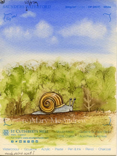
 #5 St. Cuthbert’s Mill, Saunders Waterford, 140lb, HP High White #5 St. Cuthbert’s Mill, Saunders Waterford, 140lb, HP High White 22″x30″ sheet = £ 3.60, 9″x12″ cut peice = .72p. 1. Traced through well. 2. Erases well. 3. Washes- went on nicely. 4. Lifting dry color- ok, not as easy as others, lifting small patch on blue sky was bad. 5. Dry brush- worked great, rough areas above bushes. 6. Ink and Nib- worked ok, a bit bleedy. 7. Scratch test-worked really well. 8. Color pencil- worked well easy to draw on to paper. 9. Permanent ink pen- great. 10. Clouds- worked well, I put clouds on with a bit too much water. 11. Paper took the paint well.
 #6 St. Cuthbert’s Mill, Saunders Waterford, 140lb, CP (NOT) White #6 St. Cuthbert’s Mill, Saunders Waterford, 140lb, CP (NOT) White 22″x30″ sheet = £ 3.60, 9″x12″ cut peice = .72p. 1. Trace through-a bit rough, not as thin, can trace but not as easy. 2. Erases well. 3. Washes- went on really well. 4. Lifting dry color- not so good, soft edges. 5. Dry brush- worked great, rough areas in bushes and ground. 6. Ink and Nib- worked ok, not too bad. 7. Scratch test-worked ok. 8. Color pencil- worked well, especially for rough textures. 9. Permanent ink pen- very well. 10. Clouds- worked well, nice and soft, blue wash went on really well. 11. Paper took the paint really well.
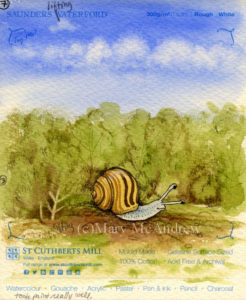 #7 St. Cuthbert’s Mill, Saunders Waterford, 140lb, Rough White #7 St. Cuthbert’s Mill, Saunders Waterford, 140lb, Rough White 22″x30″ sheet = £ 3.60, 9″x12″ cut peice = .72p. 1. Traces through well-a bit rough. 2. Erases well. 3. Washes- very good. 4. Lifting dry color- worked well but not with sky color. 5. Dry brush- worked great, rough areas in bushes and ground. 6. Ink and Nib- worked ok, a bit rough. 7. Scratch test-worked ok. 8. Color pencil- worked well, especially for rough textures. 9. Permanent ink pen- well but can be bumpy. 10. Clouds- blue wash went on well, clouds did really well. 11. Paper took the paint really well.
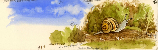
 #8 Canson, Moulin du Roy, HP #8 Canson, Moulin du Roy, HP 22″x30″ sheet = £ 3.10, 9″x12″ cut peice = .62p. 1. Traces through really well, feels thinner. 2. Erases well. 3. Washes- beaded up a lot, wouldn’t go on in some areas! 4. Lifting dry color- worked very well, even on the sky patch. 5. Dry brush- worked ok to good. 6. Ink and Nib- draws well. 7. Scratch test-not great. 8. Color pencil- worked well. 9. Permanent ink pen- nice, easy to draw. 10. Clouds- worked well, don’t get too wet, it gets blotchy. Paper towel lifts easily because color doesn’t soak in too fast. 11. Paint beaded up at first then was ok.
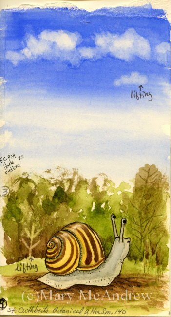
 #9 St. Cuthbert’s Botanical Ultra Smooth, 140lb #9 St. Cuthbert’s Botanical Ultra Smooth, 140lb full sheet = £ 2.20 (slightly smaller than the others), 9″x12″ cut peice = .55p. 1. Traces through really well, smooth. 2. Erases well. 3. Washes- a bit patchy in areas. 4. Lifting dry color- worked well. 5. Dry brush- worked well. 6. Ink and Nib- ok, a bit bleedy. 7. Scratch test-ok to pretty good. 8. Color pencil- worked very well. 9. Permanent ink pen- nice, easy to draw. 10. Clouds- worked well, color lifted well, clouds a bit hard edged. 11. Paper takes paint ok to well.
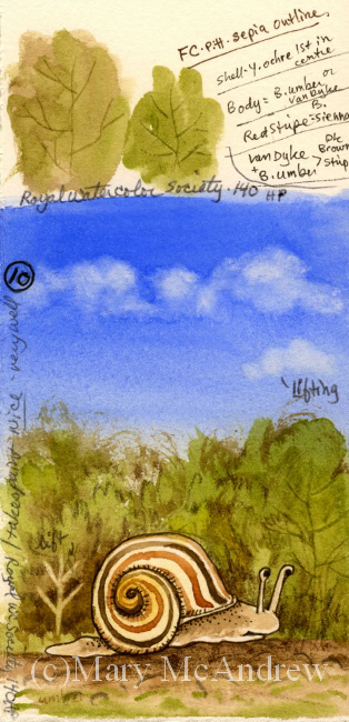
 #10 Royal Botanical Society 140lb, HP #10 Royal Botanical Society 140lb, HP 22″x30″ sheet = £ 4.70, 9″x12″ cut peice = .94p. 1. Traces through well, smooth. 2. Erases well. 3. Washes- went on nice. 4. Lifting dry color- worked well, a bit pale on sky patch. 5. Dry brush- worked well. 6. Ink and Nib- works fine. 7. Scratch test-worked well. 8. Color pencil- worked well. 9. Permanent ink pen- great, easy to draw. 10. Clouds- blue color went on nice, clouds went on very well. 11. Paper takes paint very well.
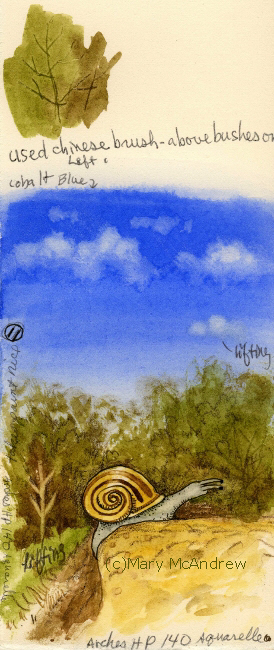
 #11 Arches Aquarelle, 140lb, HP #11 Arches Aquarelle, 140lb, HP 22″x30″ sheet = £ 5.40, 9″x12″ cut peice = £ 1.08. 1. Traces through very well, smooth. 2. Erases well. 3. Washes- went on well. 4. Lifting dry color- worked really well. 5. Dry brush- worked well. 6. Ink and Nib- worked ok to good. 7. Scratch test-worked well. 8. Color pencil- worked very well. 9. Permanent ink pen- very good, easy to draw. 10. Clouds- blue wash went on well, clouds lifted with brush and paper towel. 11. Paper takes paint nicely.
That was the last one! Whew! You can see this kept me busy for awhile. A few of the papers didn’t take the paint nicely at first, they beaded up or skipped areas. For those papers I think I would try wetting the paper first and stretch it, then see how they act. Or just take a larger peice and really wet it then play around on it. After I did the tests I wrote the price per full sheet on the backside, then figured out how much one cut 9″ x 12″ peice would be, depending on how many you could get out of a full sheet.
So what’s my verdict you’re wondering? I have to admit it’s still hard to say! For the price and how they performed for me, I have four I want to explore further.
- Saunder’s Waterford HP High White- seems to work well, price moderate but a bit more than the others I liked.
- Bockingford CP (NOT) white- worked well, rougher than what I’m used to, very affordable
- St. Cuthbert’s Botanical Ultra Smooth- love the smoothness, low price, worked well but sometimes patchy, need further testing.
- Moulin du Roy- I want to test some more, because it beaded up, but I like the feel of it and the price.
On the ones I liked I draw a little star and fill it in with really bright golden yellow, so it’s easy to spot when I’m digging in my folders.
PLEASE DO leave some comments about the paper you use and why you like it!! It would be great for everyone to share some ideas and papers that work for them here.
Happy Spring everyone, springtime posts coming soon!
 Happy Spring from our village in Northumberland, England!
Since moving to England I’ve had to look elsewhere when it comes to buying my art supplies. Back in Clarence Center N.Y., I had lots of local choices for supplies, and I really miss being able to go look at and ‘feel’ things in person. Nothing beats feeling the spring of a brush on your hand or the roughness of a sheet of paper. Of course I ordered supplies online too, if you ordered enough it was cheaper, but it always helps to see it in person first and maybe test it out.
Where we live now there’s nothing close by, you have to drive to Newcastle for choice; so shopping online is more convenient. Last year I ordered some watercolor paper from Jackson’s (jacksonsart.com) online and was happy with the price and it came pretty quickly. I meant to write a post about my tests but alas never got the time, maybe I’ll post those simple tests later. This time around I ordered seven different papers but two I didn’t bother to test yet, they aren’t anything I would use for my illustration but I couldn’t know that until I saw them in person! I also ordered a sample pack of papers that are big enough to do tests on, I’ll include them in my next round of testing.
Here are the five I started testing:
1. Canson Moulin de Roy HP
2. St. Cuthbert’s Botanical Ultra Smooth 140
3. Royal Watercolour Society HP 140
4. Saunders Waterford HP 140 High White
5. Arches Aquarelle HP 140
The Arches is the most expensive, but it’s the one I picked from my last testing, as working best for my illustrations. I’m hoping some of these cheaper options will be just as good so I can make it my ‘go to’ paper and get really familiar with it!
When my new full size sheets of paper come they mostly measure 22″ x 30″ or 56cm x 76cm each. I then lay them out stacked up on my cutting board and figure out the best way to cut them up to get the most sheets. I’ll draw a little thumbnail on scrap paper to figure it out, then mark the watercolor paper for cutting. So I cut the sheets, leaving a big chunk uncut, and some small strips.
(click on pictures to see larger)
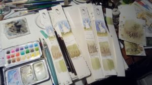 Test strips being worked on and my tiny field palette (lid is partly closed, those aren’t my paints!). For this post I’m just showing you the little bit of testing I’ve done so far. I have long strips from each paper on which I did small quick sketches/tests. Next I will use bigger peices and do a small study to get a feel for the paper with my inks and color pencils added.
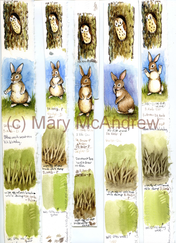
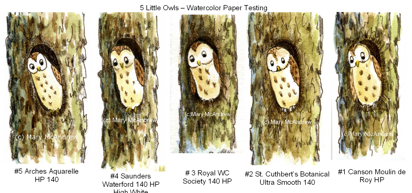
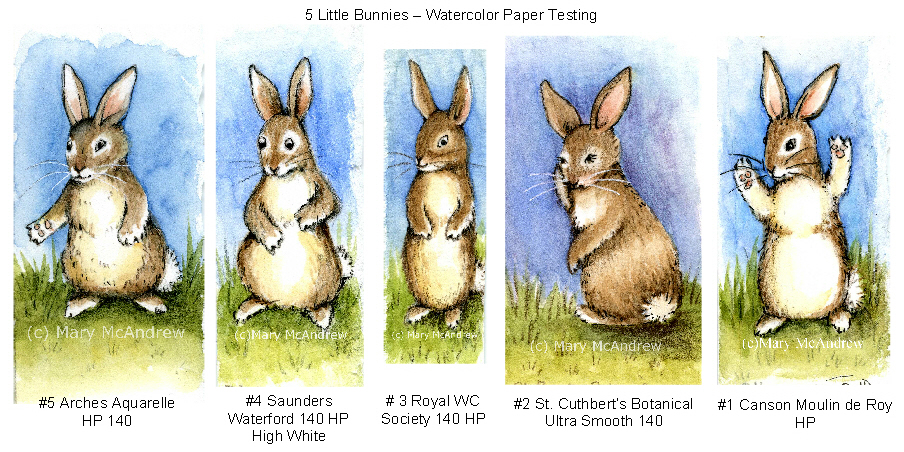
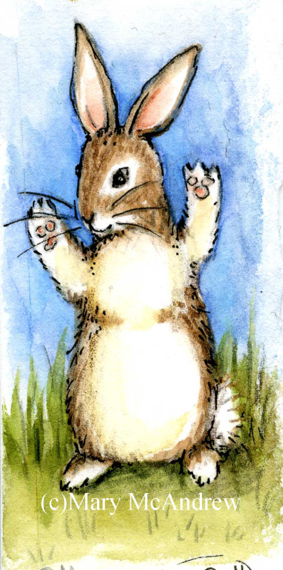
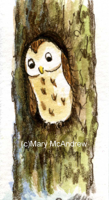
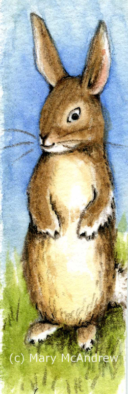
 All 5 test strips together. Above shows all 5 strips laid out on my scanner, they were only 1″ to 1 1/2″ wide so you can imagine how small the bunnies and owls were! The strips are numbered L to R 5,4,3,2,1.
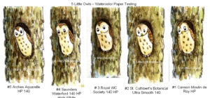 5 Little Owls For the owls I did light pencil sketch then drew with Sepia Pitt “S” permanent ink pen, then watercolor on dry paper, then some color pencil last. The color pencil was brown or black and used for shading areas. They all were just great for using the ink pen and color pencil showed up on the tooth of the paper. Good so far!
 5 Little Bunnies in a row. It’s always good to practice bunnies! Isn’t it funny how each one looks like a different personality? For these I did a light pencil sketch then watercolor for all the color. Then I used various brown colored pencils for shading and some outlineing and at the end, a touch of black Pitt permanent ink “XS” pen. Doing the tiny washes showed me I will definitely need to do washes on larger paper to really see how it behaves. I want to see if layers lift too easily or does it get blotchy?
On the owls and bunnies I was also trying out different color pencils, my familiar Prismacolors, Derwent Coloursoft and some new Derwent “Studio” pencils. The “Studio” pencils are harder than the pencils I’m used to, so they will hold their point longer but not sure if I’ll like them yet!
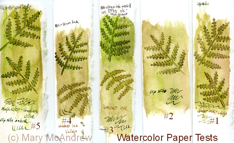
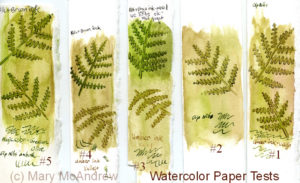 Back side of test strips, dip nib testing. On the backside of the strips I did a quick wash, let it dry then painted some Bracken leaves. When they were dry I used my dip ink nibs to try out some new inks I ordered, I’m very excited about them so far! I tested “Magic Colour – Grecian Olive” and “Vallejo – Umber”, both are acrylic permanent ink and the Magic Colour is made in England (yay! or should I say hoorah!) I did get some special empty markers that you can fill with this type of ink, but need to play around with that more. What I need to test here is, how well do my nibs work on the papers? They were all smooth enough that I cuoldn’t see much difference, next time I’ll try them on semi damp paper for bleeding.
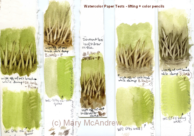
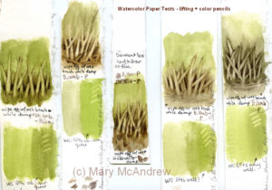 Test of lifting and color pencils. For the test above I did a simple wash of green and brown then while it was damp lifted color using a clean damp brush. Repeatedly wiping and cleaning the brush and dabbing the paper with paper towel, to help lift moisture and color. Then when it was dry I used color pencil to pick out the marks. The green area was just a quick area to try lifing color after it had dried. All did ok, the St. Cuthbert’s Botanical and Canson Moulin du Roy lifted the cleanest and brightest; though this might not be a good thing when adding washes, we’ll see when I do larger studies.
 One Happy Bunny! One Happy Bunny!
PS. Just wanted to mention on a more personal note, one of the reasons I did tiny strips was because I injured myself and sitting in the chair to work just kills me right now. I fell and cracked a rib or two and definitely injured the muscles in my back! But what’s so unbelieveable is that I could do that in a muddy sheep field! I was walking alone along a very old line of trees in a muddy field. I thought, I need a stick so I won’t slip so much….I broke a long stick off a big dead branch on the ground then tried to break it again with my foot on the bottom. Well it still had quite a bit of spring in it and as it resisted I slipped and the branch kind of sprung and I got thrown back against the base of this huge old tree! AY CARUMBA IT HURT! The tree had huge rounded burly roots and that’s exactly what I slammed my side into. Wish I had fallen in the mud! So once I sat up, avoided crying and took inventory of what was working, I had to get up and walk 1.25 miles home. This included climbing over two or three slippery farm gates, muddy fields and a steep road home. I guess there’s not much you can do for cracked ribs but take pain killers and I hate doing that. So I have but avoid overdoing it and now am not taking much. It’s gettiing better and you’d think, “ah, I can’t walk much but at least I can sit and work in the studio”, well no, I can’t concentrate on anything other than small stuff! So, now you’re caught up on me, don’t worry I’m pretty healthy so I should heal quickly (she says!)
I’ll try to work on more testing of these papers and update you on that as I go.
 This little bunny says good-bye! This little bunny says good-bye!
This past summer my husband and I tried to pop out to the Lake District when we could. Unfortunately time slipped by and we only got out there a few times for the day, except of course when my son visited and I got to stay in Keswick two days with him! (but that’s another story). On this occasion we explored Kendal, then some small tarns but the best part was walking up Gummer’s How and having a picnic. (please click on photos to see larger views)
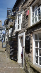 The Chocolate House, Kendal. First we stopped in Kendal and had a quick run around, but lingered a little longer in the Chocolate House. It’s a very small shop filled with all kinds of chocolates and candies. To be honest I didn’t buy any this time, I just didn’t feel in the mood….I must have been NOT feeling myself! Well it’s a reason to go back again.
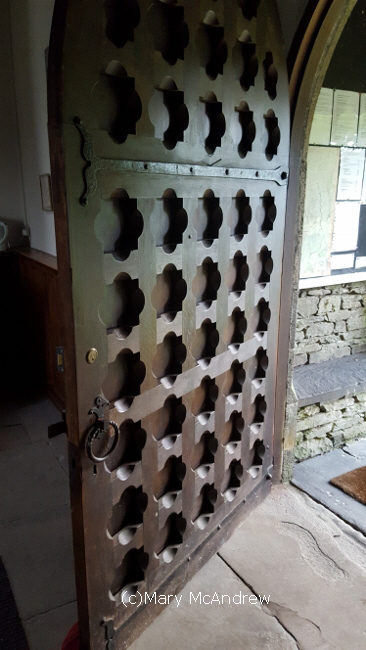
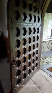 An amazing old door on a small church we visited. This is an amazing old heavy wooden door on a small church we visited.
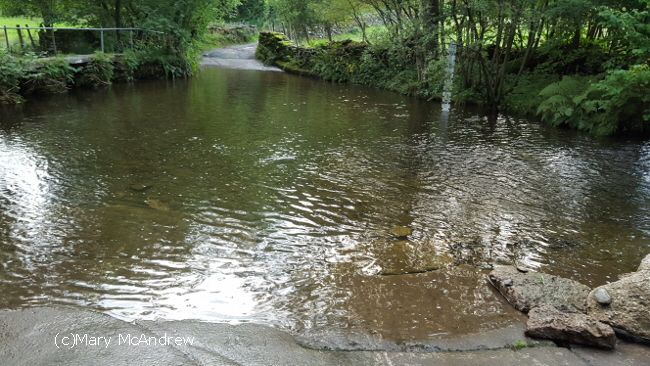
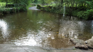 A very scary ford to cross. This is a ford we came to, I’ve never seen one this wide! There was no sign saying not to cross it but I told Gary I’d get out of the car if he tried! It looked far too deep.
 I’m so glad we decided not to cross this ford! We drove around the long way and this is the ford from the other side. It was awful, the ground was all broken up from previous flooding, and it must have been 2 1/2 feet deep! There should have been a sign to warn people!
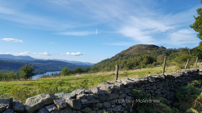
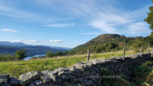 Gummer’s How, waiting for us to come up! This is Gummer’s How and you can just see Lake Windermere at its base. Time to get our boots on and get walking.
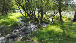 There were some really pretty areas on our walk up. We passed small grassy glades and this one had a small stream that sounded so refreshing.
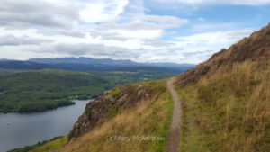 This is the path that curves around towards the top As we get near the top the path goes close to the edge and you get a great view of Windermere. I had to stop and take it in, though Gary said to keep on, he knew the view got better!
Now don’t get jealous of this next photo! It looks like a scene from the “Miss Potter” movie and I love that!
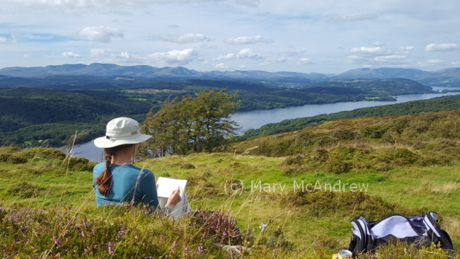
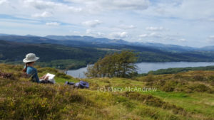 Settling down to do a watercolor of the view at Lake Windermere. Of course my big plan was to do a watercolor study up top and I’m happy to say I did. Many times we walk and when we’re at the top of our hill I don’t feel like painting or there’s just no time.
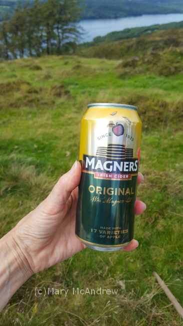
 The day couldn’t get more perfect! After our picnic of Ploughman’s sandwiches (cheese and pickle), various biscuits (cookies) and a can of apple cider we shared, I settled down on some soft mossy heather to draw.
 This apple cider was nice with our picnic. It helps to carry a plastic bag to sit on, the ground is usually very damp so I always have one tucked in my field kit.
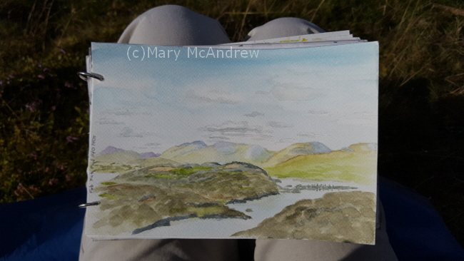
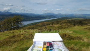 My small sketchbook and travel palette balanced on my knees. The difficult part is translating that huge expanse of landscape to your small pad, I focused in on several of the distant mountains and first sketched with pencil.
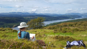
 This shows how far I got while working in the field. The above picture shows how far I got in the field. One of the best things about painting or drawing outside, is all the things you see as you sit there! We heard loud airplane engines and then two really big military airplanes flew right up the lake; it was below us and that perspective made it even more exciting! They must have been returning from an airshow?
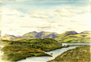 Finished watercolor of “Lake Windermere from Gummer’s How” Here’s the finished watercolor (above). The most challenging thing (as always) was the changing shadow patterns on the hills. You can sit and gaze all day at the moving shadows from the clouds, picking out brilliant greens in one area then fading to appear in another spot. It helped me greatly to look at photos I shot when I finished up details at home. I had to pick a bit from many to fit what my painting was showing.
Click on this Wikipedia link to read more about Gummer’s How. I love the quote by Wainwright at the end, I guess I don’t have to hang up my boots just yet!
https://en.wikipedia.org/wiki/Gummer%27s_How
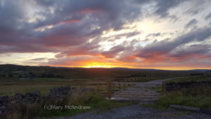 The sunset as we drove home. The end of a very nice day, this was the sunset as we drove through the Pennines back to Northumberland. I hope you enjoyed the extra photos today, though I know August is long since gone, I’ll always remember our hike and painting on Gummer’s How.
The end of May was very chilly here, wool sweaters and extra layers to peel off when the sun did decide to shine. Gary and I have continued our walks of course, especially when the rain holds off. Most of our walks are later in the day and we don’t have much time for me to sit and paint. But today we went with the intention that I’d sit and do a study of distant hills. Yay!
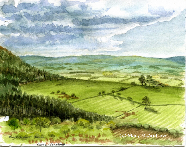
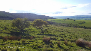 The view I painted was in this direction, looking up Coquetdale. We had a ramble around on Lordenshaws, which is situated right next to the well known Simonside Hills, a favorite place for walkers. Lordenshaws is a much more gentle hill and an easy walk but still offering great views.
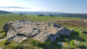 Here’s the largest cup and ring marked stone at Lordenshaws with the marvelous view in the distance of Coquetdale. I love that there are ancient cup and ring marked stones to see as you walk, made about three thousand years ago!
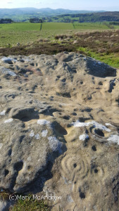 Here’s more of a close up to see the rings and the ‘holes’ are the cup marks. This shows the markings or carvings a bit closer. It’s amazing to think of how long ago they were made and we always have a wonder about the people that made them. What were they like? What did they think of and what do the marks mean? No one can answer that for sure.
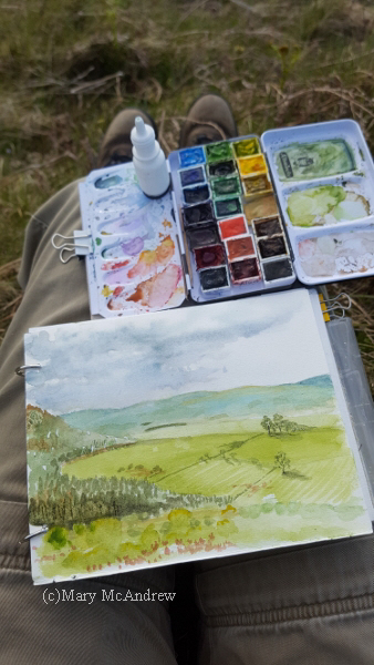
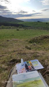 View I had of the hills and Coquetdale valley. Though there are many views, I decided to paint this one, with Simonside being just to the left and the view of Coquet valley coming from behind it. I liked the distant hills with fields marked by lines of hedges and then the nearer farm fields just at the base of Simonside. (It’s very hard to see any detail in this photo, because the sun was in front of me getting low.)
 Painting with cold hands as the sky constantly changed. I tried to get as much done as possible, then at home I looked at the photos I took on the computer, and tried to touch it up. It’s always best to get as much done in the field as possible, as the colors are never the same on the computer! The hard thing is when you work outdoors, especially in the chilly evening air, your hands get cold and your back aches…well mine does. So I try to work quickly.
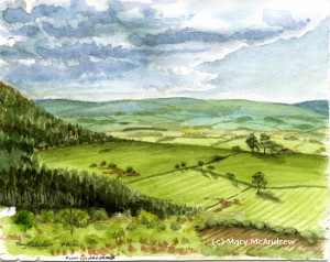 Finished! “View From Lordenshaw’s” watercolor, 5.5″x7″ Here’s the finished painting, only 5.5″ x 7″, including the ring holes!
More posts to come, it’s been such a busy summer I am far behind! Please sign up your email (upper right) to recieve notification of new posts.
Cheers!
It’s gardening time again! I started a variety of seeds on the window sill and we’re really looking forward to the sunflowers! The spring has been so cold that I waited a bit to plant, but we can hope for warmer weather. Now the sprouts have been moved outside and a few are planted. Fingers crossed, we’ll see what happens!
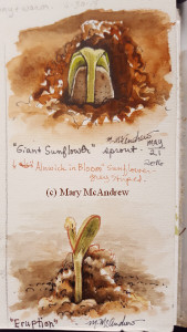 Sunflower seeds sprouting. Above are two very small studies of the sunflowers sprouting; I LOVE when seeds sprout! After messing around with my sunflower sprouts, I decided to get outside, now that the sun is actually shining!
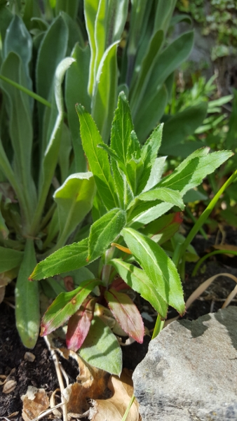
 Photo of the plant I did the watercolor study of. I wanted to do a small study of some plants and decided on this one. I liked how the tips of the leaves at the bottom of the plant are reddish, a good alizarin crimson red. I’m almost positive it’s a weed, but who cares? It looks good for a study.
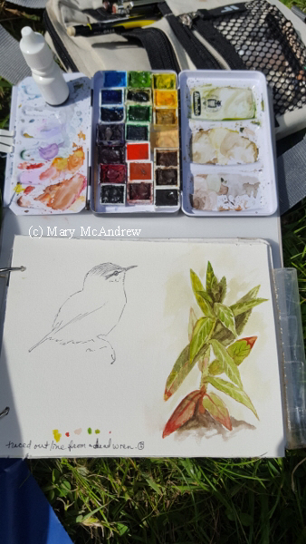
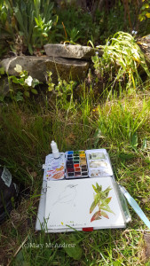 My sketchbook and paint kit, where I sat in front of the garden. I sat on the grass and the plant was about eye level in a low bed. I clipped my sketchbook and the tiny paint kit onto a stiff peice of cardboard, then I could hold it in one hand. I used a waterbrush to paint and the tiny white bottle is water that I can squirt onto the pan for extra wetness, I also use it to wet my colors.
 Close up of my kit and sketchbook. Here it is a bit closer. The sketch of the bird was done from a dead wren that my husband’s cat killed. 🙁 I would usually like to do a study from it but just didn’t have time, so I traced it’s outline. Poor sweet little thing. Happily though, the wrens are nesting behind our house, under the seat of an old bicycle! We keep the cat well away from there!
Coming up soon, a post about an adventurous hike and some watercolors that were inspired by it. (it involves little mice!)
To get automatic updates when I post, sign up your email in the subscribe box in upper right column.
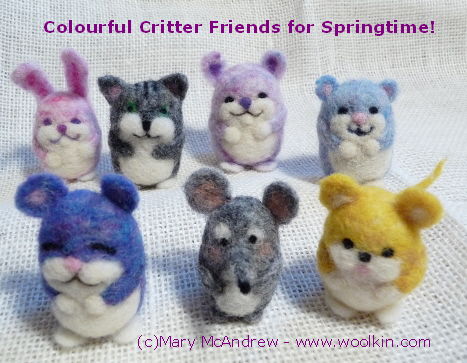
I promise I have some new sketches coming up soon, and some photos of springtime happenings around me, but lately I’ve been preparing to teach some workshops in Needle Felting. Please take a look at the fun creations I’m making! And if you live in Northumberland maybe you’d like to take a class?
 Make a Colourful Critter of your own or makes a great gift! Class 1: Wed. March 23rd 10am – 12:30 pm £20
Optional Follow-Up Class 2: Wed. 30 March 10am-12:30 pm Only £10!
LOCATION: Alnwick Playhouse, Bondgate Without, Alnwick, Northumberland, NE66 1PQ
Come have fun learning to Needle Felt with over 106 colours of wool to choose from!
In Class 1 you will make one Colourful Critter of your choice and all materials are included in the fee. The optional follow-up Class 2 is Half Price and you just pay for wool you use in class. It’s inexpensive for each little project so you may want to make a bunch! Optional follow-up class 2 is a great opportunity to ask questions, get help on projects you tried at home and gives me the opportunity to make sure you get lots of extra attention! Sign up for one or all classes! Secure your place to learn creative techniques with artist Mary McAndrew. Email me for details and to secure your place.
The class will be held at the Alnwick Playhouse. We’ll work on the balcony that overlooks the Gallery; it’s a great location but still feels cozy! Also the cafe will be open, it’s goodies and drinks available for purchase if you like.
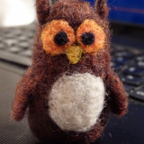
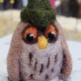
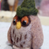
I will also have Needle Felting kits with all tools, some different colored wool and a basic Needle Felting booklet available at class for purchase. I’ll also bring over 106 different colored wools if students would like to purchase any. See additional pictures of Colourful Critters I’ve made below!
-

-
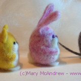
Two cute squirrels!
-

-
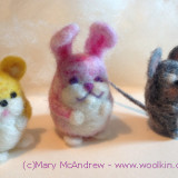
Two Easter bunnies!
-
-
-

-
Make a Colourful Critter of your own or makes a great gift!
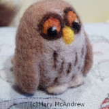
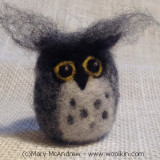
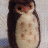
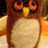
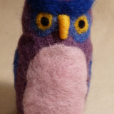
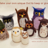
The next project I’m offering is OWLS:
Class 1: Wed. 13th April 10am – 12:30 pm £20
Optional Follow-Up Class 2: Wed. 20 April 10am-12:30 pm Only £10!
LOCATION: Alnwick Playhouse, Bondgate Without, Alnwick, Northumberland, NE66 1PQ
Come have fun learning to Needle Felt with over 106 colours of wool to choose from!
The OWL class will be run just like the COLOURFUL CRITTERS above, Email me for details and to secure your place.
-
-
-
-
-
-
-
-
-
-
Come and have fun making OWLS!
Hello everyone, I’ve been a busy bee! Working not only on some watercolors while out on my walks, but also putting together some Needle Felting classes! I’ve had so much fun preparing by making lots of snowmen, gnomes, flat felted picture ornaments and floaty soft Fairies and Angels. It really is so much fun to work with all the colors and different types of wool I’ve collected.
Here is the poster we designed for my two classes in December.
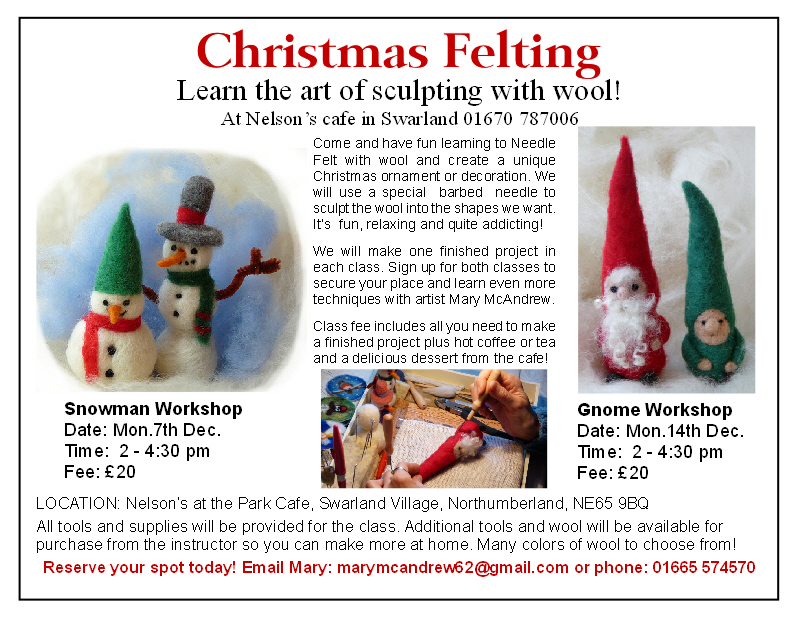 Snowman Workshop: Monday 7th December, 2 pm-4:30 pm £20 Snowman Workshop: Monday 7th December, 2 pm-4:30 pm £20
Gnome Workshop: Monday 14th December, 2 pm-4:30 pm £20
Both will be taking place at Nelson’s at the Park cafe in Swarland Village, Northumberland. It’s a great little community cafe with the most excellent desserts and I’ve been hearing such good things about their food from the locals! I’m excited because our class will include a hot coffee or tea and a dessert specially prepared for us! YUM. I already have a few students signed up so please don’t wait to send me an email if you want to join us. When you email (marymcandrew62 at gmail.com) I’ll send you a Paypal invoice and you can pay with paypal or credit card.
We’ll learn about the qualities of different wools and how to work with them. I’ll bring some fun needle felted projects I’ve made to show you what else you can do with wool and spark your creativity. I’ll also bring along a very big selection of all colors of wool for students who want to purchase some to take home.
CHRISTMAS FAIR
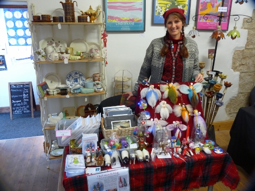
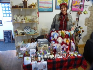 21 November at the Gallery 45 Christmas Fair. On Saturday (Nov.21) I took part in the Christmas Fair at Gallery 45 in Felton, Northumberland. I decided to do it only two days before the event so I kept it simple. I rented a small table just so I could put out some note cards, small prints of my artwork and a good selection of felted peices. It was a lot of fun meeting local people and talking about my work and a great way to talk about my classes coming up in December.
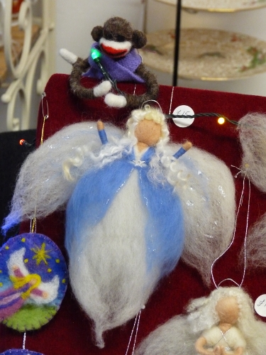
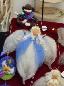 Sock Monkey and Angel, both needle felted. I thnk the Sock Monkey was trying to serenade the angel when I wasn’t looking, is she throwing her arms up to cover her ears? We’ll never know!
Email me (marymcandrew62 at gmail.com) if you have a small group in Northumberland that would like to learn how to needle felt and we’ll see if we can arrange something. So many fun things to create!
Here’s a post I wrote from July, never too late to enjoy a bit of sun I guess!?
July 16, 2015
Did I tell you how much I LOVE living here in Northumberland? I did? Well I won’t get tired of saying it or doing my sketches out in the field.
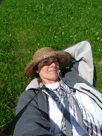
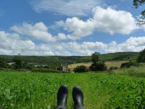 Taking a rest, enjoying the day, in my barn boots of course! I went up in the field near Edlingham Castle, I had it all to myself, no sheep or cows about. It was just that kind of day that I sat on the ground to think, listen to the birds and enjoy just living. Then I just lay back and put my straw hat over my eyes and let time slip by, and it was ok.
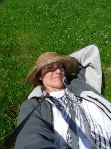 Trying to take a selfie with a 35mm isn’t easy! Laying down amongst the clovers, it made me feel like a kid again. Isn’t that funny? I should go lay in the grass more often! Maybe we could start a national “Lay in the Grass Day”! haha.
Below is a picture of what it looked like, my view from the grasses, the clouds were so beautiful.
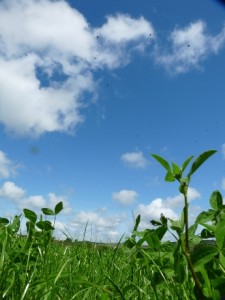 My view from the grass, my mouse eye view. And below, this is what I saw near me, a Ringlet butterfly, a very common sight in the fields here in summer. I’m really enjoying learning the new butterflies and bugs here in the UK.
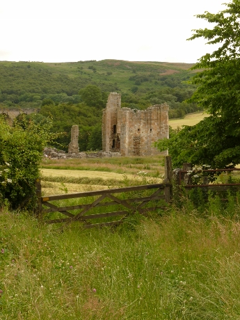
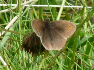 A Ringlet butterfly on a clover head. Well I didn’t just lay around all day, after a little while I went down the field, found a spot to stand and did a small painting. Below is a picture of Edlingham Castle, this was what I drew. You can see by the photo, the lighting never stays the same when you’re painting outside. My painting ended with nice blue skies and sunshine!
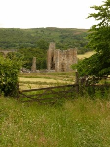 Edlingham Castle view from field. Below is the ink drawing I did first. Sometimes I do an ink drawing then paint with my watercolors, especially if I don’t think I’ll have time to paint it. The other way is to do a light pencil sketch and then paint, drawing with ink a little for details on the pencil before or after painting.
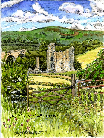
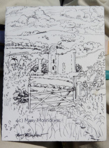 Ink drawing of Edlingham castle, over the gate. Below is my finished watercolor painting, only 4.5″ x 6″. You can see how bright the colors are, the day really was so bright, unlike the photo! The ink drawing makes it look more like an illustration than a painting to me. Kind of like all details are picked out at once, but that’s ok.
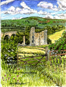 Edlingham Castle, Northumberland. Watercolor and Ink 4.5″ x 6″ I hope you enjoyed a little look back into summer! If you don’t want to miss any of my posts, just put your email in the box at the top right column. It’ll send you an email notice and you just respond then you’ll get my posts right in your inbox. Remember though, it’s best to click to come here and read the post, it lays out better on the page (and you can leave comments here).
|
Welcome to my Blog! The most up to date information about my artwork, nature sketching adventures, or step by step demonstrations. Search using Categories or Tags, or use the search box in the left column.
Please sign up below to get notified when I post new articles.
|